Best Practices for Displaying Dashboards on Large Screens
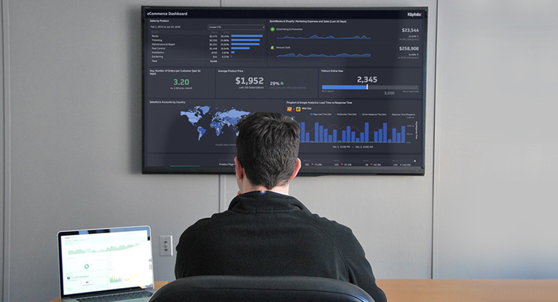
As more employees return to the office post-pandemic, big screens and wallboards have become hubs for alignment and motivation. Display real-time data where it matters most—on TVs, wallboards, and large screens—to keep your team connected, informed, and inspired. Learn how to optimize your Klips dashboards for maximum impact.
Why choose large screen dashboards?
Large screen dashboards transform office walls into command centers. When everyone can see up-to-date metrics at a glance, you unlock:
Immediate alignment: Teams gather around a shared view of key performance indicators (KPIs).
Faster decision making: Leaders and staff respond quickly to trends and anomalies.
Boosted motivation: Visible goals drive friendly competition and focus.
Transparent culture: Data lives in public view, reinforcing accountability.
"Since the implementation of Klipfolio Klips, we are much smarter about our business. Every team member has the data on their phone and we have multiple screens that are linked to Klips in our various offices. It’s truly been an incredible piece of software within our organization.” Elliot Campbell, Trace Medical
Best practices for large screen dashboard displays
Follow these guidelines to ensure your dashboards look great and deliver the right information from across the room.
1. Use a non-Admin account
Run your display on an account without the Admin role. Admin accounts show additional controls—ideal for authors, not large screens.
2. Choose the right platform
Ideally launch your dashboard from a dedicated computer connected to the TV or video wall. Smart TVs and Raspberry Pi devices often lack the memory and processing power to render dashboards smoothly. See supported systems here.
3. Trim unnecessary content
Viewers on the floor can’t inspect every detail. Remove components that don’t add real insight. If you need more information, create a separate dashboard and cycle between them in full-screen mode.
4. Adjust your browser zoom
Set your browser zoom to 150–175%. This range works well for TVs viewed within 6 meters or 20 feet. Test different levels to find the sweet spot for your room.
5. Use numeric suffixes
When viewers don’t need exact precision, switch to suffixes. Display $34.2M instead of $34,231,342.23. This saves space and improves readability on charts.
6. Scale down gauges
Gauges are designed to stand out—on a large screen, they can dominate the layout. Reduce gauge size to balance screen real estate across components.
7. Leverage Klip titles
Always include Klip titles. They scale with your zoom settings, span mobile and desktop, and provide clear context for each visualization.
8. Save space with smart labels
Drop redundant axis labels when implied by data.
Use legends for short descriptions instead of paragraphs.
Shorten tick labels and angle them diagonally if needed.
9. Keep heights consistent
Align adjacent Klips by matching component heights. Consistency looks neat and guides the eye naturally across multiple charts, tables, and images.
10. Optimize for non-interactive content
And remember, these dashboards will be glanced at multiple times throughout the day. Unlike a dashboard on your laptop or phone, users won't be interacting with the visualizations.
Common use cases
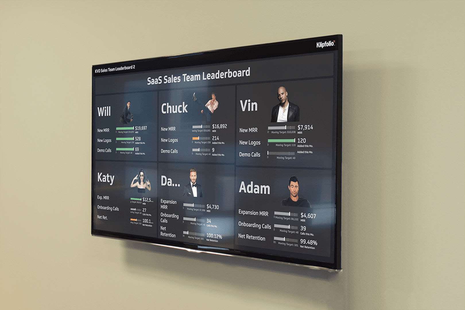
Sales performance dashboards
Display daily sales totals, conversion rates, and top-selling products. Teams rally around visible targets, celebrate wins, and course-correct quickly if numbers dip. See sales examples here.
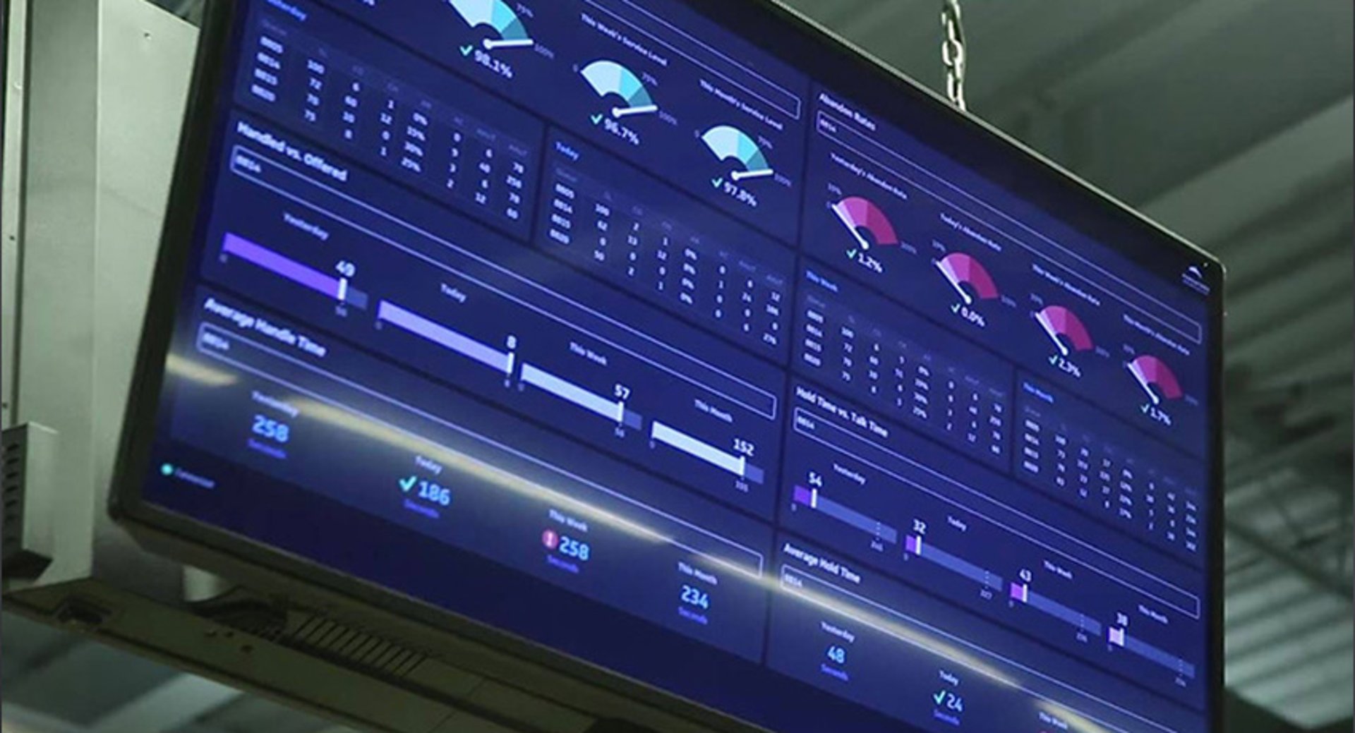
Call-centre wall boards
Show live call volumes, average handle times, and service levels. Agents stay engaged when they can see real-time queue length and individual versus team performance. See call-centre examples here.
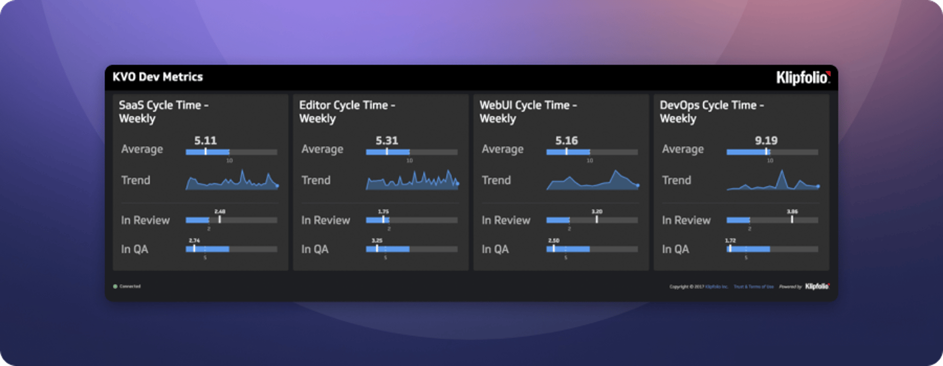
Operations and deployment monitoring
Track server health, performance, and deployment status. Engineers and SRE teams share a single source of truth, reducing incidents and improving response times. See DevOps examples here.
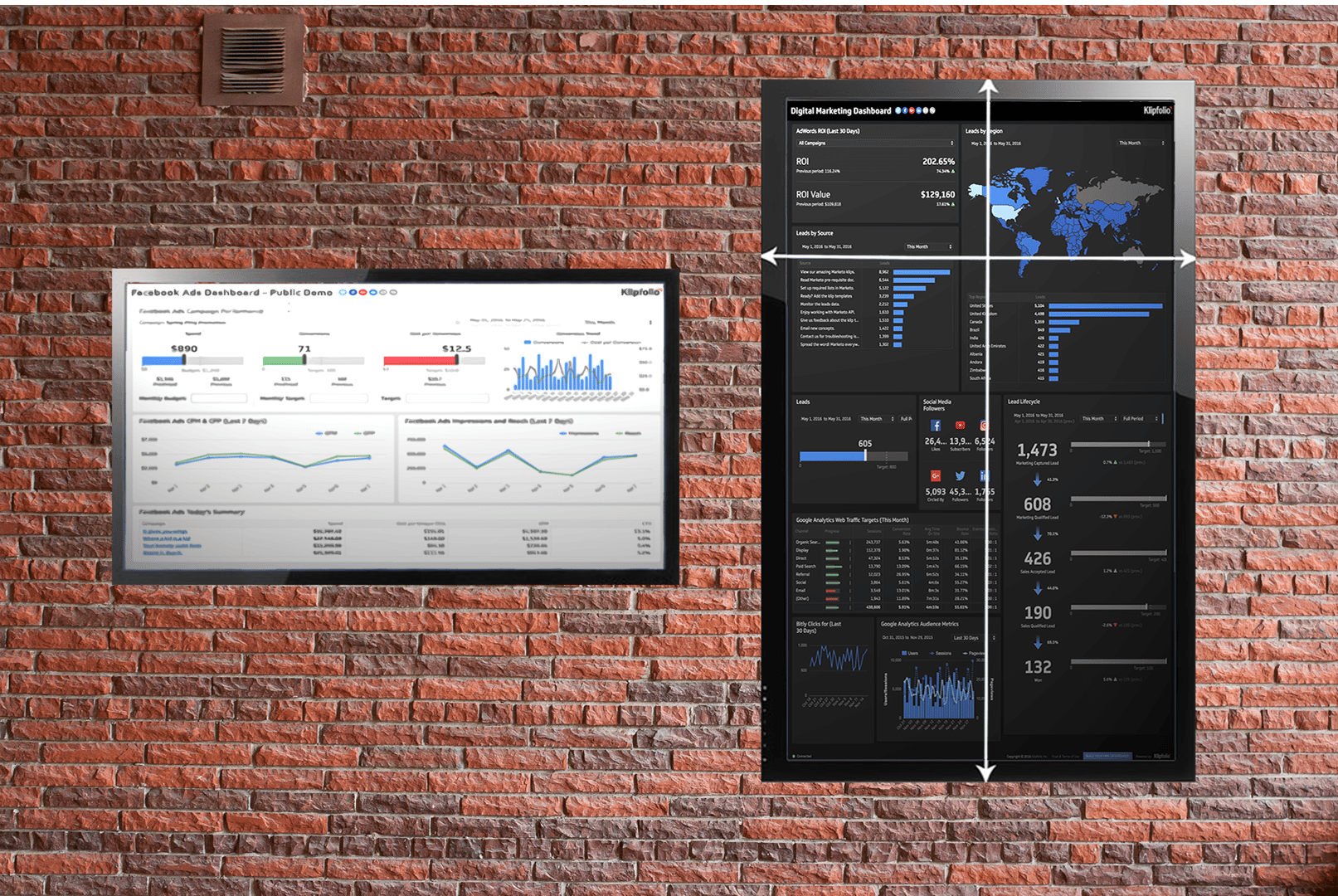
Marketing campaign trackers
Highlight campaign clicks, cost-per-lead, and channel ROI. Marketers and stakeholders stay in sync on campaign progress and adjust budgets on the fly. See marketing examples here.
Benefits of real-time alignment and motivation
Single source of truth: No more hunting for spreadsheets. Everyone sees the same numbers.
Shared goals: Visual targets spark healthy competition and teamwork.
Rapid feedback loops: Instant visibility on campaigns, projects, and ops keeps momentum high.
Data-driven culture: When data is public, conversations shift from opinions to facts.
Getting started
Ready to turn your office walls into insight hubs? Try Klipfolio Klips today to create, customize, and display your dashboards on any large screen. No credit card required, and setup takes minutes.
Need more tips? Explore our Knowledge Center for advanced display configuration and layout examples.