Management Dashboard
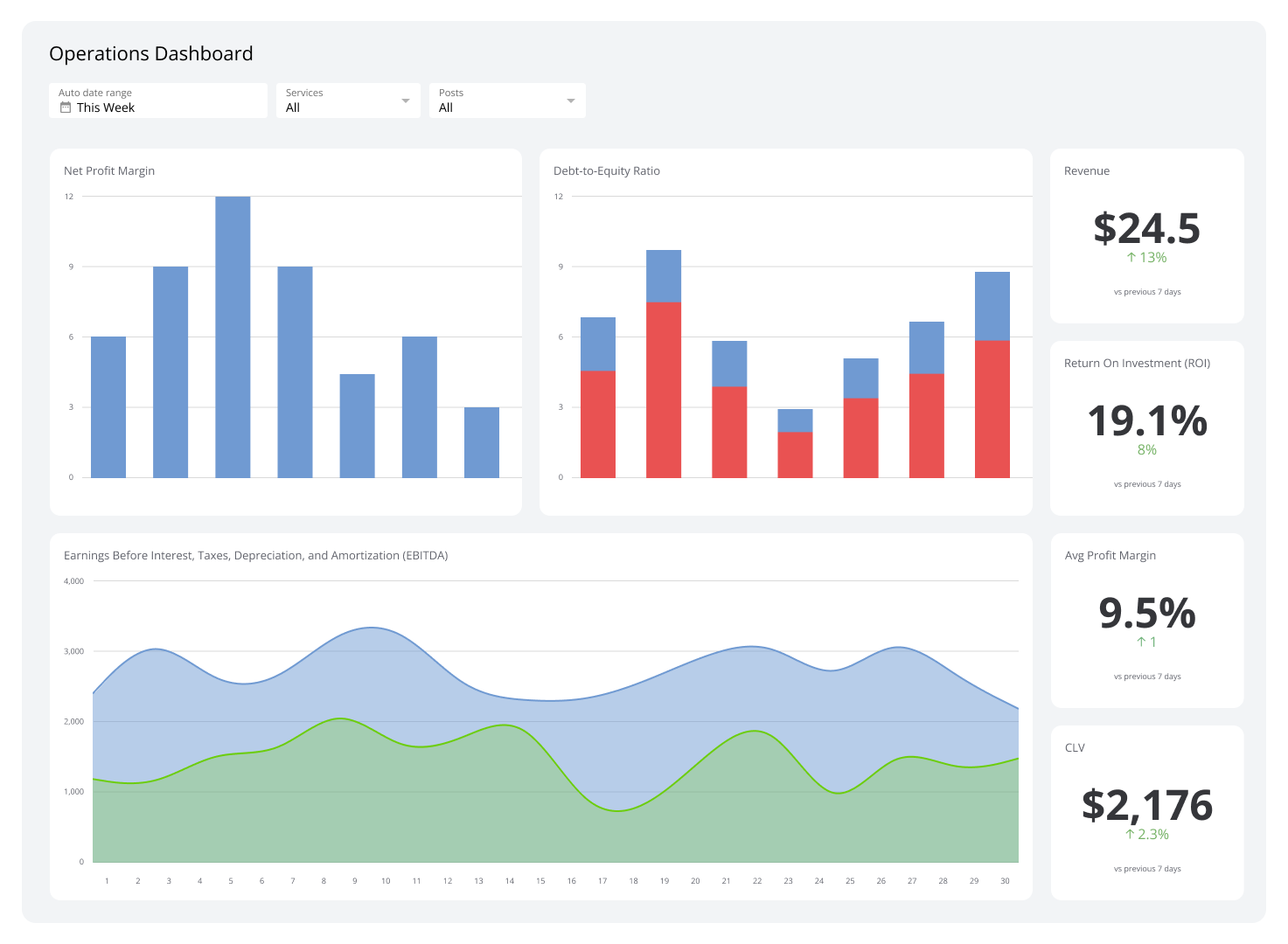
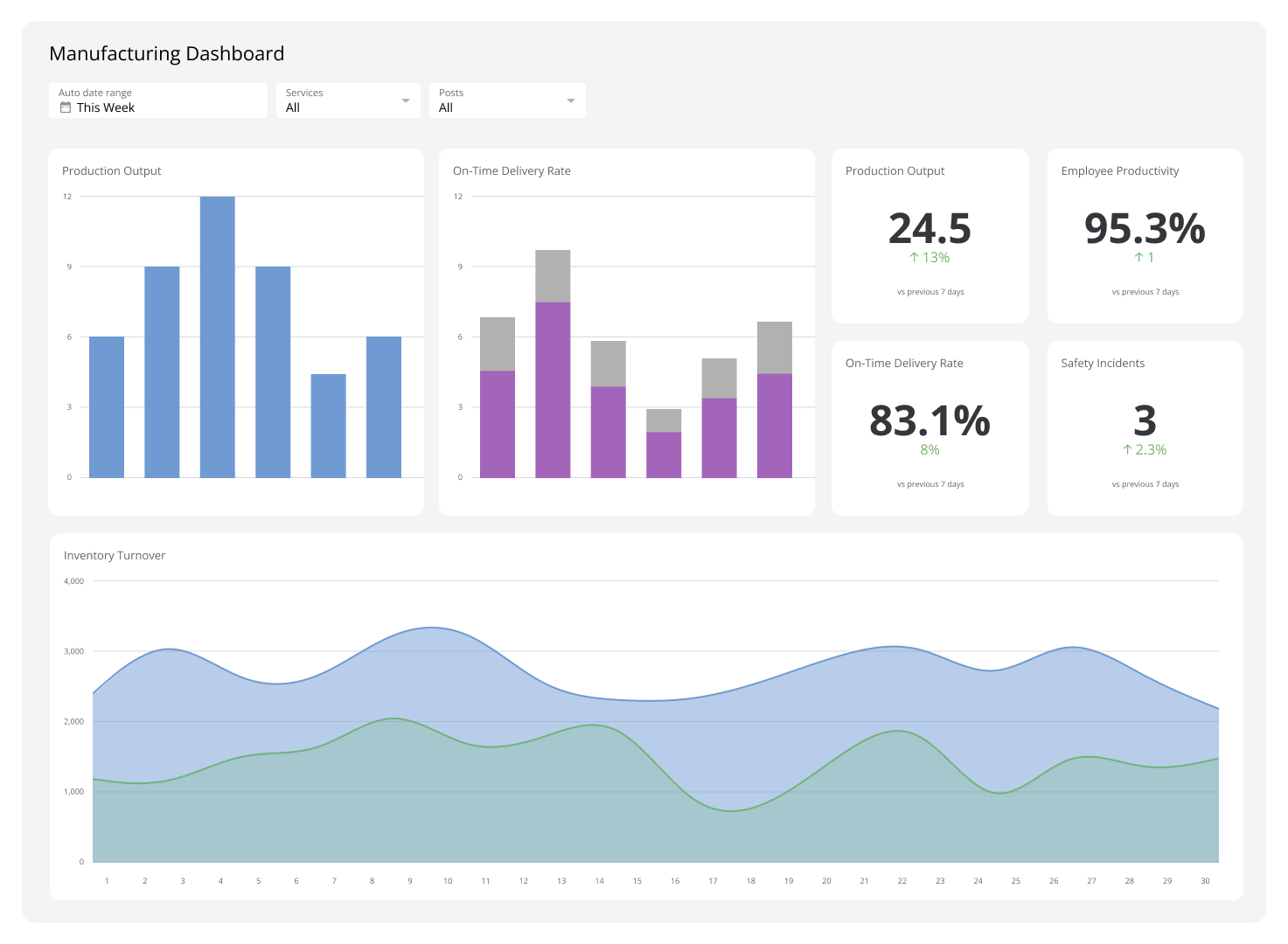
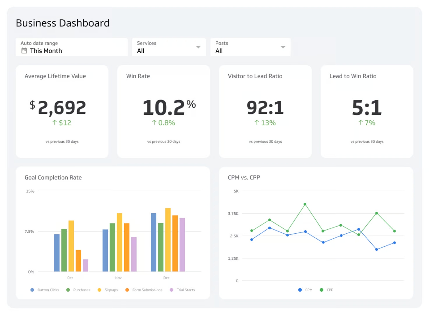
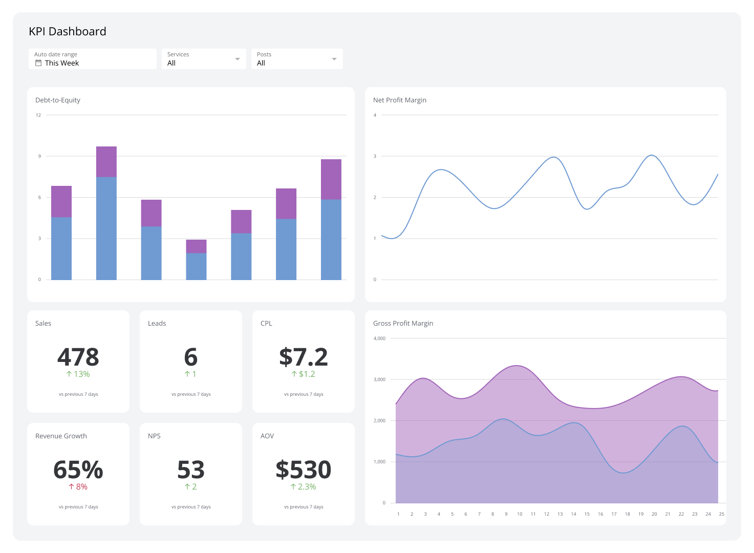
A management dashboard gives managers a real-time view of performance across sales, HR, finance, and more — all in one place.
Managers carry two jobs at once: running day-to-day operations and leading the people doing the work. That dual accountability is the biggest challenge 68% of managers face. A management dashboard helps by putting the most important numbers in one place, so you can act on what matters instead of chasing data across systems.
Here's what a management dashboard is, why it matters, which metrics to track by department, and how to build one that actually gets used.
What is a management dashboard?
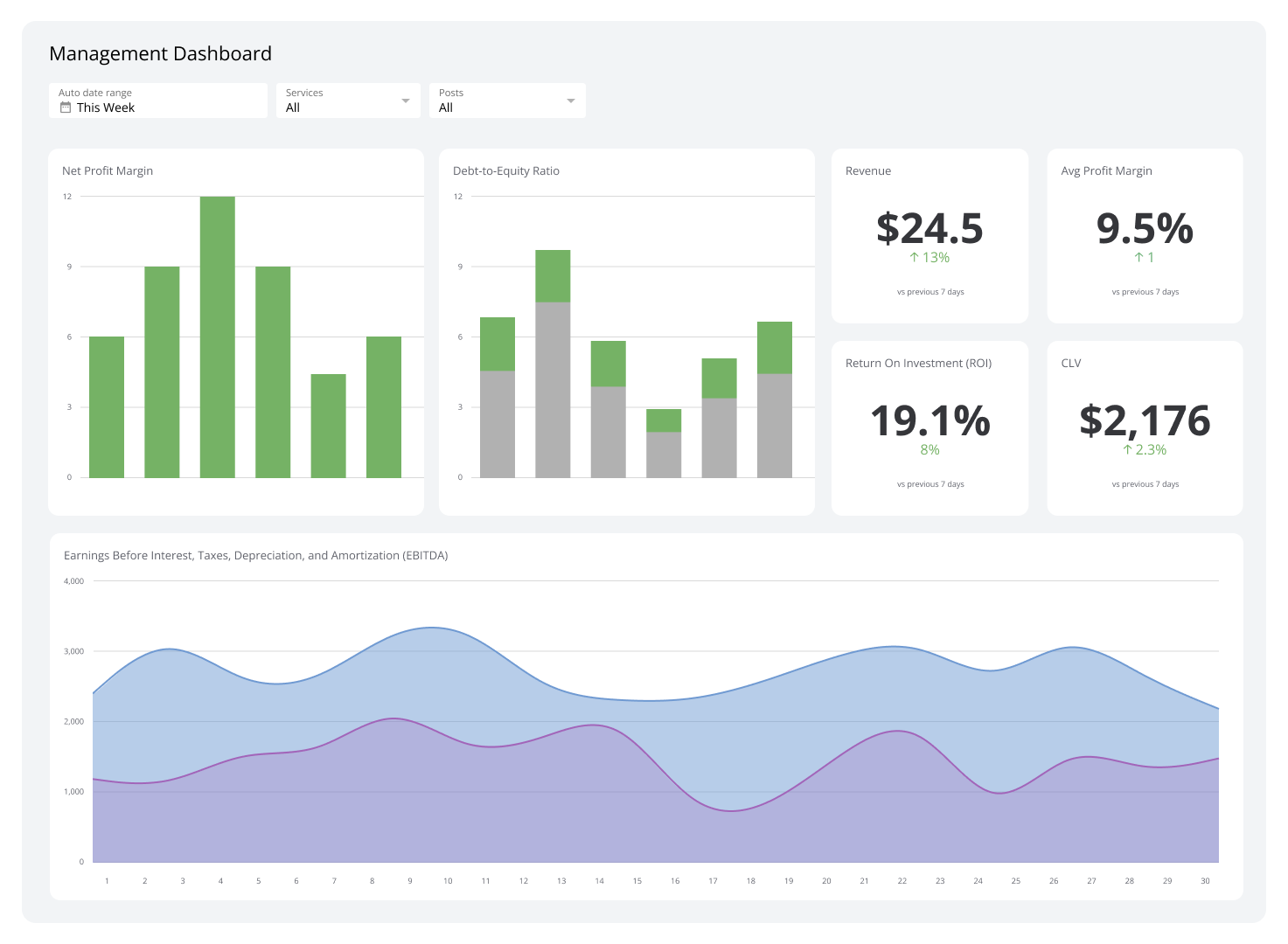
A management dashboard is a visual reporting tool that pulls data from multiple sources into a single view, displaying key metrics through charts and graphs so managers can monitor performance in real time.
Rather than combing through separate reports or spreadsheets, you get a clear snapshot of what's happening across sales, operations, HR, finance, and more — all in one place.
Why use a management dashboard?
Management dashboards replace scattered reports with a single, real-time view of performance. Here are five reasons to use one.
Save time
Instead of pulling data from multiple systems, you see everything on one screen. That quick look replaces hours of manual reporting and frees you to make calls, not compile numbers.
Klipfolio Klips connects to spreadsheets, databases, CRMs, and 130+ other data sources, then displays the results in a clean, customizable dashboard — no manual data wrangling required.
Understand data at a glance
Dashboards turn raw numbers into simple visuals: line charts, bar graphs, and scorecards that communicate trends instantly. A sales manager can see whether revenue is trending up or down without opening a single spreadsheet. That clarity keeps teams proactive rather than reactive.
Monitor performance in real time
Real-time updates mean you see problems as they develop, not after the fact. If a project falls behind schedule or a support queue spikes, the dashboard surfaces it immediately — giving you time to act before small issues become big ones.
Improve accountability
When individual performance metrics are visible, everyone knows where they stand. If output is below target, the data prompts a timely, evidence-based conversation rather than a vague review.
Managers account for 70% of the variance in employee engagement. Accurate dashboard data helps you give meaningful feedback — and a highly engaged workforce can boost profits by 22%.
Make better decisions
With accurate, up-to-date data in one place, you can spot trends, identify problems, and act with confidence. If sales data shows a decline in a particular product line, you can investigate and respond quickly rather than waiting for a monthly report to surface the issue.
The alternative — pasting numbers into a spreadsheet or asking your team to pull a figure — slows you down and introduces errors. A reliable dashboard means the number is already there, and you already trust it.
Key management metrics for different departments
A management dashboard becomes far more effective when it tracks the right metrics. Here are the key ones to consider by department.
Sales metrics
Sales metrics give you a clear picture of revenue performance and customer retention.
Revenue: Tracks income generated from sales activities and signals overall business health.
Churn Rate: High Churn Rate signals customer dissatisfaction. Monitoring it helps you investigate root causes and improve retention before the problem compounds.
Marketing metrics
Marketing managers need to know whether campaigns are generating quality leads and engaging the right audience.
Marketing Qualified Leads (MQLs): MQLs show how many leads are likely to convert. Tracking this metric helps you adjust campaigns to maintain a steady pipeline of high-quality prospects.
Customer engagement rate: High engagement rates confirm that content is resonating with your audience and driving meaningful interactions.
Email open and click-through rates: With 60% of consumers still preferring email contact, these metrics reveal whether campaigns are relevant and driving action.
Customer service metrics
Real-time visibility into support performance helps you keep customers satisfied and identify process gaps.
Customer Satisfaction (CSAT): CSAT scores are a direct measure of service quality and a leading indicator of customer loyalty.
First response time: Slow first responses erode customer trust. Tracking this metric helps you spot bottlenecks and improve support speed.
Escalation rate: A rising escalation rate signals that frontline agents may need additional training or resources to resolve issues independently.
Human Resources metrics
HR managers use dashboards to track the health of their workforce and the efficiency of their hiring process. Tracking an employee engagement dashboard alongside these metrics gives you a fuller picture of workforce health.
Employee Turnover Rate: High turnover is disruptive and can cost 90–200% of an employee's annual salary. Monitoring Employee Turnover Rate helps you address retention problems early.
Time-to-Hire: Time-to-Hire measures how efficiently the recruitment process moves from posting to offer.
Cost-per-Hire: Cost-per-Hire helps HR managers evaluate whether recruiting investments are delivering value.
Financial metrics
Financial metrics matter to accounting managers and executives alike. Key metrics to track on executive dashboards include:
Gross Profit Margin and Net Profit Margin: Gross Profit Margin and Net Profit Margin show how efficiently the business converts revenue into profit.
Operating expenses ratio: Tracks cost management effectiveness and highlights areas where savings are possible.
Cash flow: Positive cash flow is essential for meeting obligations and funding growth. It's especially critical in capital-intensive industries.
Create custom dashboards for you and your team.
Get started with KlipsIT and technology metrics
The IT department keeps operations running. Two metrics IT managers should monitor closely:
System uptime and downtime: Tracks reliability and helps you reduce disruptions before they affect the broader business.
Incident response time: Measures how quickly the team resolves issues when downtime or technical failures occur.
Project management metrics
Project managers need a clear view of delivery performance across multiple workstreams.
Project completion time: Tracks whether projects are delivered on schedule.
Resource utilization: Shows whether team capacity is being used efficiently or whether workloads are unbalanced.
Risk management efficiency: Measures how well the team identifies and mitigates risks before they affect delivery.
Best practices for creating a management dashboard
Define a specific goal
Start by identifying what you want the dashboard to accomplish. Are you tracking sales performance, monitoring employee productivity, or overseeing project delivery? A clear goal determines which metrics belong on the dashboard and keeps it focused.
Know your audience
Different managers need different information. A sales manager sharing performance data with HR will want to surface Conversion Rates and individual contribution metrics — not pipeline totals. Tailor the dashboard to the person reading it.
Prioritize key information
Place the most important metrics where they're seen first. Use visual hierarchy — size, colour, and position — to draw attention to what matters most. If customer satisfaction is your primary focus, CSAT scores and response times should lead the view.
Add context and cross-functional data
Data is more useful with context. Showing sales figures alongside marketing spend, for example, helps explain why revenue moved in a particular direction. Cross-functional data gives you a more complete picture of how departments interact and affect each other.
Use consistent formatting
Apply the same colours, fonts, and chart styles throughout the dashboard. Consistency reduces cognitive load and helps users absorb information faster.
Ensure data accuracy
Inaccurate data leads to poor decisions. Check your data sources regularly and confirm that automated connections are refreshing on schedule. A dashboard is only as reliable as the data feeding it — and when the numbers are consistent, you stop second-guessing them.
What to avoid in management dashboards
Displaying too many metrics
Overloading a dashboard with metrics makes it harder, not easier, to find what matters. Focus on the metrics that directly support your goals and cut the rest. A focused dashboard is always more useful than a comprehensive one.
Fixating on granular detail
A management dashboard should provide a high-level view of performance, not a forensic breakdown of every data point. Save detailed analysis for dedicated reports. The dashboard's job is to surface trends and flag issues quickly.
Using complex visuals
Complicated charts slow comprehension. Bar charts, line graphs, and scorecards communicate most business data clearly and quickly. Avoid 3D charts or visuals that require interpretation — the goal is to make information accessible at a glance.
Build your management dashboard with Klips
Klipfolio Klips is built for managers who need a real-time view of performance without the manual work. Connect to 130+ data sources, build custom visualizations using Excel-like formulas, and share dashboards across your team with flexible distribution options — including TV mode, scheduled PDF reports, and public links.
You spend less time pulling numbers and more time acting on them. That's the point.