

Summary - Working with data across disconnected sources wastes time and leads to decisions made on stale numbers. This guide explains what business intelligence is, how its core processes work together, and how growing companies use BI to make faster, more confident decisions. Covers descriptive, diagnostic, and predictive analysis; data integration methods including ETL, ELT, SDI, and data virtualization; visualization best practices; and real-world examples from sales, accounting, and customer service.
Working with data across a dozen disconnected sources is exhausting. You pull numbers from one place, paste them somewhere else, and by the time you have a picture of what's happening, it's already out of date. Business intelligence gives you a better way: a structured approach to collecting, connecting, and presenting data so you can make confident decisions without the manual scramble.
What is business intelligence?
Business intelligence (BI) is the set of processes that transform raw organizational data into clear, actionable information. Through data collection, integration, analysis, and visualization, BI gives leaders a reliable view of what's happening across their business, without having to chase numbers or explain context from scratch every time.
The core processes work together:
Data collection pulls data from multiple sources into one place.
Data integration standardizes formats and moves everything into a unified repository.
Data analysis examines the data for patterns, trends, and anomalies.
Data visualization translates datasets into charts, graphs, tables, and maps that are easy to read and act on.
Most growing companies collect data from a wide range of sources: operational systems, web analytics, social media, financial platforms, and third-party services. Because those sources rarely talk to each other, getting a clear picture of the business takes real effort. BI removes that friction. The result is faster decisions, grounded in numbers you can trust.
The benefits of business intelligence
BI makes useful data available at the right time. When it works well, you spend less time hunting for answers and more time acting on them.
Efficiency
Without BI, teams spend hours pulling data from disconnected sources, reconciling formats, and chasing down the right numbers. That's time that could go toward the work that actually moves the business forward.
A solid BI setup removes that overhead. Data integration tools merge sources into a consistent format. Visualization tools surface insights without requiring manual analysis. The information you need is ready when you need it, not after a half-day of spreadsheet work.
Competitiveness
When insights are available quickly and reliably, leadership can make informed decisions faster. You're not waiting for someone to pull a report or guessing based on last quarter's numbers. You're working from a current, complete picture of the business, and that's a real advantage.
Cost-effectiveness
Data reduces the risk of acting on assumptions. Historical trends help you anticipate costs before they hit. Knowing what's driven results in the past gives you a stronger basis for deciding what to do next, rather than finding out after the fact that a strategy didn't work.
The 3 main categories of BI analysis
| Type of analysis | Question answered |
|---|---|
| Descriptive | What happened? |
| Diagnostic | Why did it happen? |
| Predictive | What will happen next? |
BI analysis falls into three categories. Each builds on the last, moving from observation to explanation to action.
Descriptive
Descriptive analysis is usually the first step. It uses historical data to describe where the business is, or where it's been. Common outputs include monthly sales reports, marketing summaries, and financial statements. These help you assess performance and establish a baseline for everything that follows.
Diagnostic
Once you know what happened, diagnostic analysis helps you understand why. It examines relationships between data points to identify probable causes of trends, patterns, and anomalies.
For example, an eCommerce company sees an unexpected spike in sales. Diagnostic analysis surfaces the likely reason: an influencer featured the product, driving a surge in traffic and conversions.
Predictive
With a clear picture of what happened and why, predictive analysis estimates what's likely to happen next. It uses those cause-and-effect relationships to model outcomes and inform strategy.
In the same example, the company might use predictive analysis to assess whether the sales spike will hold, and whether partnering with more influencers would sustain the growth.
The business intelligence framework
Effective BI follows a repeatable process. Each step builds toward the same goal: reliable information that supports confident decisions.
The organization defines its objectives, identifying the core questions it needs to answer and the data required to answer them.
The organization collects data from all relevant sources: sales reports, web analytics, social media, financial systems, and more.
Data teams integrate data from disparate sources into a unified format so everything can be compared and analyzed together.
The team analyzes data using queries, algorithms, or AI to surface patterns, trends, and anomalies.
The team visualizes data in charts, graphs, or dashboards to make findings easy to communicate and act on.
The organization uses the data to build evidence-based strategies and track results over time.
Goal-setting
Before any BI work begins, the organization needs to define what it's trying to learn or achieve. A specific goal determines what data to collect and how to present it.
The most useful objectives are measurable. When you can measure progress, you can break an objective down into the metrics that will tell you whether you're on track.
A practical approach is to frame the objective as a set of questions that descriptive analysis can answer. Take an eCommerce company that wants to increase ROI from digital marketing. It might ask:
What does ROI look like now?
What activities generate expenses?
What activities generate revenue?
Which marketing efforts contribute most to current revenue?
Which metrics reflect the performance of current campaigns?
From there, the team knows what data to gather: organic traffic by platform, leads by source and region, daily sessions and page views, and so on.
Data collection
With objectives defined, the team identifies where the relevant data lives. Sources might include databases, spreadsheets, APIs, web analytics tools, social media platforms, email marketing systems, and third-party data services.
In the marketing ROI example, the team would draw from sales reports, web analytics, social media analytics, and email marketing data.
Data integration
Once collected, data needs to be moved into a single, consistent format so it can be analyzed together. Data engineers typically handle this step using one of several approaches.
ETL
The extract, transform, and load (ETL) pipeline works in three stages:
Extract: Data moves from source systems into a temporary staging area.
Transform: The data is cleaned, standardized, and formatted to match the target repository.
Load: The transformed data loads into the target system, ready to use.
ETL ensures data is clean and consistent before it enters the repository. The trade-off is upfront planning: transformation rules need to be defined before the pipeline runs.
ELT
Extract, load, and transform follows the same steps in a different order. Raw data loads directly into the target repository first; transformation happens later, on demand. This approach suits organizations that need to move large volumes of data quickly.
SDI
Streaming data integration (SDI) moves data continuously in real time, from extraction through transformation to loading. It's the right fit when decisions depend on up-to-the-minute information.
Data virtualization
Data virtualization creates a unified view of data without physically moving it. A virtual layer connects to the source systems and presents data in a consistent format, leaving the originals unchanged. It's a cost-effective option when real-time access matters but full data migration isn't practical.
Data analysis
With data consolidated, the team can start extracting insights. Data analysis runs queries and applies statistical or computational techniques to surface patterns, trends, and relationships.
Data mining is one of the most common approaches. It includes several techniques:
Association identifies how often two or more variables appear together. Retailers use this to understand which products customers buy in combination.
Classification assigns data points to predefined categories based on their attributes. Spam filters are a familiar example.
Clustering groups data points by similarity without predefined categories. Marketers use it to segment customers by behaviour.
Predictive analytics applies machine-learning algorithms to historical data to forecast future outcomes. Accountants use it to project cash flow.
Data visualization
Numbers in a table tell part of the story. Data visualization tells the rest, in a format anyone can read.
Visualization tools translate datasets into charts, graphs, maps, and tables that make trends and patterns visible at a glance. They help people without a technical background understand what the data means and what to do about it.
Common formats include:
Line or area graphs
Bar graphs
Pie charts
Heat maps
The most effective way to use data visualization is to build dashboards: structured interfaces that group related visualizations into a single view. A dashboard gives the team a clear picture of performance across all the metrics that matter for a given objective.
The marketing ROI example would have a dashboard showing leads by region, leads by program, daily page views, organic traffic by source, and daily sessions. Each panel uses the format that fits the data: a heat map for geographic distribution, a bar graph for comparing program performance. The right format makes the implication of the data immediately clear.
Data-driven strategy planning
With insights in hand, the team can build its strategy. The three analysis categories provide a useful structure:
Descriptive: Where are we now? What variables are shaping current performance?
Diagnostic: Why are those variables having this effect?
Predictive: What happens if we change them?
In the marketing ROI example, descriptive analysis reveals that most leads come from the US and Canada, blogs drive the most conversions, and paid search generates the most traffic. Diagnostic analysis points to a likely explanation: paid search campaigns target North America and promote blog content, which converts well with that audience. The team then uses that understanding to build a more targeted personalization strategy, focusing on the regions and demographics producing the most leads.
As the new strategy runs, the team repeats the process. Each iteration adds more data, sharpens the analysis, and improves the accuracy of future decisions.
Examples of BI in real-world industries
BI isn't a back-office function. It shows up wherever a team needs to know what's happening and act on it quickly.
Sales and retail
Upper Canada Truck Sales specializes in late-model, high-end transport trucks. In its early stages, the company had no reliable system for monitoring performance data. Reports were slow to produce, and without clear visibility, operational problems went unaddressed until they became costly.
BI dashboards changed that. The team gained real-time visibility into inventory, sales rep performance, profit and loss by truck and location, and sales trends. With that information consistently available, they made faster buying decisions and caught issues before they escalated.
Accounting
The Summit CPA accounting firm offers cash flow management, tax planning, and forecasting services. Before adopting BI tools, the team relied on spreadsheets to collect and share data, which made real-time reporting slow and difficult.
With BI, Summit CPA connects directly to client financial systems, processes data automatically, and delivers up-to-date dashboards showing cash position, performance, and profitability. Clients can also benchmark their results against industry data, giving them context alongside the numbers.
Customer service
Equinox, a chat support company, uses BI to give employees and clients real-time access to performance metrics: chats handled, average speed of answer, service level agreement compliance, and customer satisfaction scores. Klips dashboards display daily, weekly, monthly, and quarterly stats on workspace TV screens.
Keeping those numbers visible means the team always knows where it stands relative to its goals. It also gives clients a transparent view of performance, which builds trust without requiring a separate reporting process.
Frequently asked questions
What is the difference between business intelligence and data analysis?
Business intelligence is the broader term. It covers everything from goal-setting and data collection to integration, analysis, visualization, and strategic decision-making.
Data analysis is one process within that system. It focuses specifically on examining datasets to surface patterns, trends, and relationships, typically using statistical or computational methods.
Data analysis also exists outside of business contexts: climate science, healthcare, genomics, and other fields all rely on it. Business intelligence, by contrast, is specifically oriented toward organizational decision-making.
What is the difference between business intelligence and data science?
Data science is a multidisciplinary field combining mathematics, statistics, computer science, and software engineering. It focuses on building the models, algorithms, and tools that make data integration, mining, and visualization possible.
In practical terms: data science builds the machinery. Business intelligence uses it.
What is the difference between data visualization and data modelling?
Data visualization represents actual data, such as sales totals or lead counts, using charts, graphs, and maps. It helps people understand what the numbers mean without needing technical expertise.
Data modelling creates a structural map of an entire data system. Rather than showing specific values, it illustrates the relationships between different types of data: how entities connect, what attributes they carry, and what rules govern them. Data models typically use flowcharts or entity-relationship diagrams.
For an eCommerce database, a data model would show that customers place orders, which contain items. A data visualization would show how many orders were placed last month, or which items sold most.
Make your data work for you
Chasing numbers across disconnected tools, pasting figures into a spreadsheet, or explaining your business context from scratch every time you need an answer: none of that is a strategy. It's overhead.
Klips gives growing companies a better setup: real-time data visualization dashboards that connect to 130+ data sources, refresh automatically, and surface the information your team needs without anyone having to go looking for it. Finance, marketing, sales, support: one place, always current, built to share.
Related Articles

5 tips to understand (and organize) your restaurant data
By Saleem Khatri — June 9th, 2026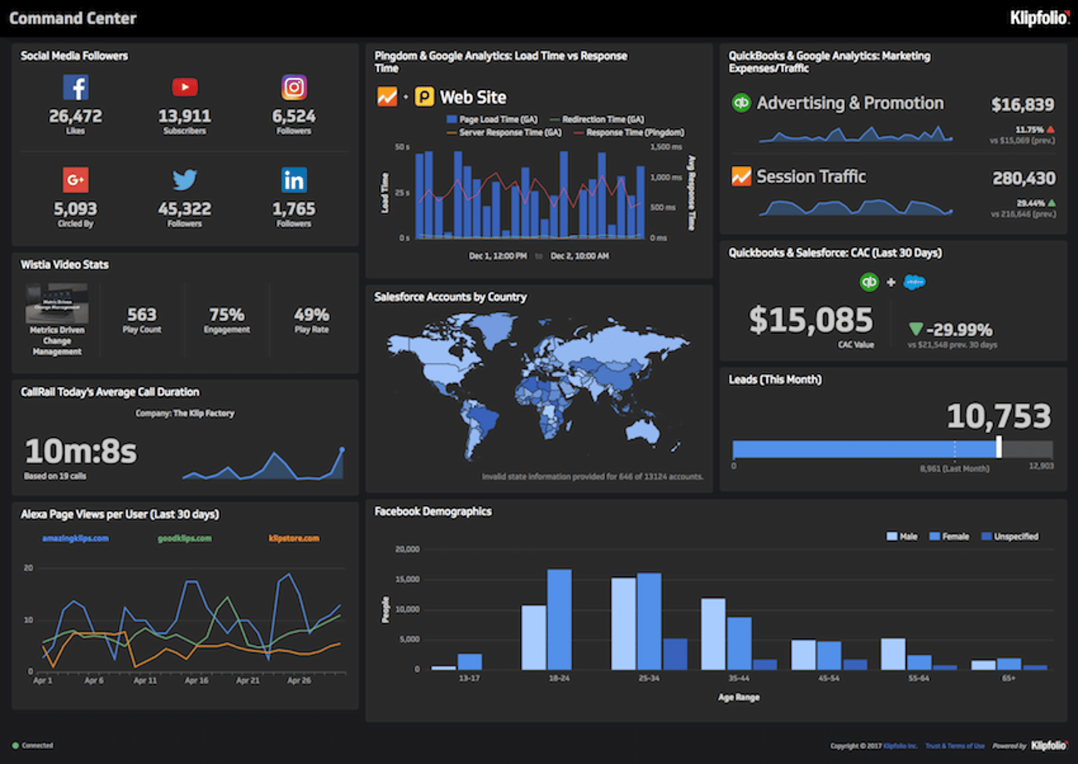
6 dashboards I use daily to run my SaaS company
By Allan Wille, Co-Founder — April 10th, 2026
Business Metrics vs. KPIs: What’s the Difference?
By Jonathan Taylor — March 13th, 2026