
Summary - Dashboard design is more than picking the right chart. This guide covers how to design dashboards that help leaders act fast: how to define your audience, choose the right visualizations, use colour and layout effectively, and avoid the most common mistakes.
So you want to design a great dashboard. You've landed in the right place. This guide walks you through everything you need to know about dashboard design, whether you're starting from scratch or refining what you already have. By the end, your dashboards will have people asking, "Can I get one of those?"
Here's what this article covers:
- What is dashboard design and why does it matter?
- The first rule of dashboard design: define your audience
- Dashboard design best practices
- Common dashboard design mistakes (and how to avoid them)
What is dashboard design and why does it matter?
Dashboard design is the process of deciding how to structure, organize, and present data so the right people can act on it quickly. It covers everything from choosing visualizations to layout, colour, and who sees what.
Dashboards display information through data visualizations. For businesses, they track and display KPIs and metrics and other key data points in one place. A well-designed dashboard lets a leader read the room in seconds, without digging through spreadsheets or waiting for someone to pull a number.
Design matters because it shapes how people interpret and act on data. Dashboards are:
- Interactive and live: They display real-time and historical data, often pulling from multiple sources at once
- Goal-oriented: They surface the metrics that matter for a specific role or objective
- Decision-ready: They give leaders and teams what they need to move forward, without doing the analysis themselves
Before you build anything, ask yourself these questions:
- Who is my audience?
- What decisions do they need to make?
- What do they already know about these metrics?
- How comfortable are they with data?
- What do they need to see at a glance versus on demand?
The dashboard design golden rule: define your audience
A well-executed dashboard communicates a clear message. It's a communication tool, just like a report, a presentation, or a briefing, and it follows the same rule: know who you're talking to.
It's easy to assume that everyone looking at your dashboard shares your context. They don't. The relationship you have with your data is different from the relationship your audience has.
Here's a useful frame: imagine your audience is a new employee on their first day. The dashboard needs to get them up to speed on business performance fast, with no explanation required.
Context is everything. An executive needs a dashboard that summarizes key performance metrics so they can make decisions about the business. A social media manager needs a dashboard that surfaces what's working and what isn't across channels like X (formerly Twitter), Facebook, and LinkedIn. Same principle, different data, different decisions.
Design for the person who needs to act on the information, not the person who built it.
Dashboard design best practices
Good dashboard design comes down to seven core practices. Here's a quick overview, followed by a deeper look at each:
- Design different dashboards for different business needs
- Add comparison values
- Consider your dashboard layout
- Pick the right visualizations
- Use colour properly
- Make information easy to read
- Design for different displays
Design different dashboards for different business needs
Don't cram all your data onto one dashboard. The point of a dashboard is to surface insights quickly. If your audience can't read it at a glance, there's too much on it.
- Plan by role or objective: Build dashboards around departments, campaigns, and projects, not around what data happens to be available
- One dashboard per need: Separate dashboards for separate purposes give people direct access to what they care about, without filtering through everything else
Add comparison values
A number without context is just a number. Comparison values tell the story: is this good, bad, or expected?
- Context at a glance: Comparing current numbers to a target or a prior period lets users assess performance immediately
- Meaningful comparisons only: If you can't find a meaningful comparison for a metric, it probably doesn't need one. Adding one for the sake of it creates noise, not clarity
Common comparison types include:
- Current value vs. a set target
- Today vs. yesterday (or this week vs. last week)
- This period vs. the same period last year
- Current value vs. a trailing average
- Cumulative total vs. projected total at this point in time
- One metric vs. a related metric (for example, new activations vs. cancellations)
Consider your dashboard layout
An effective dashboard layout follows five design principles.
Hierarchy
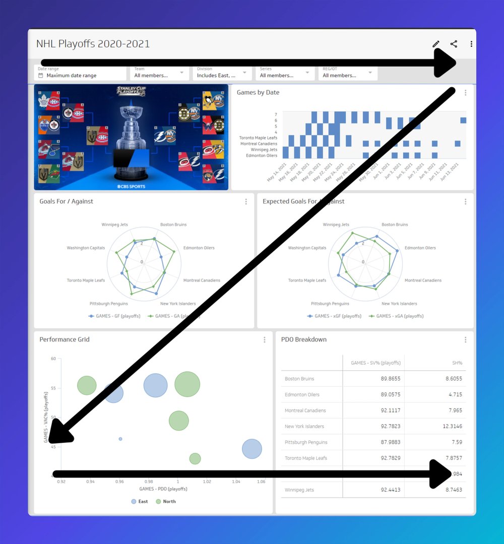
- Most important information goes top left. That's where eyes land first. Build the visual hierarchy so information cascades naturally from there.
- Use placement, size, and colour to signal what matters most. White space, contrast, and weight all do heavy lifting here.
Proximity
- Related data belongs together. Users shouldn't have to scan across the dashboard to connect related metrics.
- Give visualizations enough breathing room to feel distinct, but not so much that the relationships between them get lost.
Contrast
- Use contrast to direct attention. A different colour or a larger chart signals importance without requiring a label.
- Use bolding in text to call out key figures or labels.
Alignment
- Left-align text as a default. It matches how most people read and makes the dashboard easier to scan.
- Consistent alignment across metrics creates a cleaner, more trustworthy layout.
Repetition
- Reuse visual elements to build familiarity. Consistent colours, chart styles, and formatting help users move through the dashboard faster.
Pick the right dashboard visualization
Choosing the right visualization is one of the most consequential decisions in dashboard design. For a full breakdown, see our guide to data visualization types.
Here's a quick look at four common types and when to use them.
Tables
Tables organize data into columns and rows. They're one of the most flexible visualizations because they can include graphical elements like bullet charts, sparklines, and icons. They can also support drill-down functionality and heatmaps.
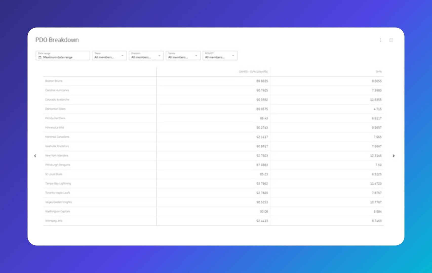
Use a table when:
- You need to display two-dimensional data organized by category
- You want to add graphical context alongside raw numbers
- Your data has a natural drill path (for example, Country > Province > City)
Line charts
Line charts plot data points on a graph and connect them to show patterns over time. They're ideal for spotting trends, but they don't surface exact values at a glance.
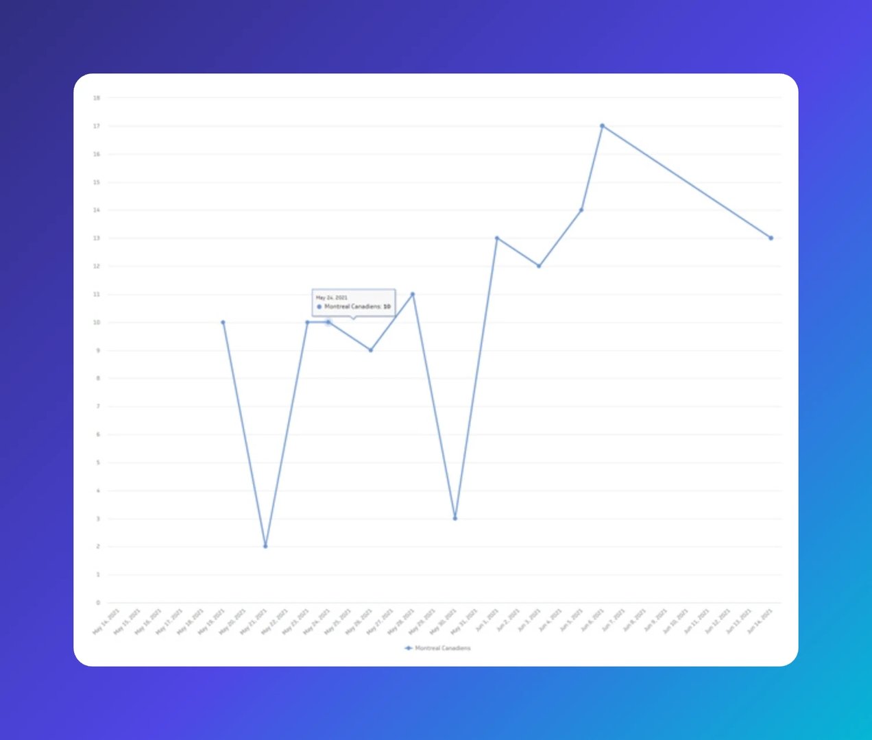
Use a line chart when:
- Your data is time-series based
- You want to show trends, fluctuations, or patterns
- You're comparing two or more related data sets over time
Bar or column charts
Bar charts display values as rectangular bars, making it easy to compare values across categories. They work well when there's a clear categorical relationship between the data points.
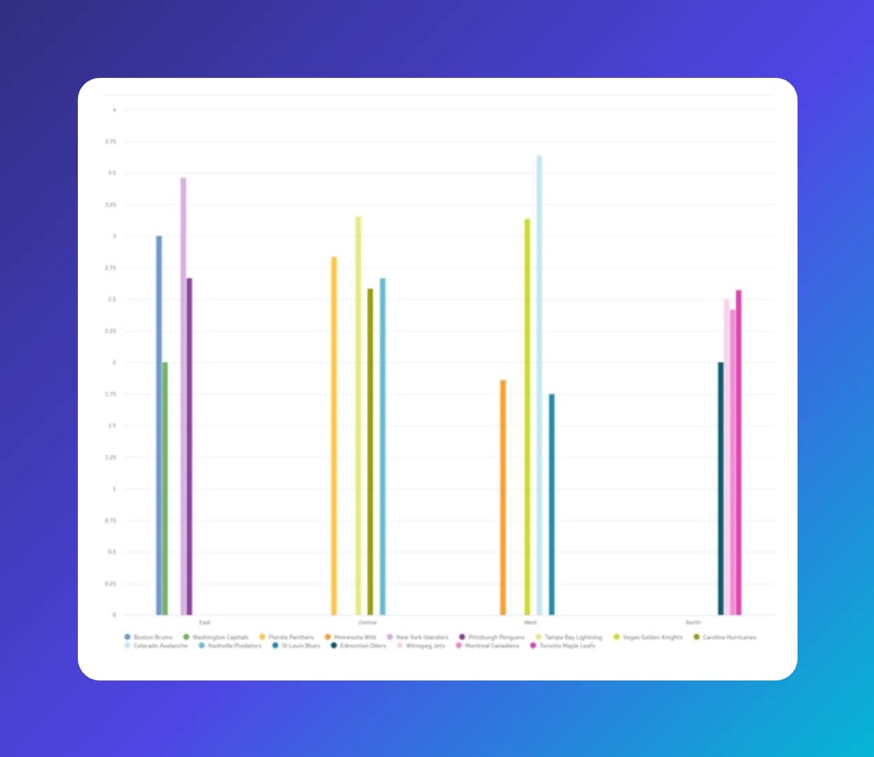
Use a bar chart when:
- You're comparing two or more values within the same category
- You want to show a stacked breakdown to see totals alongside subtotals
Pie or donut charts
Pie and donut charts divide categorical data into segments so users can see each value relative to the whole. Hover tooltips surface the specific values for each segment.
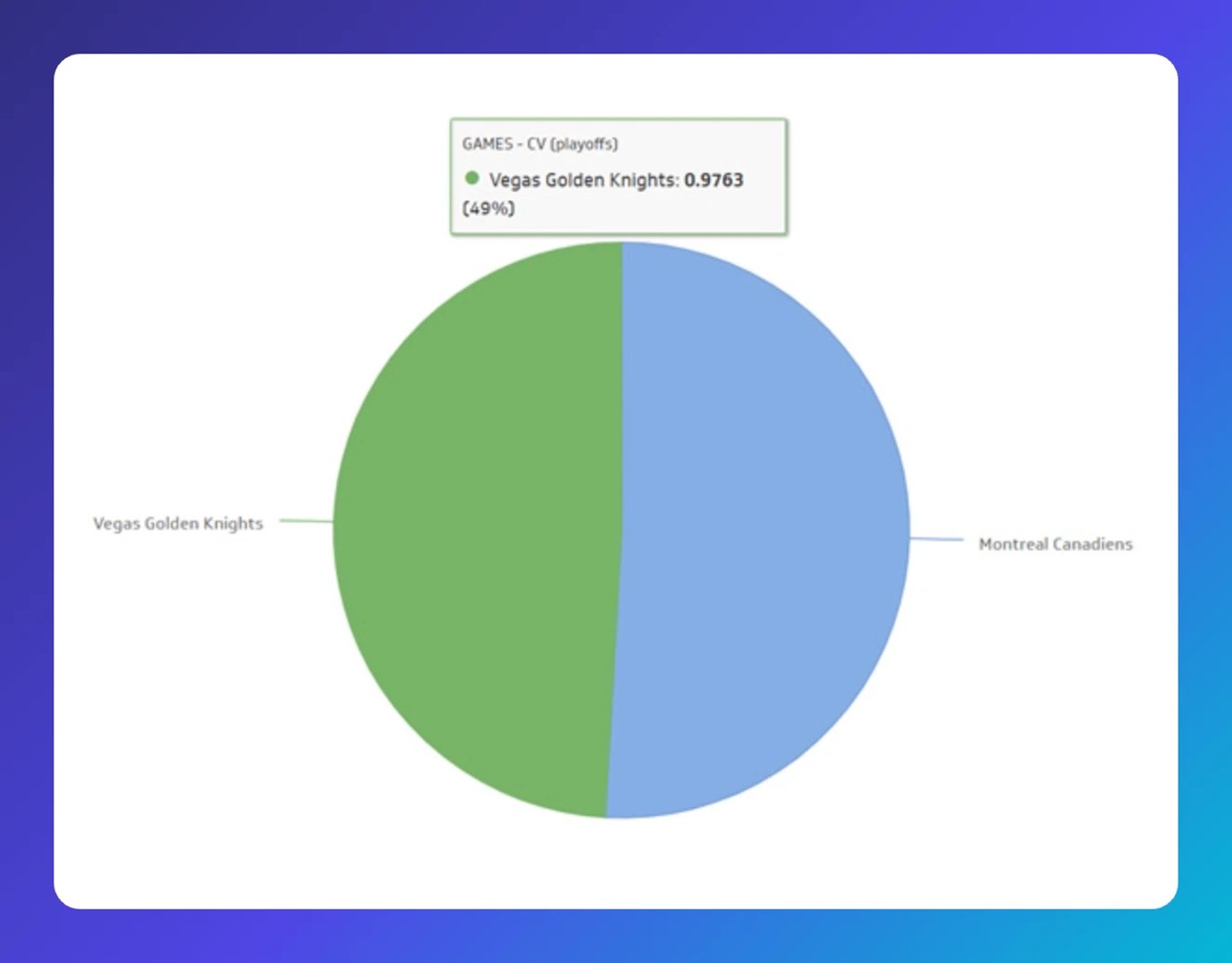
Use a pie chart when:
- You have a small number of segments (too many weakens the visual)
- You want to show proportional relationships quickly
Proper use of colour
Colour is one of the most powerful tools in dashboard design, and one of the easiest to overuse.
- Default to desaturated colours for most visualizations. Use saturated colours sparingly to draw attention to changes or key indicators.
- Be consistent. Use the same colour for the same data across different charts. Inconsistency erodes trust in the numbers.
- Use sequential hues for ordered categories. For data that follows a sequence (time periods, risk levels, pipeline stages), use the same hue with varying saturation.
- Design for accessibility. Avoid red/green combinations without an additional indicator for users who are colour-blind.
- Reserve traffic light colours for what they mean. Red signals a problem. Green signals an opportunity. Yellow is a caution, but use it carefully since it doesn't always land with impact.
Make sure your information is easy to read
Clarity isn't just about the data. It's about how quickly a reader can trust what they're seeing and move on.
- Use a consistent set of symbols. A limited, repeated symbol set makes the dashboard scannable without explanation.
- Put the most important information in the upper left. That's where readers look first.
This layout illustrates how to organize a dashboard so key information lands immediately:
Design your dashboard for different displays
Dashboards appear on phones, tablets, browsers, and TV wallboard displays. Each context has different constraints.
Mobile or tablet
- Keep it minimal. Small screens demand simple, focused layouts.
- Use short metric titles and minimal text.
- Use menus and filters to handle complexity without cluttering the view.
Browser
- Design for responsiveness. Metrics should stay legible as the browser window resizes.
- Browser dashboards support deeper exploration. Users are at their desks and can focus, so this is the right place for more analytical depth.
TV or wallboard displays
- Design for distance. Remove axis labels that are implied or redundant. Trim content to what reads clearly from across a room.
- Keep responsive design in mind so the layout holds as screen dimensions vary.
4 common dashboard design mistakes (and how to avoid them)
A few mistakes come up again and again. Here's what to watch for, and how to fix each one.
1. Building a one-size-fits-all dashboard
One-size-fits-all dashboards are usually built around the data, not the decision. They try to serve everyone and end up serving no one. Because they're dense and hard to navigate, they get abandoned quickly.
One-size-fits nobody.
The fix is straightforward: build one dashboard per role. It sounds like more work, but the payoff is real. Role-based dashboards cut down on filtering and searching. The right person gets the right information immediately, without having to dig.
Two tips for building role-based dashboards:
- Start by identifying the audience and their key metrics. What does this person need to know to do their job well today?
- Build junior-role dashboards first. Senior dashboards are often aggregated versions of the same data. Starting at the junior level speeds up the whole process.
2. Not adding comparison values
A number on its own doesn't tell you whether to act. Is revenue up? Compared to what? Is churn high? Relative to target or to last month?
Comparison values answer those questions before users have to ask them. Without them, dashboards raise more questions than they resolve, and leaders end up pasting numbers into a chat thread or asking someone to pull the context they're missing.
Meaningful comparison types include:
- Target comparison: Current value vs. a set business target
- Prior period: Today vs. yesterday, or this week vs. last week
- Year-over-year: This period vs. the same period last year
- Trailing average: Today vs. the average of the previous 30 days
- Projection: Cumulative total vs. expected total at this point in time
- Related metric: New activations vs. cancellations
3. Choosing the wrong data visualization
Not every chart works on a dashboard. The right visualization depends on the data and the decision it needs to support.
Use this table to evaluate your options:
| Visualization type | Compact | Scannable | Clear | Precise | Familiar |
|---|---|---|---|---|---|
| Line chart | Yes | Yes | Yes | Yes | Yes |
| Bar chart | Yes | Yes | Yes | Yes | Yes |
| Pie chart | Yes | Yes | Yes | ||
| Gauge | Yes | Yes | |||
| Scatter plot | Yes | Yes | Yes |
When in doubt, prioritize scannability and clarity. A chart that requires explanation defeats the purpose.
4. Making users "do the math"
A dashboard should hand the answer to the reader, not hand them the ingredients. When users have to look between two charts, scribble calculations, or paste numbers somewhere else to make sense of what they're seeing, the design has failed them.
Ask for feedback after people review a dashboard. If they're consistently cross-referencing or calculating, that's a signal to redesign. The goal is confidence in the number, not work to arrive at it.
Start designing your dashboard
These resources will help you move from principles to practice:
- Browse over 60 Klips dashboard examples and templates for inspiration
- Read best practices for displaying dashboards on large screens
- Follow the Step-by-Step Guide to Dashboard Design to put it all together
Related Articles
6 dashboards I use daily to run my SaaS company
By Allan Wille, Co-Founder — April 10th, 2026
Klipfolio Partner How-To #1: Duplicating dashboards across client accounts
By Stef Reid — November 27th, 2025
What is a data dashboard?
By Emily Hayward — August 20th, 2025