

Summary - Dashboard design is more than picking the right visualization. Learn how to design captivating and informative dashboards for you and your team.
So, you want to design a beautiful dashboard. You’ve landed in the right place! In the spirit of helping people succeed with data, I’m going to take you through the ultimate guide to dashboard design, whether you’re new to the art or you’re a seasoned expert. Either way, when you’re done, your dashboards will have everyone you know asking, “Can I do that, too?”
By the end of this article you’ll be equipped with the information you need to start creating eye-catching and insightful dashboards. In this article I’ll cover a few important topics:
- What is dashboard design and why does it matter?
- The first rule of dashboard design: define your audience
- Dashboard design best practices
- Common dashboard design mistakes (and how to avoid them)
Ready to jump in? Let's go!
What is dashboard design and why does it matter?
Dashboard design is the process and approach you take to design your dashboard which includes everything from how to design for a specific audience to selecting and organizing data visualizations.
Dashboards display information with data visualizations. For businesses, dashboards are used to track and display KPIs, metrics, and other key data points. Designing a dashboard is a means of effective communication that users can read at a glance to understand current performance and access information that otherwise would have been layered in complex data sets.
While it may not seem like a big deal, dashboard design matters in the context of how your users interpret and act on the data. Dashboards are:
- Interactive, displaying live and historical data, often bringing multiple metrics together
- A way to monitor known areas of interest or goals
- A vital source of information for businesses and employees to make data-driven decisions
And before you even start to build a dashboard, there are a few questions you should ask yourself. This will help you design a dashboard that people will want to reference or turn to for insights:
- Who is my audience?
- What information do they need?
- What do they already know about the metrics?
- What is their level of experience with data?
- What are their preferences in terms of visualizations and colours?
The dashboard design golden rule: Define your audience
A well-executed dashboard is one that communicates a clear message. Business dashboards are a communication tool used to convey information about performance. That means dashboards follow the same golden rule as other communication tools like a book, website, or TV show: know who your audience is.
As a writer, my first step is to define my audience before I even put fingers to keyboard. What good is a piece of content if it doesn’t resonate with your audience? The same rule should be applied to dashboard design.
It’s easy to think of yourself as the default audience. And it’s easy to assume that everyone who is looking at your dashboard is on the same page. Don’t fall into that trap!
Here’s a tip: Imagine that your audience is a new employee and it’s their first day on the job. The purpose is to get them up to speed on your business performance so they can hit the ground running.
Remember, the relationship you have with your data is different from the relationship your audience has.
When it comes to your audience and your dashboard, context is king. Understanding your audience will also help you understand their needs. An executive needs a dashboard that summarizes key performance metrics to make decisions about the business, whereas a social media manager needs a dashboard that highlights key metrics from social channels like X (formerly Twitter), Facebook, or LinkedIn to understand campaign performance or gaps. Understand the context of the dashboard before you begin to ensure it supports the goals and objectives of the user.
Dashboard design best practices
You can bucket dashboard design best practices into seven categories. I’ll explain each in-depth, but here’s a quick look at each best practice:
- Design different dashboards for different business needs
- Add comparison values
- Consider your dashboard layout
- Pick the right visualizations
- Proper use of colour
- Easy-to-read information
- Design for different displays
Design different dashboards for different business needs
Don’t cram all of your data onto one dashboard. Remember, the point of a dashboard is to quickly communicate insights. If your audience can’t glean insights at a glance, there’s probably too much data.
- Strategically plan your dashboard design based on different departments, campaigns, and projects
- Create different dashboards for different business needs or data to provide quick access to KPIs and metrics that are organized in relation to one another
Add comparison values
Comparison values add context to current numbers by comparing them to historical values or targets. They help users differentiate between good and bad performance at a glance
- Comparison values add context to current numbers by comparing them to historical values or targets
- Comparison values in visualizations differentiate between good and bad performance at a glance
- If you can’t come up with a meaningful comparison value for a metric, it likely doesn’t need it (and adding one just for the sake of it could distract from valuable information on your dashboard)
Consider your dashboard layout
There are five design principles that an effective dashboard layout should follow..
Hierarchy
- Create a visual hierarchy so your information cascades intuitively and supports readability. A good rule to follow is that the most important information goes in the upper left quadrant of your dashboard.
- Use a visual hierarchy to display the most important information first followed by secondary information
- Consider placement and colour to ensure what you want your audience to read stands out - colour, contrast, and white space can all have a huge visual impact
Proximity
- Related data belongs together so that users don’t have to look for related metrics across your dashboard; data points should flow logically and intuitively
- Balance how you space your visualizations - give enough breathing room so they don’t look cluttered, but don’t give so much that it’s hard to tell what belongs together
Contrast
- Use colour and contrast to make a specific visualization stand out
- Use different sizes to call out various visualizations (larger visualizations could indicate an increased level of importance)
- Use bolding to make text stand out on your dashboard
Alignment
- As a general rule, all text should be left aligned to match the way most people read
- Align your metrics on your dashboard for easy reading from left-to-right
Repetition
- Reuse ideas and elements to create a common theme on your dashboard
Pick the right dashboard visualization
Choosing the right visualization is arguably one of the most important elements of dashboard design. For an in-depth look at the types of data visualizations, check out our guide to data visualization.
Here’s a brief overview of four population visualization types and tips on when and how to use them effectively in your dashboard design.
Tables
Tables organize data into columns and rows. Tables are also one of the most flexible dashboard data visualizations because you can use it to display graphical elements like bullet charts, sparklines and icons. Additionally, tables can be configured to have drill down functionality or create a heatmap.
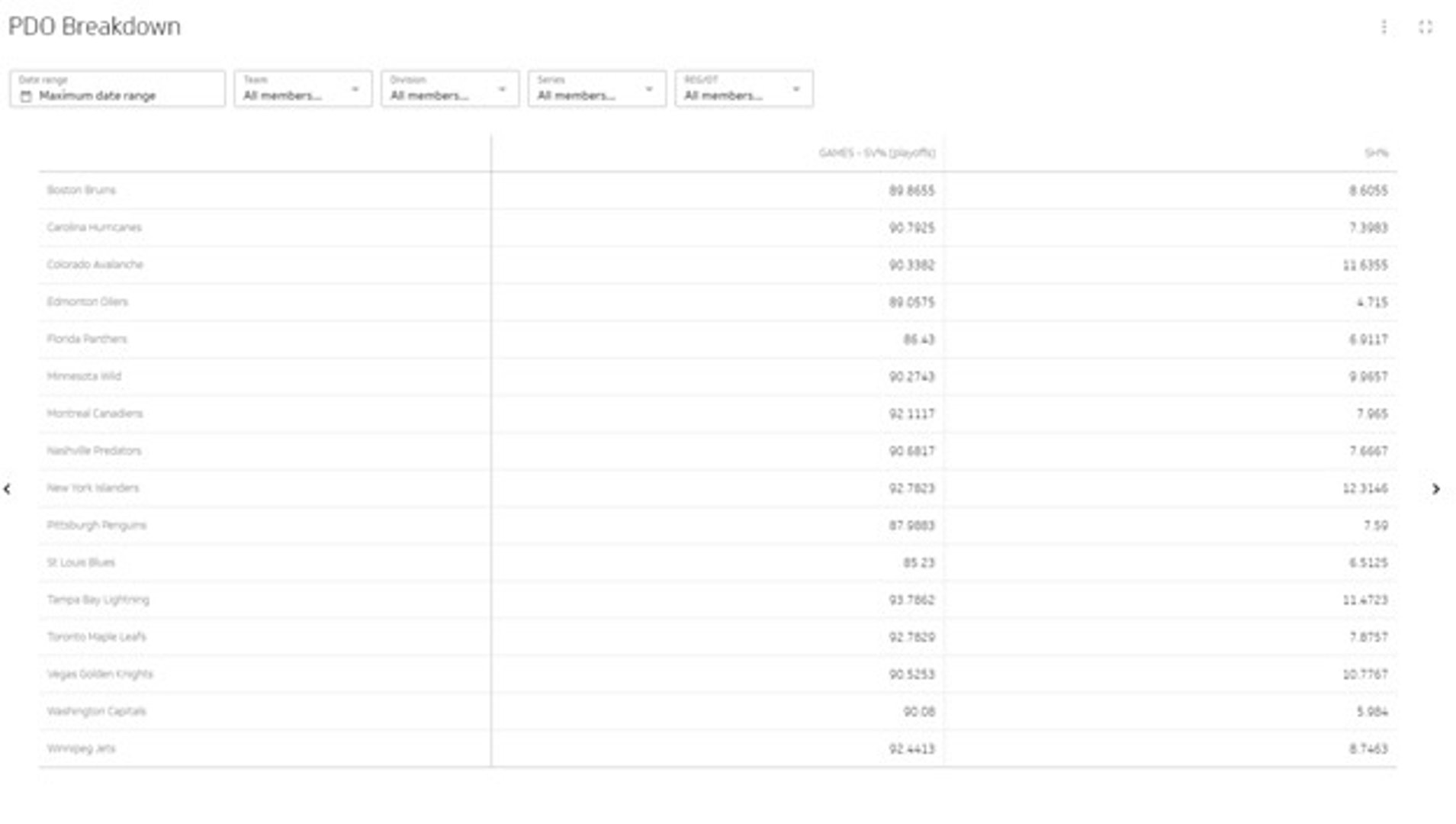
When do I use a table to visualize my data?
- To display two-dimensional data sets that you can organize by category
- To add additional graphical elements like a bullet chart to add context
- To drill down large data sets that have a natural drill path, for example, Country > Province > City
Line charts
Line charts plot a series of data points on a graph and then connect those dots with a line to show patterns in the data. Line charts are an ideal visualization if you are trying to spot trends and patterns, but keep in mind that line charts don’t display the exact values (but you can select the values as labels in PowerMetrics).
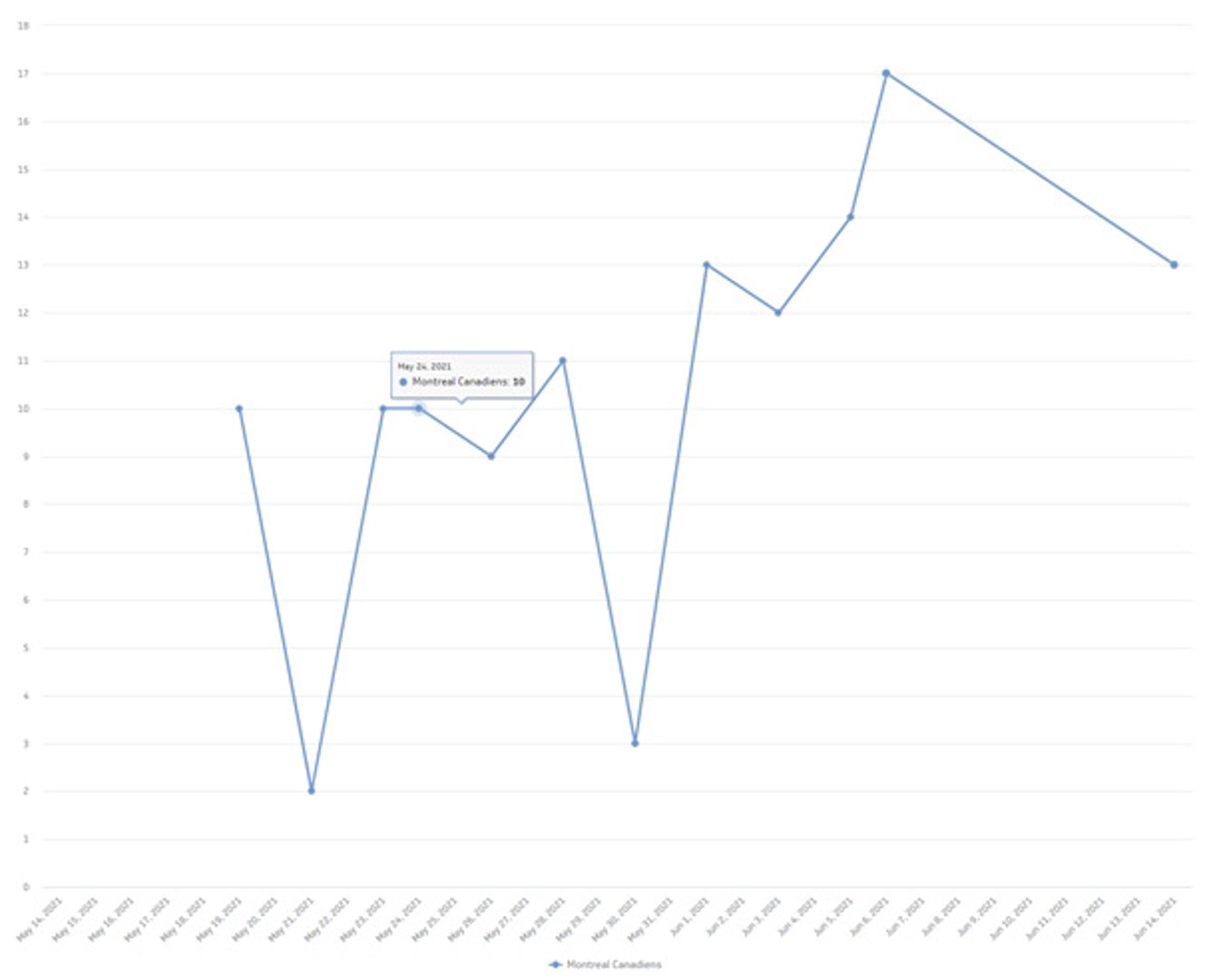
When do I use a line chart to visualize my data?
- For time-series oriented data points
- To understand general trends, fluctuations and patterns associated with your data set
- To compare two or more related data sets
- To compare trends over time
Bar or column charts
Bar charts or column charts display values as rectangular bars to compare categorically-related values along an axis. For example, displaying values associated with different countries makes sense because there is a category relationship.
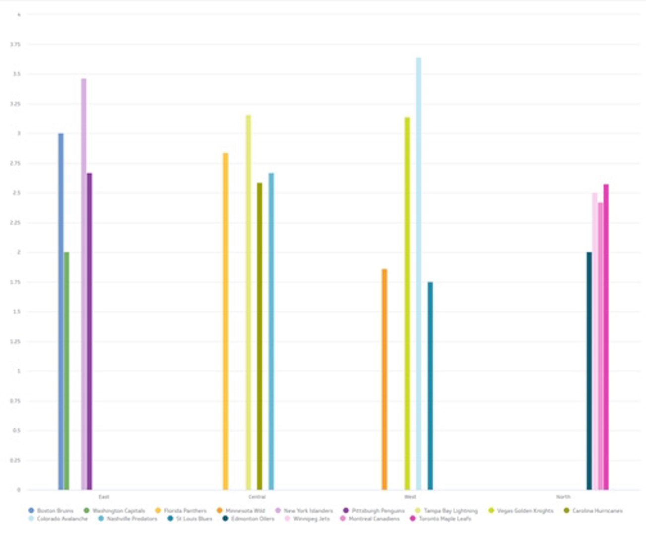
When do I use a bar chart to visualize my data?
- Compare two or more values that fall within the same category
- To display your categorical data as a stacked bar or column to see the total value segmented by each subtotal
Pie or donut charts
Like bar charts, pie or donut charts display categorical data but divide it into sections (like wedges of a pie or donut) so you can see each section’s value in comparison to the whole. To see the specific values for each segment, you can hover over with your mouse to see the tooltip.
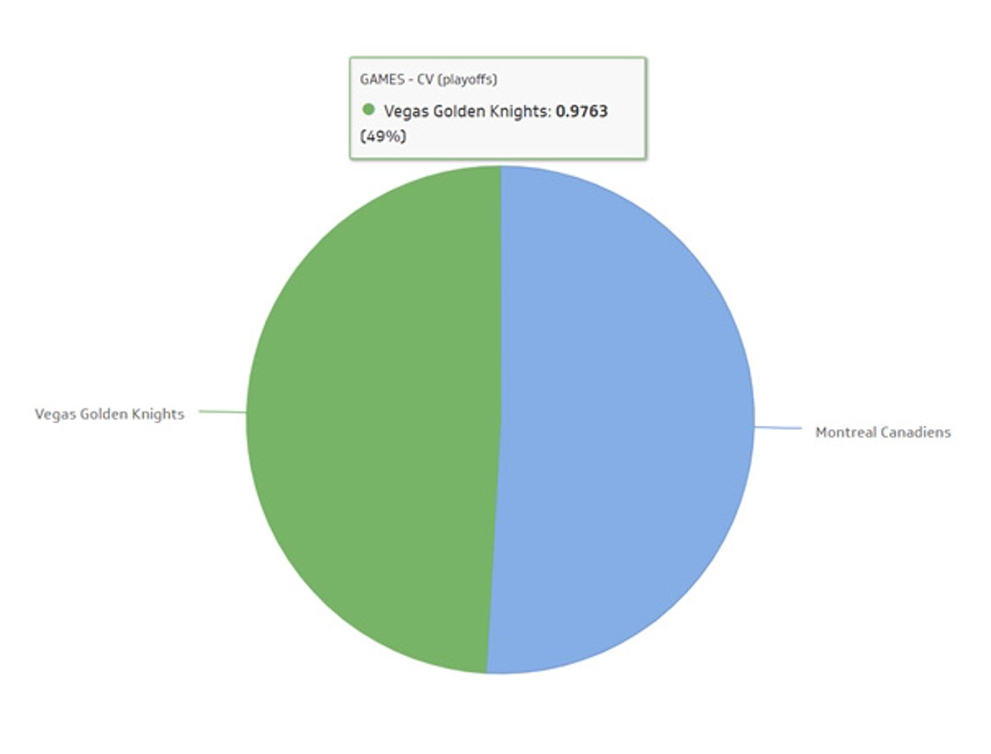
When do I use a pie chart to visualize my data?
- To quickly convey information without too many segments (this can weaken the impact of the visualization)
Proper use of colour
As a general rule, use desaturated colours for visualizations. Use saturated colours sparingly to draw attention to changes or key indicators.
Be consistent in your use of colour for the same data across different charts. For categories that follow a sequence (time, risk levels, lead stages, etc.), use the same hue with varying saturation.
Be mindful of accessibility — avoid red/green combinations without additional indicators.
Traffic light colours (red, green, yellow) should be used sparingly. Reserve red for major issues and green for opportunities. Yellow typically represents a middle ground, but may not have strong impact. Use it carefully.
Make sure your information is easy to read
Establish and implement a limited set of consistent symbols on your dashboard to make for easy reading.
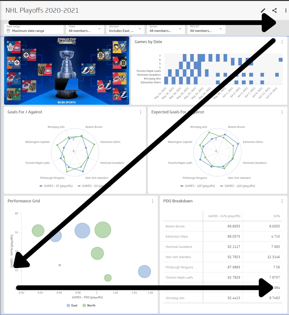
I mentioned it earlier, but dashboards should be designed so that your most important information is in the upper left quadrant to match the way we intuitively read information.
This is a really great visual representation of a dashboard layout so the information is easy to read at a glance.
Design your dashboard for different displays
Dashboards can be displayed on various devices, from mobile phones or tablets to online browsers or TV displays.
Mobile or tablet
- Err on the side of simple and minimalistic
- Use minimal amount of text for clear and concise display on a small screen
- Shorten your metric titles where applicable
- Use menus and filters to simplify complex data sets
Browser
- Keep responsive design in mind; ensure your metrics are sized appropriately so that if your browser window shrinks the metrics on your dashboard are still legible
- Use this as an opportunity to build dashboards that allow for analytical exploration since users will likely be viewing at their desk and able to focus for a longer period of time (vs on-the-go exploration on mobile)
TV or wallboard displays
- Trim content to make it easy to view from a distance
- Save space by removing axis labels if they are implied or redundant
- Keep responsive design in mind; ensure your metrics are sized appropriately so that if your browser window shrinks the metrics on your dashboard are still legible
4 common dashboard design mistakes (and how to avoid them)
We all make mistakes, but when it comes to dashboards, a few repeat offenders stand out. Here are the ones to watch for:
1. Building a one-size-fits-all dashboard
Building a one-size-fits-all dashboard is a common design mistake. One-size-fits-all dashboards are usually the product of building a dashboard that focuses on the data itself (what type of data is available, what’s important enough to go on the dashboard, and what’s the best way to visualize the data) instead of the story the data is supposed to tell.
Because of the vast size and scope of a one-size-fits-all dashboard, they are typically abandoned or underused shortly after they are created. And no one wants to put time and effort into a dashboard that isn’t going to get eyeballs on it!
Truthfully, when it comes to dashboard design, one-size-fits nobody.
Create one dashboard for each role within your audience. I know this sounds like a lot of work, but the pay-off is worth it. One dashboard per role reduces the need for extensive filtering and segmentation to get to the data, and delivers the information into a single at-a-glance display.
Here are two tips to design a role-based dashboard:
- Figure out who your dashboard is for and identify the metrics and KPIs that are important to add to that dashboard.
- Start with the junior roles first to accelerate your dashboard design. Oftentimes, senior roles are looking at the same metrics as junior roles, but it’s a more aggregated version of the data. Tackling the junior role dashboards first will help you speed up the creation of additional dashboards.
2. Not adding comparison values
I mentioned the importance of comparison values earlier when I discussed best practices, but it’s worth noting it here again. Comparison values on a dashboard add value for your users.
Unless you are familiar with your data history or targets for sales, numbers on a dashboard without a comparison value may raise more questions than provide answers. Without an indicator, how are you supposed to know if those numbers are normal or cause for concern?
Comparison values compare current numbers to historical values (like yesterday’s leads) or to targets to put today’s numbers into context.
A guiding principle for comparison values is that it should be meaningful to users. Most comparison values fall into one of the following categories:
- Comparison against a set target (current average customer satisfaction rating vs. target rating set by the business)
- Comparison against a preceding period (today vs. yesterday)
- Comparison against a prior equivalent period (this week vs. same week last year)
- Comparison against a trailing average (today vs. an average of previous 30 days)
- Comparison against a projection (current cumulative total vs. expected total for this point in time)
- Comparison against another metric (new account activations vs. account cancellations)
3. Choosing the wrong data visualization
Not all data visualizations work on a dashboard. Charts and graphs are certainly popular choices due to their compact display and easy readability to glean insights and see patterns, but they aren’t always the right choice either. In the end, it depends on what data you want to display.
When it comes to picking a data visualization, consider this:
| Type of visualization | Compactness | Rapid scannability | Clarity | Precision | Familiarity |
|---|---|---|---|---|---|
| Line chart | ✔ | ✔ | ✔ | ✔ | ✔ |
| Bar chart | ✔ | ✔ | ✔ | ✔ | ✔ |
| Pie chart | ✔ | ✔ | ✔ | ||
| Gauges | ✔ | ✔ | |||
| Scatter plots | ✔ | ✔ | ✔ |
4. Making users "do the math"
Dashboards enable decision-makers to consume information quickly, right? Making users “do the math” is when you present information on a dashboard that forces users to do the calculations themselves to get the information they need. It’s a design mistake that can drastically increase the amount of time spent trying to make sense of the information, even on a simple dashboard.
How do you know that your users aren’t quickly getting the information they want? Ask for feedback after they review the information on your dashboard. If your users are consistently looking between two charts or scribbling numbers on a notepad to understand what the data means, it’s a good indicator that you should revisit your design. Providing a fully functional dashboard requires thought on the part of the designer - it’s one of the main reasons you need to understand your audience and their KPIs.
Resources to help you start designing a dashboard in PowerMetrics
- Be inspired with over 60 Klips dashboard examples and templates
- Best practices for displaying dashboards on large screens
- Explore MetricHQ, find the metrics that matter most to you, and try Instant Metrics.
- The Step-by-Step Guide to Dashboard Design
Related Articles

6 dashboards I use daily to run my SaaS company
By Allan Wille, Co-Founder — April 10th, 2026
Klipfolio Partner How-To #1: Duplicating dashboards across client accounts
By Stef Reid — November 27th, 2025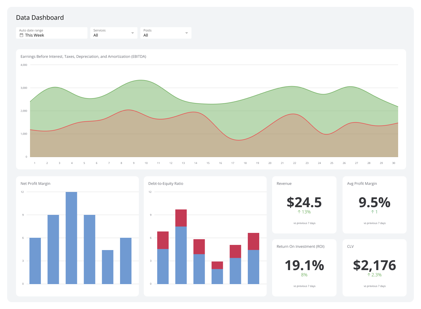
What is a data dashboard?
By Emily Hayward — August 20th, 2025