

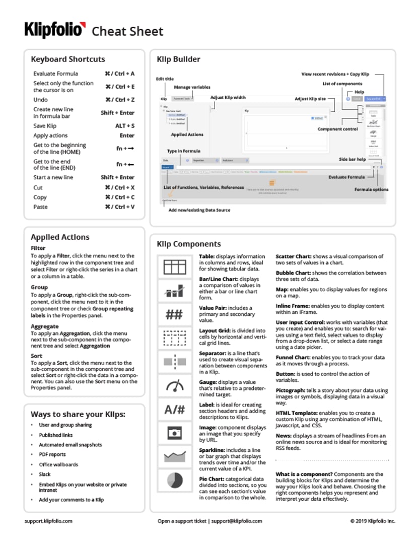
Summary - Use this Klipfolio cheat sheet whenever you build. It includes top functions and components used when Klip building.
The Klipfolio cheat sheet for building metrics
Your go-to reference guide for building Klips. This cheat sheet covers the essentials—from the Klip Editor and components to top functions, keyboard shortcuts, and sharing options. Keep it handy whenever you're building.
Download the cheat sheet
Click here to download the full PDF
Below you'll find everything included in the cheat sheet, plus additional details and context. Use your keyboard's search function (Ctrl/Cmd + F) to find specific topics quickly.
What's covered
The Klip Editor
The Klip Editor is where you create and edit Klips. You can also set up data sources in the Klip Editor.
Every Klip is built from components—attributes that control everything from titles to visualization styles. The Klip Editor lets you customize your Klip's data, properties, and appearance by working with these components. Smart dashboards that look amazing are built using these powerful tools.
Klip Components
There are 18 different components available for building your Klips.
Presentation components
Layout Grid, Label, and Separator are presentation components that provide structure and context.
The Label component creates section headers, adds descriptions, and displays single values. Labels support text, numbers, image URLs, hyperlinks, and mini charts.
Layout Grid divides space into cells using horizontal and vertical grid lines. Drag it into your Klip workspace, then insert other components into its cells—for example, a table in one cell and an image in another. You can add, remove, or adjust cell width and height. For best performance, avoid nesting one Layout Grid inside another. Add rows and columns to increase capacity.
The Separator component is a line that creates visual separation between components. Position it vertically or horizontally to organize content, differentiate components, control white space, and enhance overall appearance.
Bar/Line Chart
The Bar/Line Chart component displays value comparisons in bar or line form (or both). It's ideal for comparing metrics and showing trends over time.
Use a horizontal Bar Chart (inverted) to show zero as a reference point between positive and negative numbers. A stacked Bar Chart visually aggregates categories into groups.
For more details, see the Bar/Line Chart support article.
Table
The Table component displays information in columns and rows, making it ideal for tabular data like regional sales figures. It's also effective for showing large amounts of related data while maximizing dashboard space.
Keep tables clear and simple—avoid overloading them with excessive information. Tables shine when you add mini-charts, links, result rows, and images. You can also enable drill-down functionality.
For more details, see the Table component support article.
Value Pair
The Value Pair component displays a primary value and a secondary value, making it ideal for monitoring a single KPI (primary value) like a stock price or ratio alongside a label or comparison value (secondary value). You can set indicator thresholds to show progress.
For more details, see the Value Pair component support article.
Sparkline
The Sparkline component includes a line or bar graph that displays trends over time and the current value of a KPI. Choose from three chart types: Sparkline, Spark Bar, or Win/Loss.
For more details, see the Sparkline component support article.
Pie Chart
The Pie Chart component displays categorical data divided into sections so you can see each section's value relative to the whole. It's ideal for monitoring KPIs like survey results or regional revenue breakdowns. Available as pie or donut styles, you can add tooltips, a legend, and click functionality. Use colours and labels to add context and detail.
For more details, see the Pie Chart component support article.
Scatter Chart
The Scatter Chart component shows a visual comparison of two sets of values. It works best for data like survey results, test results, and demographics.
For more details, see the Scatter Chart support article.
Bubble Chart
The Bubble Chart component displays the correlation between two sets of data.
For more details, see the Bubble Chart support article.
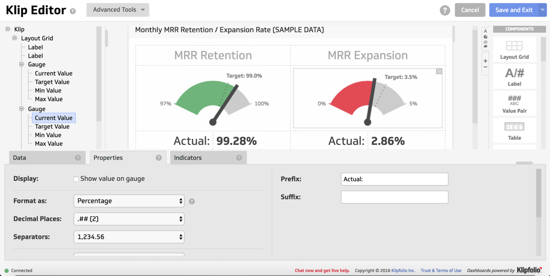
Gauge
The Gauge component displays a value relative to a predetermined target. It's ideal for monitoring KPIs with set goals or benchmarks—for example, sales or revenue performance against a clear objective.
For more details, see the Gauge component support article.
Map
The Map component displays values for regions on a map, providing insight into regional and global data and performance. Hover over a region to see its associated value. Use map markers to specify locations by latitude and longitude. You can also create custom maps.
For more details, see the Map component support article.
Image
The Image component displays an image specified by URL. It works well for monitoring webcam outputs and adds visual detail and character to a Klip. Use Layout Grid to arrange multiple Image components in a single Klip.
For more details, see the Image component support article.
Inline Frame
The Inline Frame component displays content within an iFrame, making it ideal for showing web content like widgets, web pages, or videos.
For more details, see the Inline Frame component support article.
User Input Control
The User Input Control component works with variables you create to enable:
Search for values using a text field
Select values from a drop-down list
Select a date range using a date picker
You can set its scope to apply to a Klip, a dashboard, or all dashboards.
For more details, see the User Input Control component support article.
Funnel Chart
The Funnel Chart component tracks data as it moves through a process—for example, leads to sales or leads to conversions. Use colour to highlight each stage, include labels for detail, and show conversions as a percentage from any stage.
For more details, see the Funnel Chart support article.
Button
The Button component controls the action of variables. For example, set a variable to toggle between dates when the button is clicked. Buttons can also coordinate multiple User Input Control components, which is useful when working with dynamic data sources.
For more details, see the Button component support article.
Pictograph
The Pictograph component tells a story about your data using images or symbols in a visual way. Select from a library of images or upload your own.
For more details, see the Pictograph component support article.
HTML Template
The HTML Template component enables you to create a custom Klip using any combination of HTML, JavaScript, and CSS.
For more details, see the HTML Template component support article.
News
The News component displays a stream of headlines from an online news source and is ideal for monitoring RSS feeds.
For more details, see the News component support article.
The Components Palette
All components listed above are available in the Components Palette in the Klip Editor. The Components Palette contains a list of all components you can add to a Klip. Drag your chosen components onto a blank Klip or add them to any existing Klip. You can use the Components Palette to create a Klip with multiple components.
Component Tree
Every Klip is made up of components—all components appear in the component tree.
Top Klipfolio Functions
Klipfolio offers Excel-like functions to perform calculations and manipulate data. Each function has a specific syntax and parameters. You can nest functions within each other and use additional formulas to satisfy parameters.
See the full list of Klipfolio functions.
What are Klipfolio functions?
Functions are used in the formula bar of the Modeller and the Klip Editor. The formula bar lets you type formulas or select from a list of functions. As you type a function name, a filtered list appears. Function Help with examples and parameters displays automatically in a pop-up window. Check out our learning resources with videos to get started.
LOOKUP
Use LOOKUP to correlate data between two data sources. For each input item, search for the first match in keys and return the value at the corresponding position in results. If there's no match, a blank is returned.
Syntax:
LOOKUP(input, keys, results)
- A list of one or more items.
input:
- A list of one or more items that intersects with the input list.
keys:
- A list of one or more items from the same source as keys. Must contain the same number of items as keys.
results:
When to use: Correlate data between data sources and align data across sub-components (for example, in a Bar/Line Chart to align a series with the X-axis).
Example:
Uses the Example: Live Sales Data and Example: Product Data data sources.
The primary data source is Example: Live Sales Data and the secondary data source is Example: Product Data. Both contain the same Product column. The intersecting Product column aligns the data in both sources.
LOOKUP (@Product, @Product, @Shipping Location)
This formula returns the data in the Shipping Location column from the secondary data source, aligned with the data in the Product column and additional columns in the primary data source.
DATE
Use DATE to convert dates specified in a given format into Unix time format.
Syntax:
DATE ( dates , format , [timezone] )
- A list of one or more date/time values.
dates:
- The date format of the values in the dates parameter.
format:
- The time zone.
timezone:
Example:
Uses the Example: Live Sales Data data source.
DATE ( @Date, "yyyy-MM-dd HH:mm:ss" )
This formula lists all dates in the Date column in Unix time format. For example, the first five results are 1483262958, 1483284416, 1483383839, 1483396523, 1483435365.
This example converts an entire date and time stamp to Unix time format:
DATE("2017-04-03T04:18:38.943Z","yyyy-MM-dd'T'HH:mm:ss")
This formula returns 1491207518.
MAPFLAT/MAP
Use MAPFLAT/MAP to repeat a formula or data source reference (specified by the formula parameter) for each value in the values parameter.
Syntax:
MAPFLAT( values, variable name, formula)
- A list of one or more values.
values:
- Name of the variable used in the formula parameter, typed as a literal string.
variable name:
- Formula that uses variable name (entered as a $variable) and is executed for each item in values. If the formula returns more than one item, only the first value is returned.
formula:
When to use: Aggregate data over a set of account IDs by repeating a reference to a dynamic data source where the account ID is passed in as a variable.
Note: We recommend using MAPFLAT rather than MAP because MAPFLAT supports returning multiple items per first parameter, while MAP returns only one item.
SUBSTITUTE
The SUBSTITUTE function replaces a set of characters with another set of characters in a text string. If the occurrence parameter is specified, that occurrence is substituted; otherwise, all occurrences are substituted.
Syntax:
SUBSTITUTE ( text, old text, new text, [occurrence] )
- The values to be manipulated.
text:
- The values that will be replaced.
old text:
- The values to replace the old text.
new text:
- [optional] Indicates the instance that will be replaced.
occurrence:
Note: While SUBSTITUTE is similar to the REPLACE function, SUBSTITUTE replaces part of a value.
ARRAY
Use ARRAY to join together single values and return them as a single list of data in the order provided.
Syntax:
ARRAY ( data )
- The values to join together, including strings or columns of data from different data sources.
data:
When to use: Combine data from multiple sources, such as data sources and results references.
Example:
Uses the Example: Live Sales Data data source.
ARRAY ( @Customer Contact, @Sales Rep )
This formula returns a single list combining values from both columns.
In this example, ARRAY adds the value "Exception" to the list of data:
ARRAY ("Exception", @Customer Type)
This formula returns: Exception, Direct Billed, Customer, Distributor, Partner, Reseller.
CONTAINS
Use CONTAINS to test each value in the haystack parameter to see if it contains the value in the needle parameter.
Syntax:
CONTAINS ( haystack, needle )
- A list of one or more items.
haystack:
- The case-sensitive item to search for in the haystack parameter.
needle:
Example:
Uses the Example: Live Sales Data data source.
In this example, true is returned for all values in the Customer Type column that contain "Customer":
CONTAINS(@Customer Type, "Customer")
The first five results are false, false, true, false, true.
More examples:
Uses the Example: Live Sales Data data source.
In this example, the Price Base is returned for every instance of Mexico in the Country column:
SELECT(@Price Base, CONTAINS(@Country, "Mexico"))
The first five results are 3.04, 2.34, 3.04, 3.33, 1.42.
GROUP
Use GROUP to group data into unique instances and hide duplicate values. Results are returned in alphabetical order.
Syntax:
GROUP ( values )
- A list of zero or more values.
values:
Example:
Uses the Example: Live Sales Data data source.
In this example, all repeating values are grouped into one instance:
GROUP (@Country)
This formula returns US, Canada, and Mexico.
Note: You can also use the Group action to return results similar to GROUP. Actions are available in the Klip Editor. Learn more about the actions menu.
SELECT
Use SELECT to select values from a list according to specified criteria.
Syntax:
SELECT ( data, condition )
- A list of one or more items.
data:
- A list of true and false values, typically a formula that combines one or more Logic functions. Data and condition must have the same number of items.
condition:
Example:
Uses the Example: Live Sales Data data source.
This example returns the value from the Product column when the value in Customer Type contains "Distributor":
SELECT(@Product, @Customer Type="Distributor")
The first ten results are Bread, Bread, Eggs, Bread, Milk, Milk, Eggs, Milk, Butter, Butter.
COUNTIF
Use COUNTIF to test each value in a condition and count the true results.
Syntax:
COUNTIF ( condition )
- A list of true and false values.
condition:
Example:
Uses the Example: Product Data data source.
This example counts the number of shipments from the warehouse:
COUNTIF ( @Shipping location="warehouse" )
This formula returns 30.
SLICE
Use SLICE to return the subset of values between the start and end positions. If start and end parameters are not specified, the first row is removed.
Syntax:
SLICE ( values, [start], [end])
- A list of zero or more items.
values:
- [optional] Indicates the number of items sliced off the top.
start:
- [optional] Indicates the position of the last item to be returned.
end:
When to use: Often used to remove row headers from data.
Example:
Uses the Example: Live Sales Data data source.
In this example, the first row of data is removed from the Product column:
SLICE ( @Product )
In this example, the subset of values between row 1 and 6 are returned:
SLICE( @Product, 1, 6 )
This formula returns Milk, Milk, Bread, Eggs, Eggs.
Note: If start and end parameters contain negative values, values are returned from the end of the list.
DATE_CONVERT
Use DATE_CONVERT to convert values from one date format to another.
Syntax:
DATE_CONVERT ( values , format in , format out )
- A list of one or more date/time values.
values:
- The current date format of the date/time values.
format in:
- The date/time format you want to convert the dates to.
format out:
Example:
DATE_CONVERT("9/11/2018", "d/M/yyyy", "MMM dd, yyyy")
This formula returns Nov 09, 2018.
IF
Use IF to test a condition and specify the result if it evaluates to true or false.
Syntax:
IF ( condition , if true , if false )
- A list of one or more values to test.
condition:
- Data returned if the condition is true.
if true:
- Data returned if the condition is false.
if false:
Example:
Uses the Example: Live Sales Data data source.
This example returns the value for the Company Name column if the corresponding value in the Country column is Canada. If the Country value is not Canada, the formula returns a blank value:
IF(@Country="Canada",@Company Name, BLANK())
More examples:
Uses the Example: Live Sales Data data source.
In this example, IF is used to establish a true and false condition. AND is used to create a statement with multiple conditions. This statement returns the Revenue value if dates from the Date column fall in the last year and the Customer Type column lists that date as having a Direct Customer. Otherwise, it returns 0:
IF(AND(DATE_IN(DATE(@Date, "yyyy-MM-dd HH:mm:ss"),year,-1),@Customer Type="Direct Customer"),@Revenue, 0)
The first ten results are 0, 0, 27.81, 0, 18.32, 0, 0, 10.85, 0, 0.
Note: It's strongly recommended to nest only up to two IF formulas. For more conditions, use SWITCH or SELECT instead.
SWITCH
Use SWITCH to switch a value to another value based on whether the case is evaluated to be true. If no match is found, null is returned.
Syntax:
SWITCH ( data , case, values )
- A list of one or more values.
data:
- The condition to be evaluated as either true or false.
case:
- The value to be returned if the case is true.
values:
CONCAT
Use CONCAT to join two or more values into one text string.
Syntax:
CONCAT ( data )
- The value or values to join together.
data:
Example:
Uses the Example: Product Data data source.
In this example, " Units" is appended to every value in the Units column:
CONCAT(@Units, " Units")
The first five results are 9 Units, 5 Units, 2 Units, 4 Units, 7 Units.
More examples:
Uses the Example: Live Sales Data data source.
In this example, the values in the Country column are appended to the main Wikipedia link. Using the Format as option in the Properties panel, the data is set to Hyperlink:
CONCAT("https://en.wikipedia.org/wiki/", @Country)
This formula displays a link to each country's Wikipedia page.
Uses the Example: Product Data data source.
In this example, CONCAT is used to display the total number of units sold for 2018. The formula uses SUM to sum the total number of units from the Units column. NUMBERFORMAT wraps around the SUM function to ensure the numeric display doesn't use decimal places. CONCAT adds text to the display:
CONCAT( "Total for 2018: ", NUMBERFORMAT(SUM(@Units))," Units sold" )
This formula returns: Total for 2018: 3401 Units sold.
COUNT
Use COUNT to return a count of all non-blank (numeric and text) items in data.
Syntax:
COUNT ( data )
- A list of one or more items.
data:
Example:
Uses the Example: Product Data data source.
In this example, the number of shipments is calculated by the COUNT of the values in the Shipping location column:
COUNT ( @Shipping location )
This formula returns 754.
BETWEEN
Use BETWEEN to return true or false if a value is numerically between a (inclusive) start and end.
Syntax:
BETWEEN ( values, start, end )
- A list of one or more numeric items.
values:
- Numeric start of range.
start:
- Numeric end of range.
end:
When to use: Determine if a list of dates falls within a specific date range (all dates must be in Unix time format).
SORT
Use SORT to sort values according to the specified order.
Syntax:
SORT ( values, type, [return values])
- A list of one or more values.
values:
- The sort order. Choose between ascending, ascending numeric, descending, or descending numeric.
type:
- [optional] A list of one or more values that corresponds to the values parameter.
return values:
Example:
Uses the Example: Live Sales Data data source.
In this example, the Qty column is returned in descending numeric order:
SORT ( @Qty, descending numeric )
This formula returns the values in the Qty column descending from 15.
Note: You can also use the Sort action to return results similar to SORT. Actions are available in the Klip Editor. Learn more about the actions menu.
TIME
Use TIME to convert a date/time duration (specified as a combination of days, hours, minutes, and seconds) to number of seconds.
Syntax:
TIME ( values, format )
- A list of one or more date/time durations.
values:
- The format of the date/time duration.
format:
Supported formats include:
hh:mm:ss
hh:mm
dd:hh:mm:ss
dd:hh:mm
dd:hh
d
h
m
s
ss
dd
mm
hh
mmss
ddhhmmss
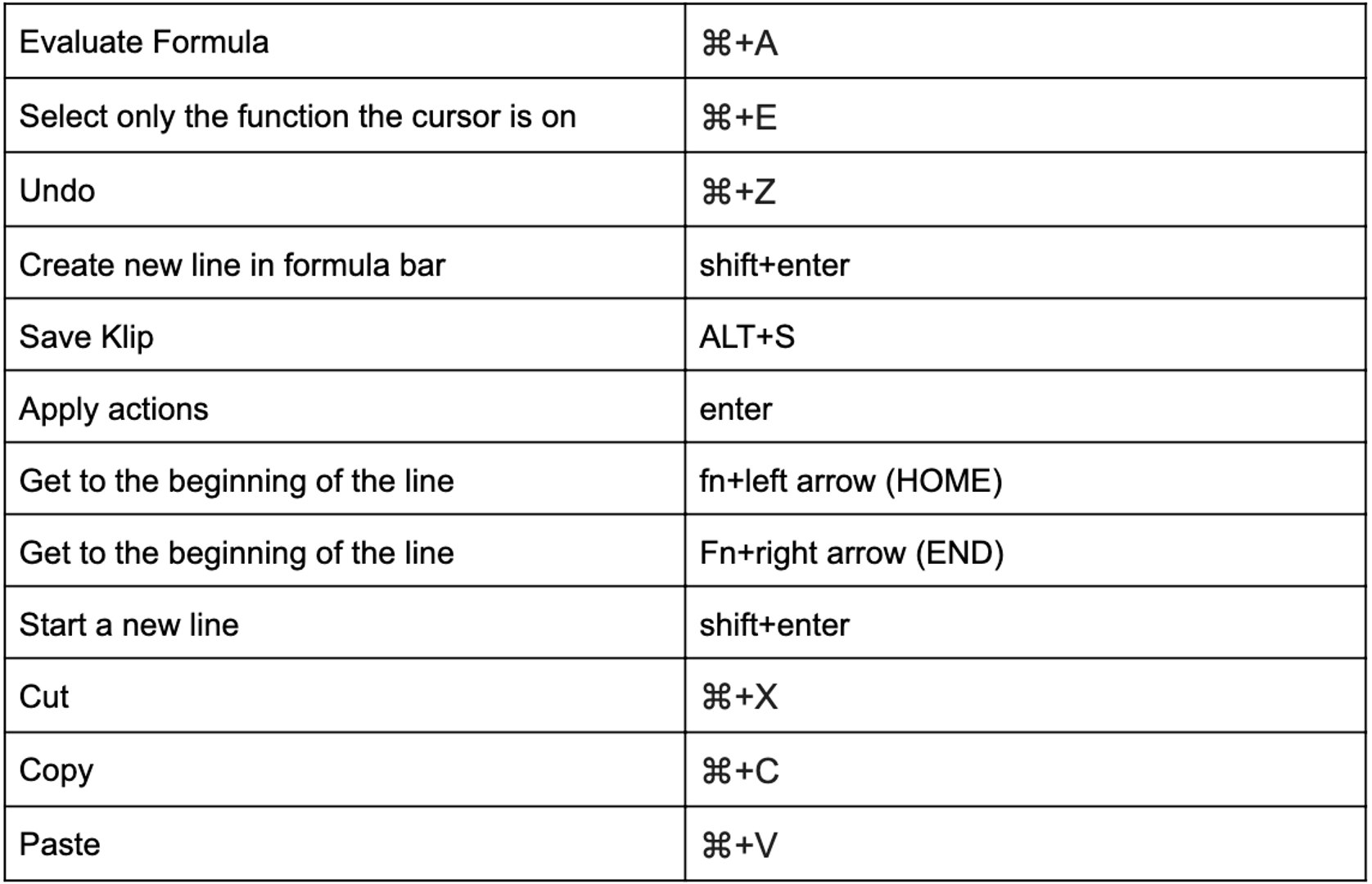
Keyboard shortcuts
Applied Actions
Filter, group, aggregate, hide, and sort on visualizations without formulas—all components support these actions.
To see if any actions have been applied to your visualization, click the asterisk icon (*) next to the visualization type name. A list displays showing applied actions. You can delete actions from this list.
Filter
Click the menu next to the highlighted row in the component tree and select Filter, or right-click the series in a chart or column in a table. You can also click Add Filter in the Properties panel. Learn more about the Filter action.
When Filter is selected from the More Actions menu, a Filter dialog appears. You can see the result of the applied filter in the Klip visualizer.
The type of filter available depends on the data and component. Text is filtered with a pick list, while numbers are filtered with a slider or input box. User Input Control components always use a pick list.
When a filter is applied, a hint displays next to the series or column row in the component tree.
Group and Aggregate
After applying a Group, series data can be aggregated with standard aggregations including Sum, Average, and Count Distinct. Group and Aggregation settings are available from the component tree and the Properties panel.
Group
To apply a Group, right-click the sub-component, click the menu next to it in the component tree, or check Group repeating labels in the Properties panel.
Aggregate
To apply an Aggregation, click the menu next to the sub-component in the component tree and select Aggregation, or right-click the data in the component visualization to access the More Actions menu. You can also use the Aggregation menu in the Properties panel.
Sort
To apply a Sort, click the menu next to the sub-component in the component tree and select Sort, or right-click the data in a component. You can also use the Sort menu in the Properties panel.
Note: You can apply a Sort from the More Actions menu or use the SORT function. Only one Sort (the most recent) is supported at a time. The Sort action is always applied last.
When a sort is applied, a hint displays next to the series or column row in the component tree.
Hidden Data
You can use actions on Hidden Data (Additional Data), allowing you to modify your visualization with added Data sub-components. The actions applied to these additional sub-components change your visualization but do not add Series, Axes, Columns, or other elements to your component.
Add Hidden Data from the Properties panel or Control panel of the Klip Editor.
Sharing Dashboards and Klips
Sharing your data encourages collaboration and discussion. It keeps everyone aware of the current situation and focused on common goals. Klipfolio offers many ways to share, providing flexibility to share internally, externally, in real time, or periodically.
Before sharing: add users and groups
To share within your organization, first add users and optionally organize them into groups. Organizing individuals into relevant groups saves time when sharing. For example, if you've already created a Support Team group and added all its members, you can share a dashboard with everyone at once.
Note: To simplify cross-company sharing, all users in your account are automatically added to All Users. When users are added or removed from your account, the "All Users" list is automatically updated.
Learn more:
Ways to share
User and group sharing: Enable viewing or editing access to dashboards, Klips, data sources, metrics, and Metric Boards with individuals and groups in your organization.
Published links: Share internally or externally via a link to your dashboard. Make your dashboard publicly available, searchable, and indexable by search engines, or restrict access to those with a link and optionally a password.
Learn more about published links
Automated snapshots: Set up scheduled emails to share snapshots of individual Klips or entire dashboards. You decide who receives the snapshot, at what time, and how often.
Learn more about automated emails
PDF reports: Download Klips and dashboards as images or PDFs (ideal for presentations and printed reports) and share them as email attachments.
Best practices for generating PDF snapshots
Display dashboards on office wallboards: Keep everyone up to date by displaying one dashboard or setting up multiple dashboards to display in rotation. Displaying dashboards on wallboards is a great way to keep teams data-driven and focused on performance.
Displaying dashboards on a large screen
Share with Slack: Once the Slack integration is enabled in your account settings, sharing individual Klips or dashboards with users or channels in Slack is fast and easy.
Sharing Klips and dashboards with Slack
Embed on your website or intranet: Seamlessly embed individual Klips or entire dashboards into your website or host application.
Add comments to a Klip: Anyone with access to a Klip can write a comment. Adding comments encourages collaboration and is a great way to share insights with others.
You've made it to the end. Hopefully this resource has been helpful. Happy Klip building!
Related Articles
6 dashboards I use daily to run my SaaS company
By Allan Wille, Co-Founder — April 10th, 2026
Klipfolio Partner How-To #1: Duplicating dashboards across client accounts
By Stef Reid — November 27th, 2025
Klipfolio Partner How-To #2: Company Properties can simplify client set-up
By Stef Reid — November 26th, 2025