Supply Chain Dashboard
Track your operational health with essential supply chain KPIs.
What is a supply chain dashboard?
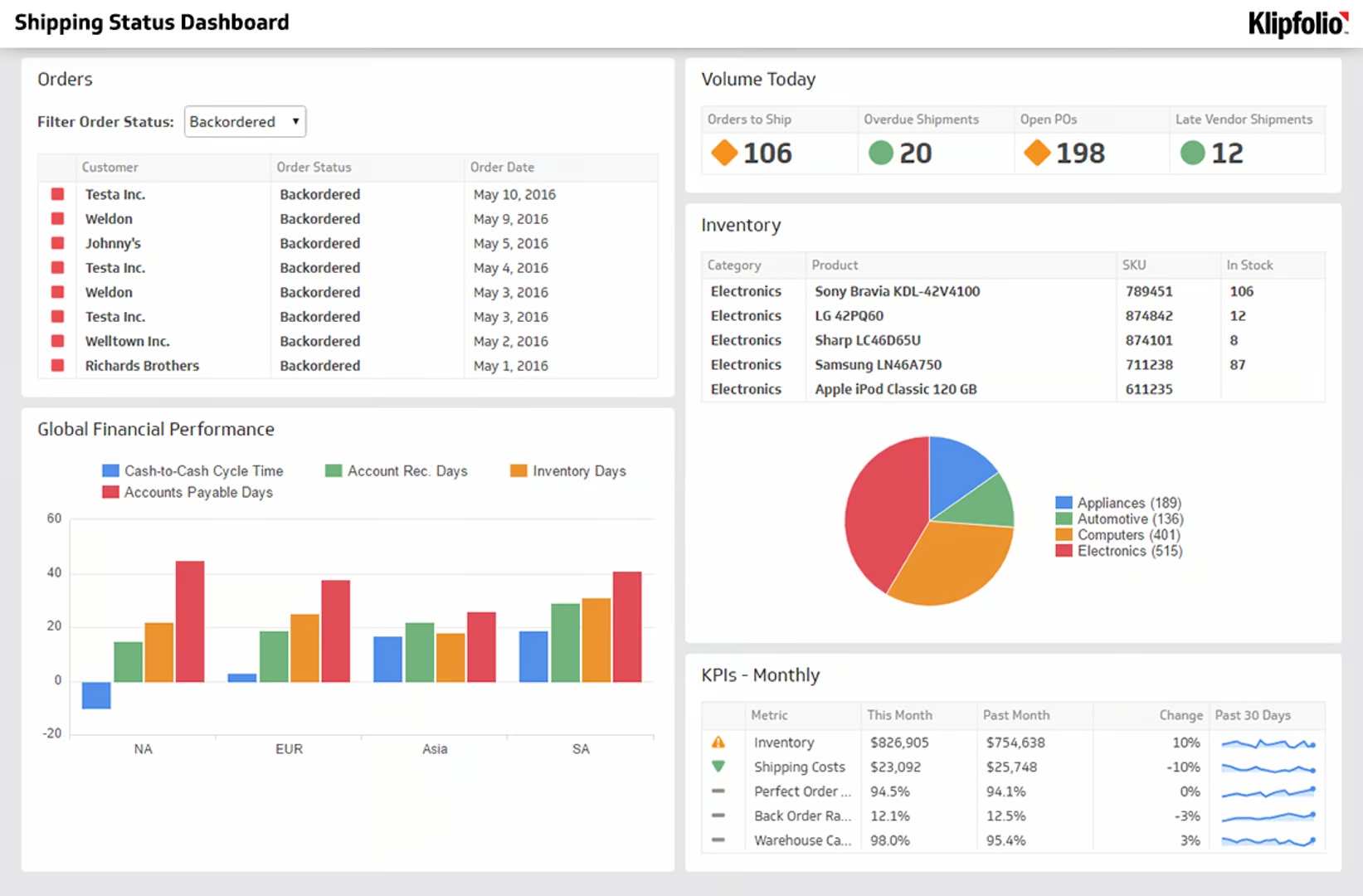
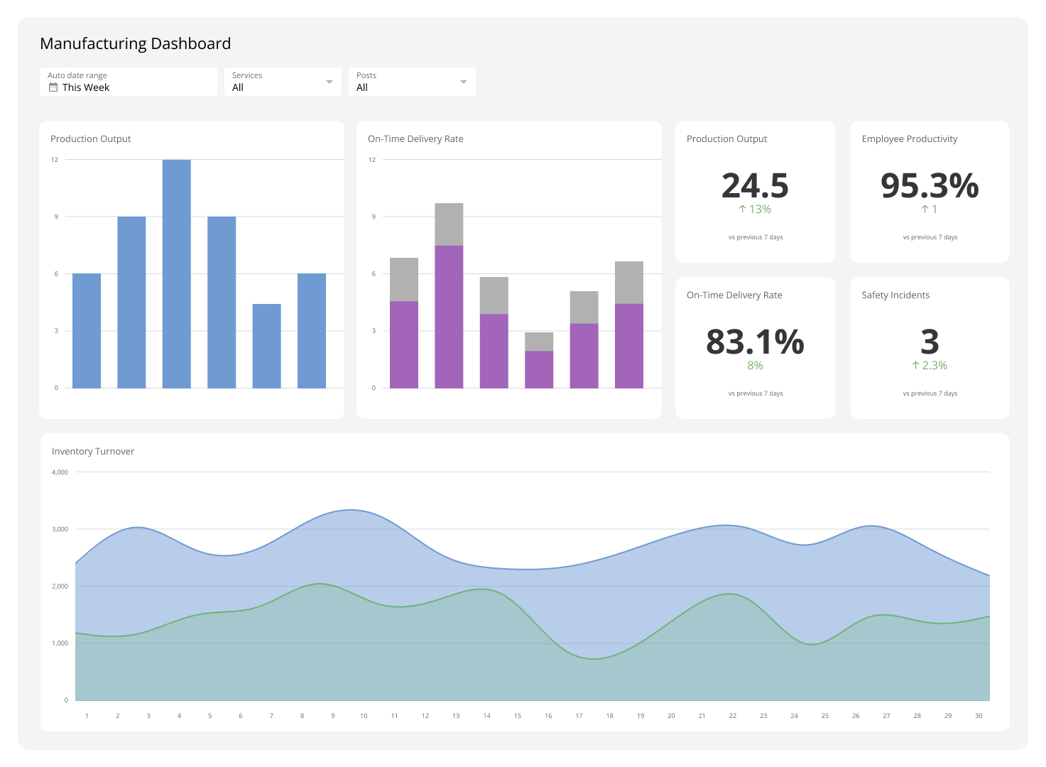
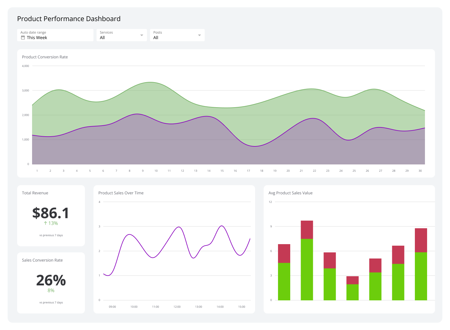
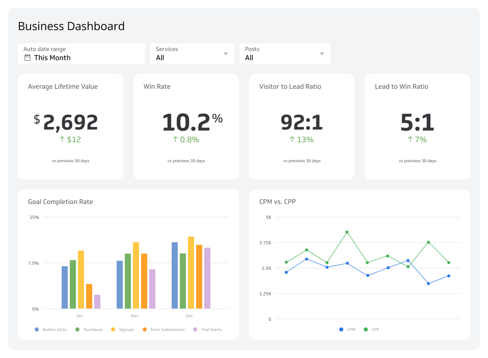
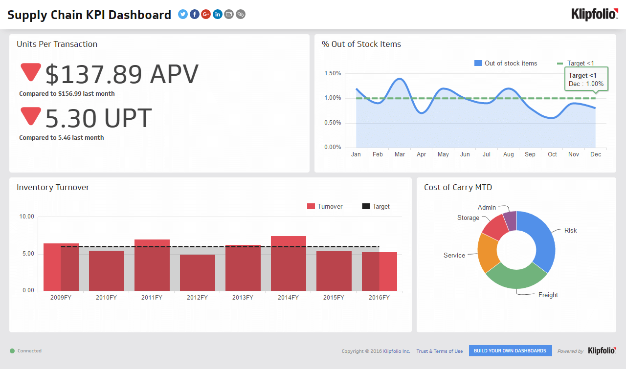
A supply chain dashboard is a reporting tool that tracks supply chain KPIs and metrics in a single, real-time display — giving you a visual overview of inventory, logistics, and warehouse operations.
If you're running supply chain operations on spreadsheets, you already know the problem. Data lives in multiple systems, someone has to pull it together manually, errors creep in, and by the time a report lands in your inbox, it's already out of date. You're making decisions on yesterday's numbers, or worse, on a gut feeling.
A supply chain dashboard changes that. It pulls data from your sources automatically, keeps it current, and puts the right numbers in front of you without anyone having to chase them down. You stop waiting for reports and start acting on what's actually happening.
This dashboard is built for leaders and managers in any company that handles physical goods — from growing consumer goods brands to established construction and materials firms.
For smaller companies, it's the natural next step after outgrowing spreadsheets. Manual work drops, costly errors go with it, and you stop pasting numbers from three different places just to answer a basic question.
For mid-sized companies, it creates a single source of truth that aligns procurement, inventory, and sales teams so everyone works from the same up-to-date information — no more version conflicts, no more "which number is right?"
Key supply chain KPIs to track
A strong Supply Chain Dashboard goes beyond raw data points. It tracks KPIs that reveal the true health of your operations. Here are three essential ones to start with:
Units Per Transaction (UPT): Calculates the average number of items sold per transaction. Monitoring Units Per Transaction helps you understand purchasing behaviour, measure the effectiveness of promotions, and identify cross-selling opportunities.
Inventory Turnover: Measures how many times your company has sold and replaced its inventory over a set period. A high Inventory Turnover rate signals strong sales; a low rate may indicate overstocking or slow-moving product lines. Either way, you want to know before it becomes a cash flow problem.
Inventory to Sales Ratio: Compares the value of on-hand inventory to total sales. A balanced Inventory to Sales Ratio means you have enough stock to meet demand without tying up excess capital in unsold goods.
These three metrics won't tell you everything, but they'll tell you where to look. Tracking them together surfaces patterns that no single number can.
Why a centralized dashboard makes the difference
Tracking KPIs in isolation creates blind spots. When inventory data lives in one system, sales data in another, and logistics updates arrive by email, it's nearly impossible to see how each part of the chain affects the others. You're not missing information — you're missing the connections between it.
A centralized Supply Chain Dashboard connects those sources automatically. Metrics refresh on a schedule — from every minute to every 24 hours — so your team is always working from current data. When a number changes, you see it. You don't have to ask someone to pull a report, and you don't have to explain your business from scratch to get an answer.
That reliability matters more than it sounds. When everyone on your team is looking at the same numbers at the same time, decisions get made faster and with more confidence. Procurement, inventory, and sales stop working from different versions of the truth.
Beautifully presented visuals make it easy to share performance with stakeholders, whether on a screen in the warehouse, a TV in the boardroom, or a scheduled PDF report. The goal isn't a prettier spreadsheet — it's a small team operating with the clarity of a much larger one.
What good supply chain visibility actually gives you
Most teams think about dashboards as a reporting tool. The more useful way to think about it: a Supply Chain Dashboard is an early warning system.
When Inventory Turnover drops, you know before it becomes a write-off. When your Inventory to Sales Ratio climbs, you can act before capital gets stuck in slow-moving stock. When Units Per Transaction shifts, you have a signal about purchasing behaviour before it shows up in the financials.
That's the difference between a dashboard that tells you what happened and one that tells you what to do next. The data is only useful if it reaches the right person in time to change the outcome.
Create custom dashboards for you and your team.
Get started with KlipsBuild your supply chain dashboard with Klips
Klipfolio Klips connects to 130+ data sources — including APIs, SQL databases, and cloud storage — so you can pull supply chain data from wherever it lives. Use Excel-like formulas to model your metrics, choose from 30+ visualization types, and distribute dashboards to your team in the format that works best for them.
You get consistent, reliable numbers without the manual work. Your team gets clarity without having to ask for it.
Get everyone on the same page. Start building your Supply Chain Dashboard today.