Twitter Analytics Dashboard
Boost your Twitter performance by monitoring key engagement metrics in a dashboard.
What is a Twitter Analytics Dashboard?
A Twitter analytics dashboard displays the metrics and KPIs for your social media marketing strategy. When you visualize your Twitter metrics on a dashboard, you can use the insights to further develop your marketing strategy, increase engagement, or drive performance outcomes.
When you monitor your Twitter analytics on a dashboard, you can answer important questions like:
- How many people are my tweets reaching?
- How does my audience engage with my Twitter content?
- Are people talking about my brand, product, or service on Twitter?
A Twitter analytics dashboard will give you the insight you need to understand how effective Twitter is as part of your social media strategy and if it is helping you to achieve your goals.
What metrics should you include on a Twitter dashboard?
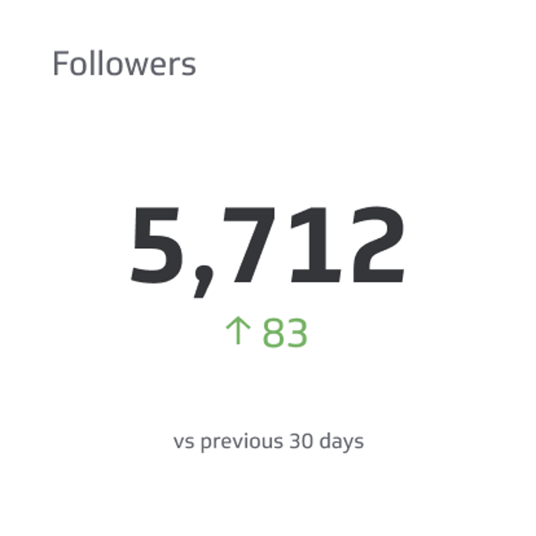
Followers
Followers is the number of users who have chosen to follow another user’s or company’s posts.
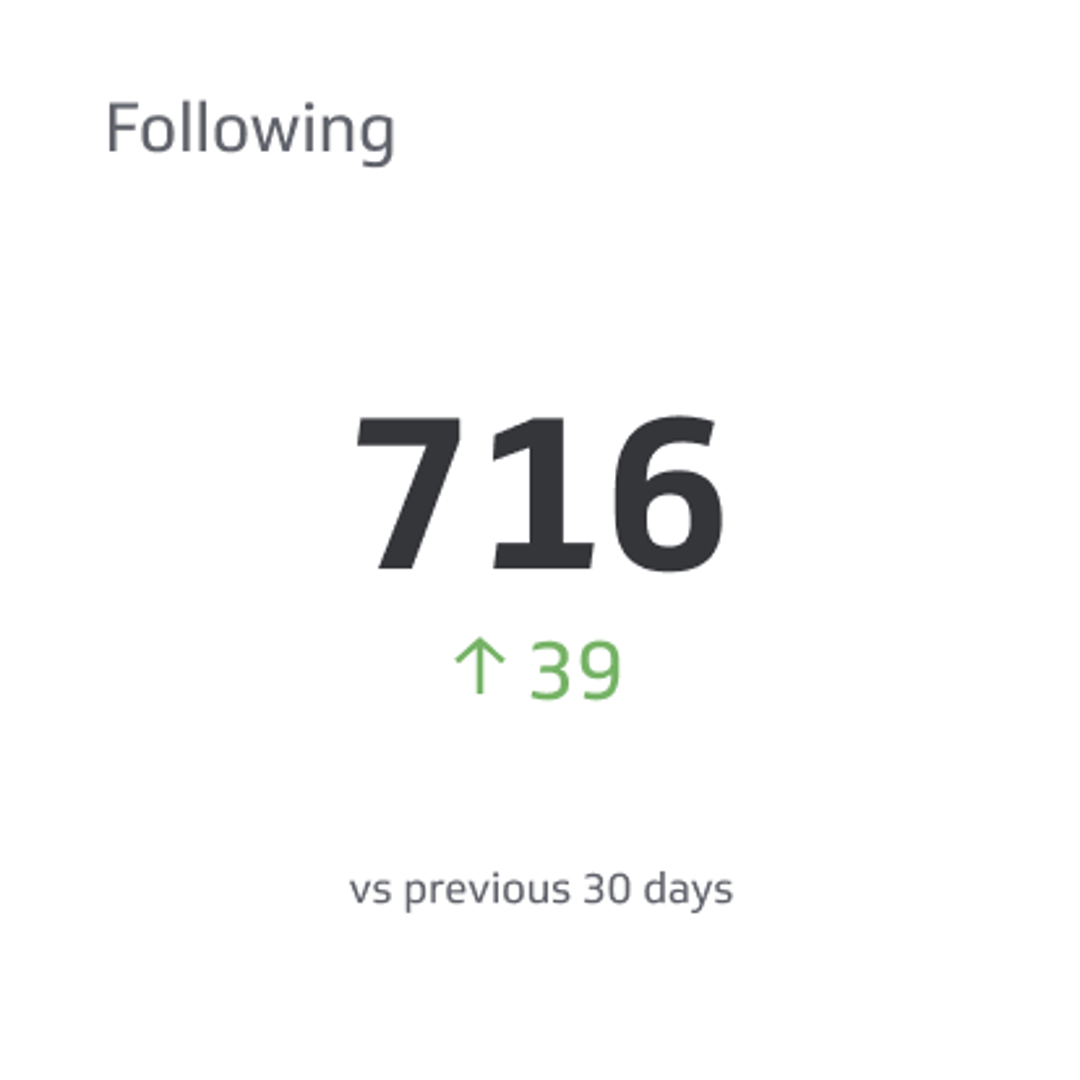
Following
Following is the number of accounts or pages a user or brand has chosen to follow on social platforms.
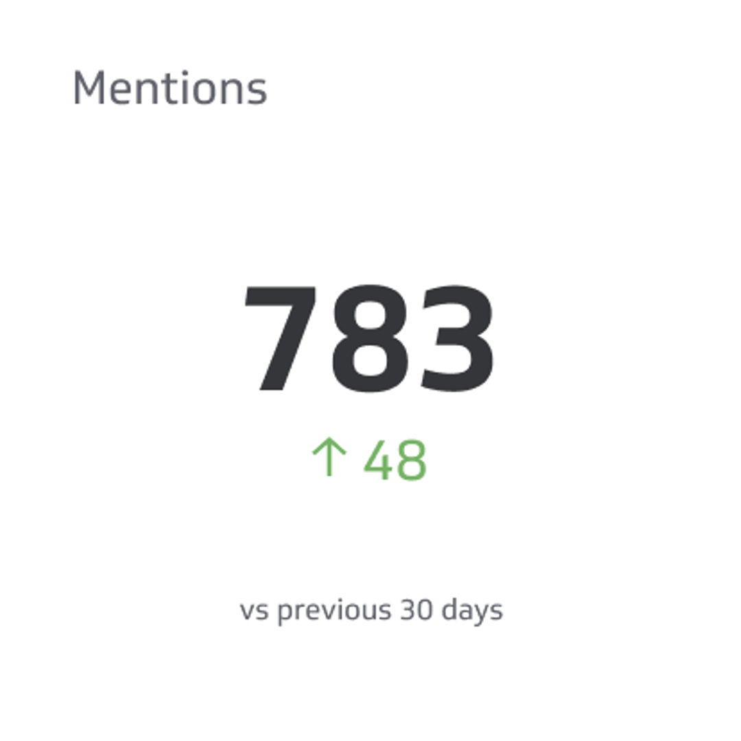
Mentions
Mentions on social media are instances where users reference another user by using the @ symbol.
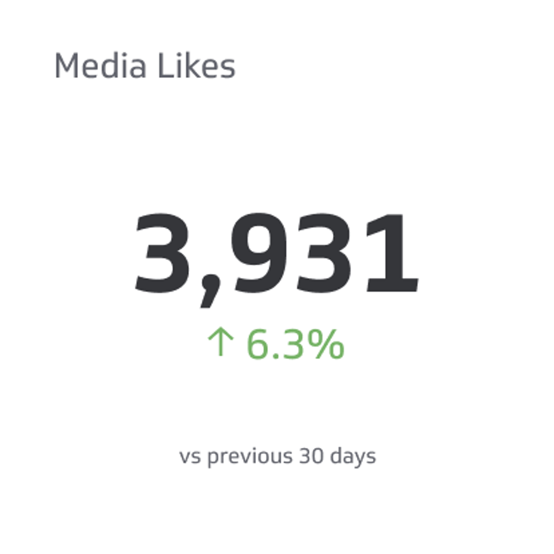
Media Likes
Media Likes is the total count of likes you receive on multiple formats of media posted on your social media page.
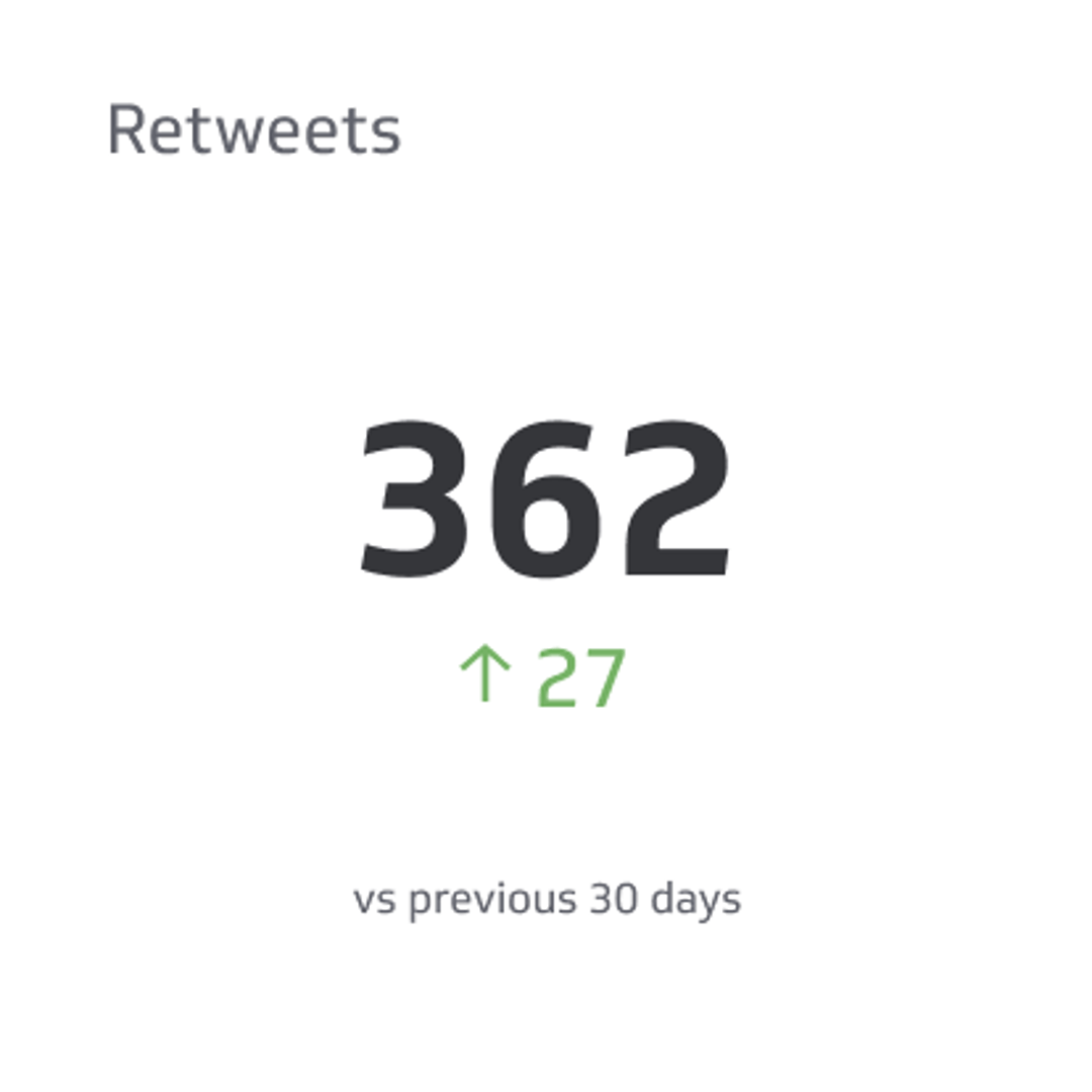
Retweets
Retweets is the total number of people who click the retweet button under your tweet.
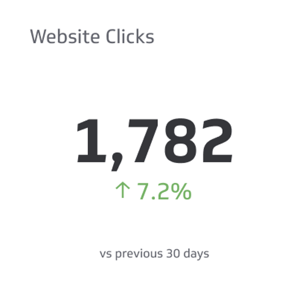
Website Clicks
Website Clicks counts the number of times people clicked on the link to your website on your social media profile page.
What type of visualizations work best on a Twitter dashboard?
Twitter analytics provide valuable insight into the growth and engagement of your account. The metrics you can put on your Twitter dashboard have basic dimensionality. You can segment your metrics by time periods (days, weeks, or months) to understand how your Twitter content performs and identify any trends.
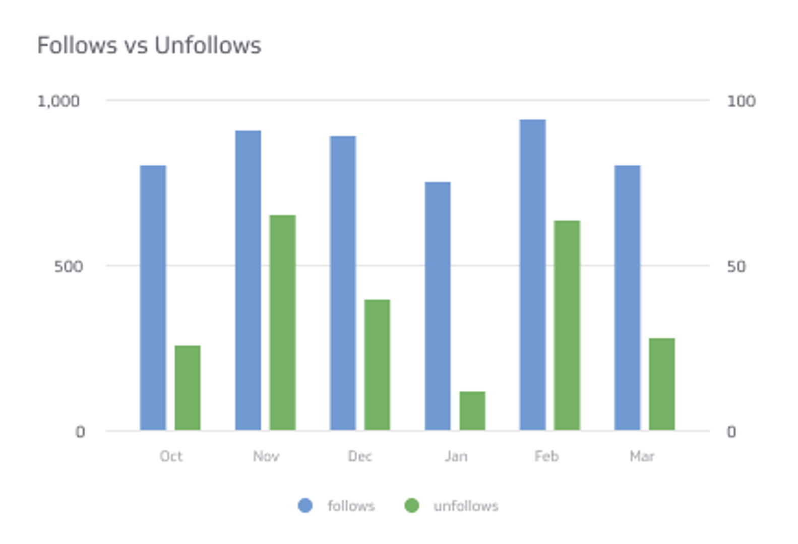
Temporal data visualizations are the most common choice to display periods of time. Temporal data visualizations include bar charts or line charts. These data visualizations also have an x- and y-axis so you can easily compare values over a period of time.
With this information in mind, let’s consider the data visualizations you can use on a Twitter dashboard.
Bar charts or line charts
For example, if you want to compare follower growth by week, you can use a bar chart or a line chart. Using a bar or line chart to visualize your follower growth means you can quickly see any growth trends or insights.
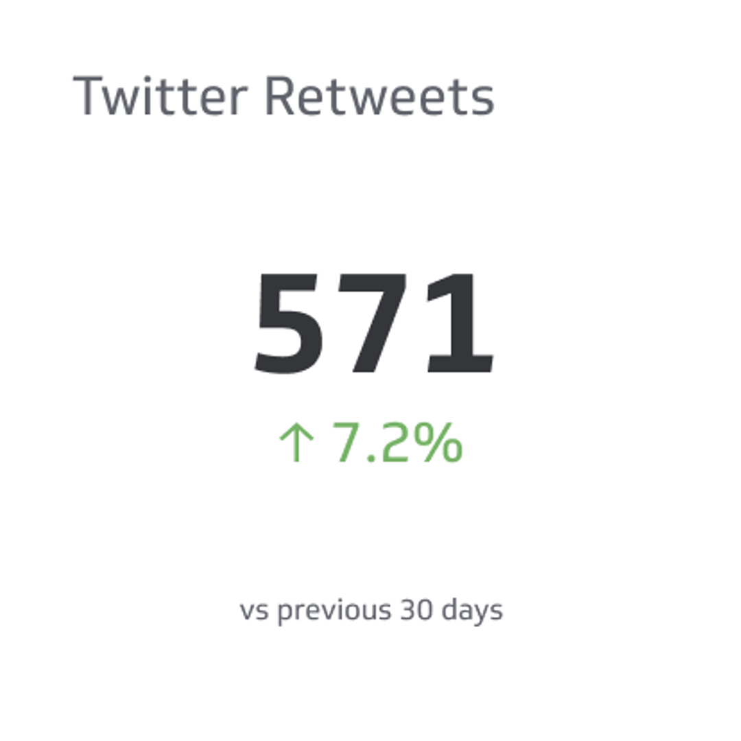
Summary Charts
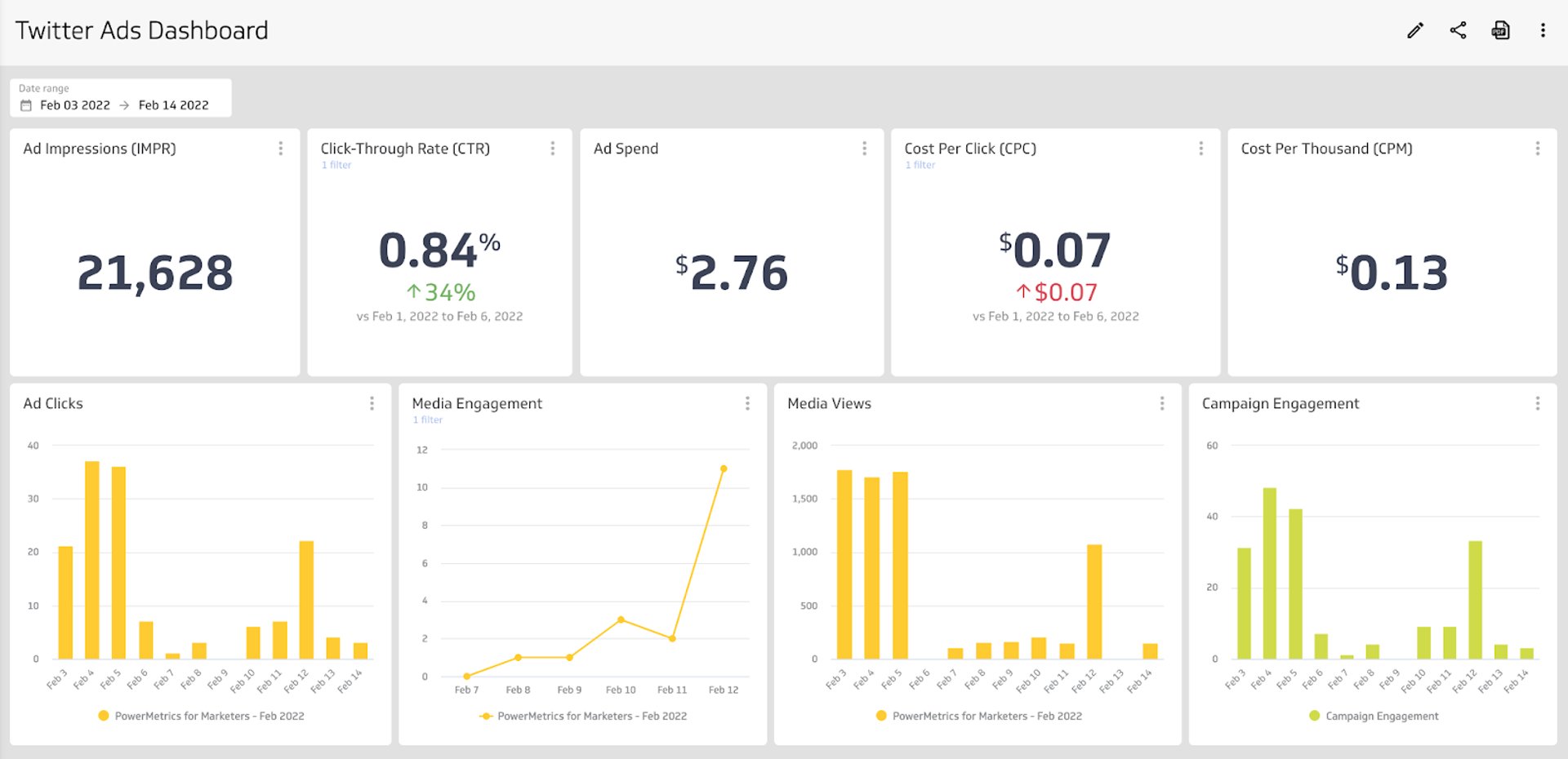
A summary chart displays a single numeric value. On a Twitter analytics dashboard, a summary chart is a good visualization to display your total number of accounts you’re following or the number of retweets from your account. Summary charts also allow you to add a comparison value (numeric or percentage) so you can track any variances or trends. The benefit of adding a comparison value is that the colours, red or green, are easily identifiable indicators of positive or negative trends.
Tables
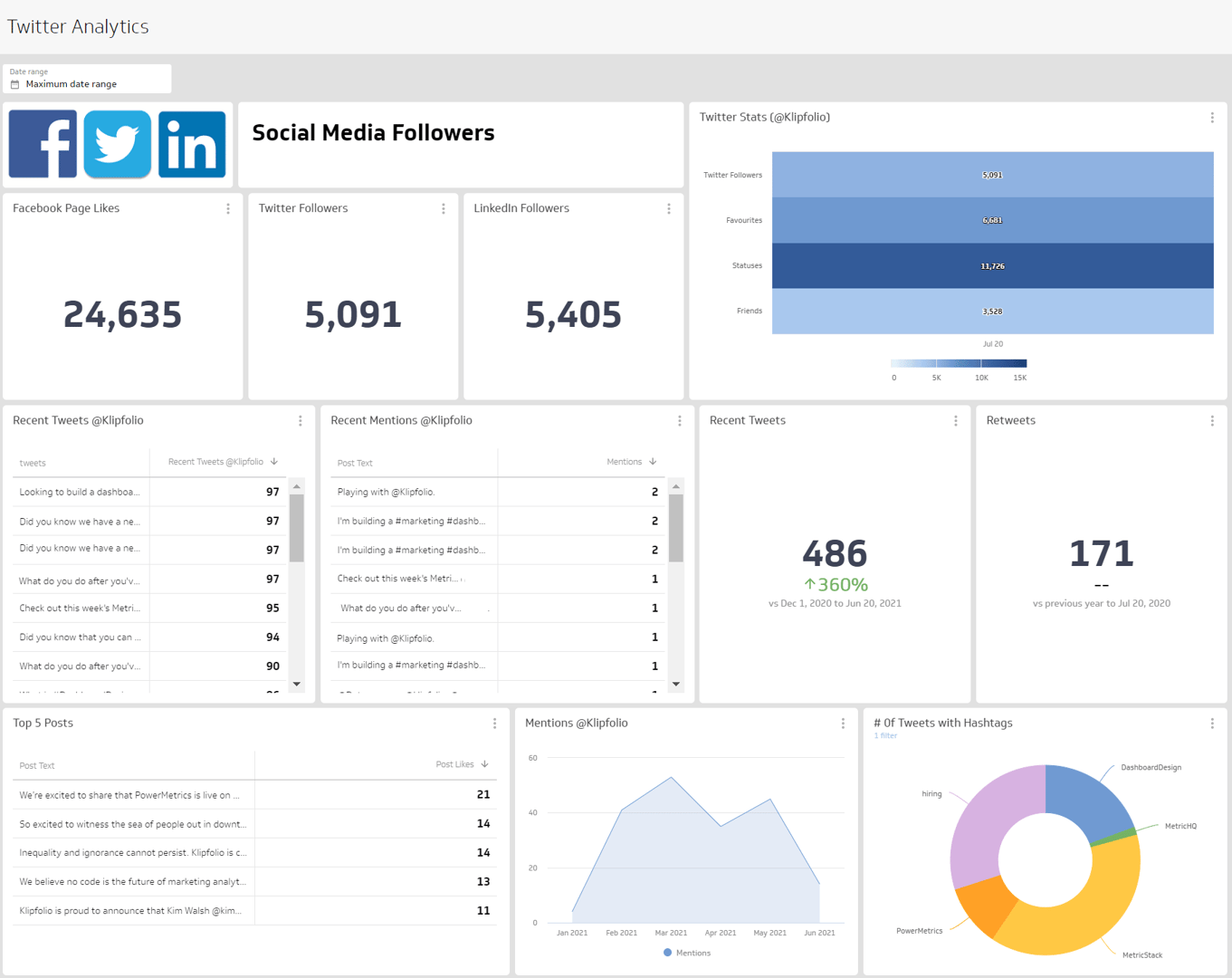
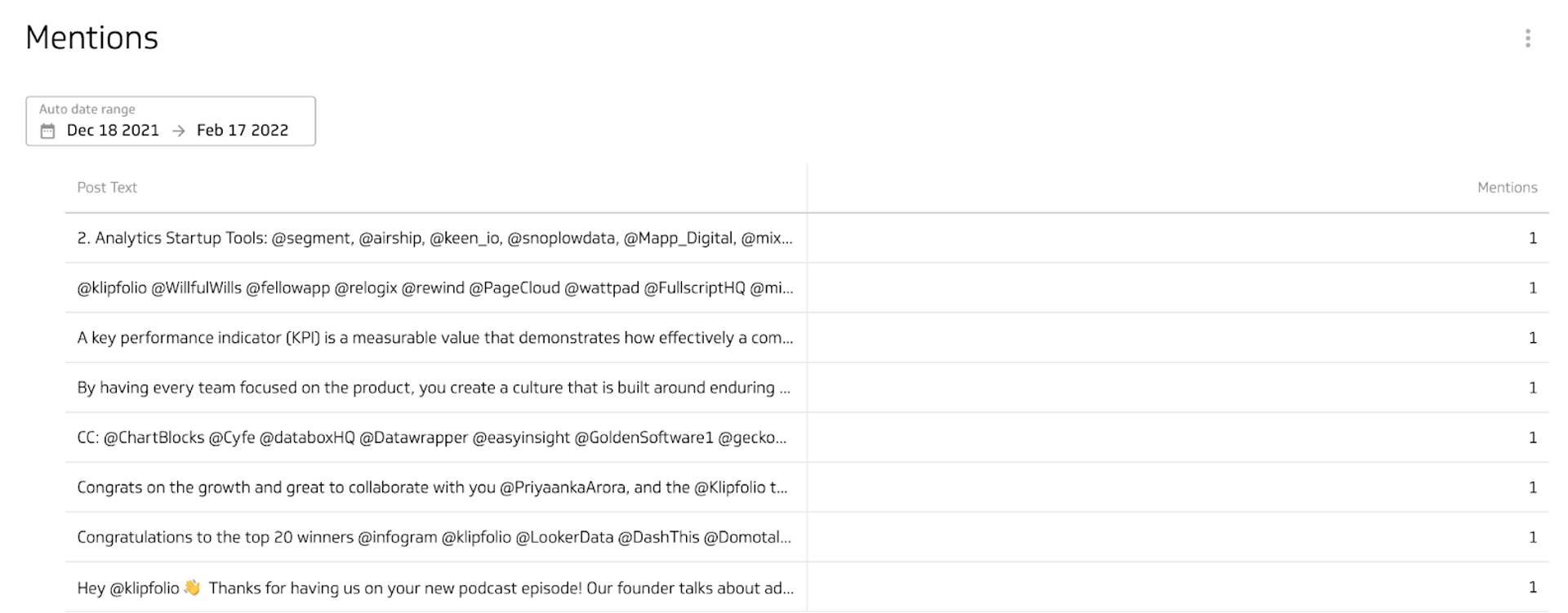
Table visualizations display your data in tables and rows, much like a spreadsheet. List tables, like the example below, displays your data - in this case Twitter mentions - in the order it was returned. You can also explore pivot tables and ranked tables.
Tables shouldn’t be used for large data sets, but in this instance you can filter your data down to drilldown to your top 10 mentions.
Benefits of a Twitter analytics dashboard
Twitter doesn’t capture historical follower data. Twitter offers a few metrics: impressions, profile visits, and mentions. But followers are a key part of any social media strategy. The more you grow your audience, the more people you reach with your message. You can work around this by checking your follower count every day or looking at the 28-day snapshots provided within Twitter’s analytics, but why not make it easier for yourself and use the followers metric on a dashboard. That way you can compare follower growth over time and between different time periods so you can identify trends.
Dashboard inspiration for your Twitter analytics
How do you know which metrics to track in a way that makes sense for you? Here are a few ways you can design your Twitter dashboard to focus on specific areas of performance and engagement.
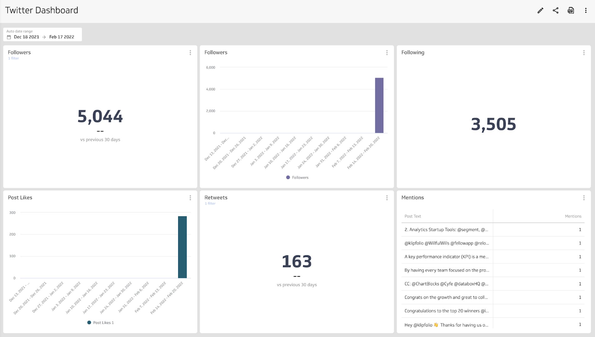
Track your performance on a Twitter analytics dashboard
Build a Twitter dashboard that looks at your follower growth, tweet engagements, and overall performance. This dashboard will answer questions like:
- How many new followers per week?
- How many people like our tweets?
- How many retweets this week versus last?
Looking at your Twitter performance metrics will help you answer these questions and find areas of focus to ensure you’re creating engaging Twitter content.
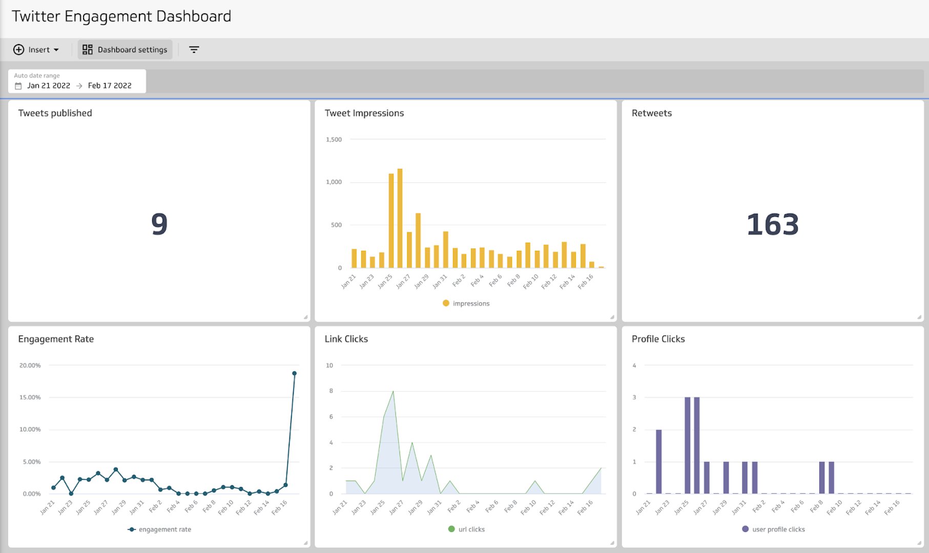
Track engagement with your Twitter content
Build a Twitter analytics dashboard that displays the metrics that show how users engage with your content. This dashboard will help you answer questions like:
- What is the average engagement rate per tweet?
- How many impressions did my tweets receive this month?
- How many link clicks did my tweets get today?
Tracking these metrics will not only help answer the questions, but help you determine what type of content receives the highest engagement and how you can focus your efforts to continue on your growth trajectory.
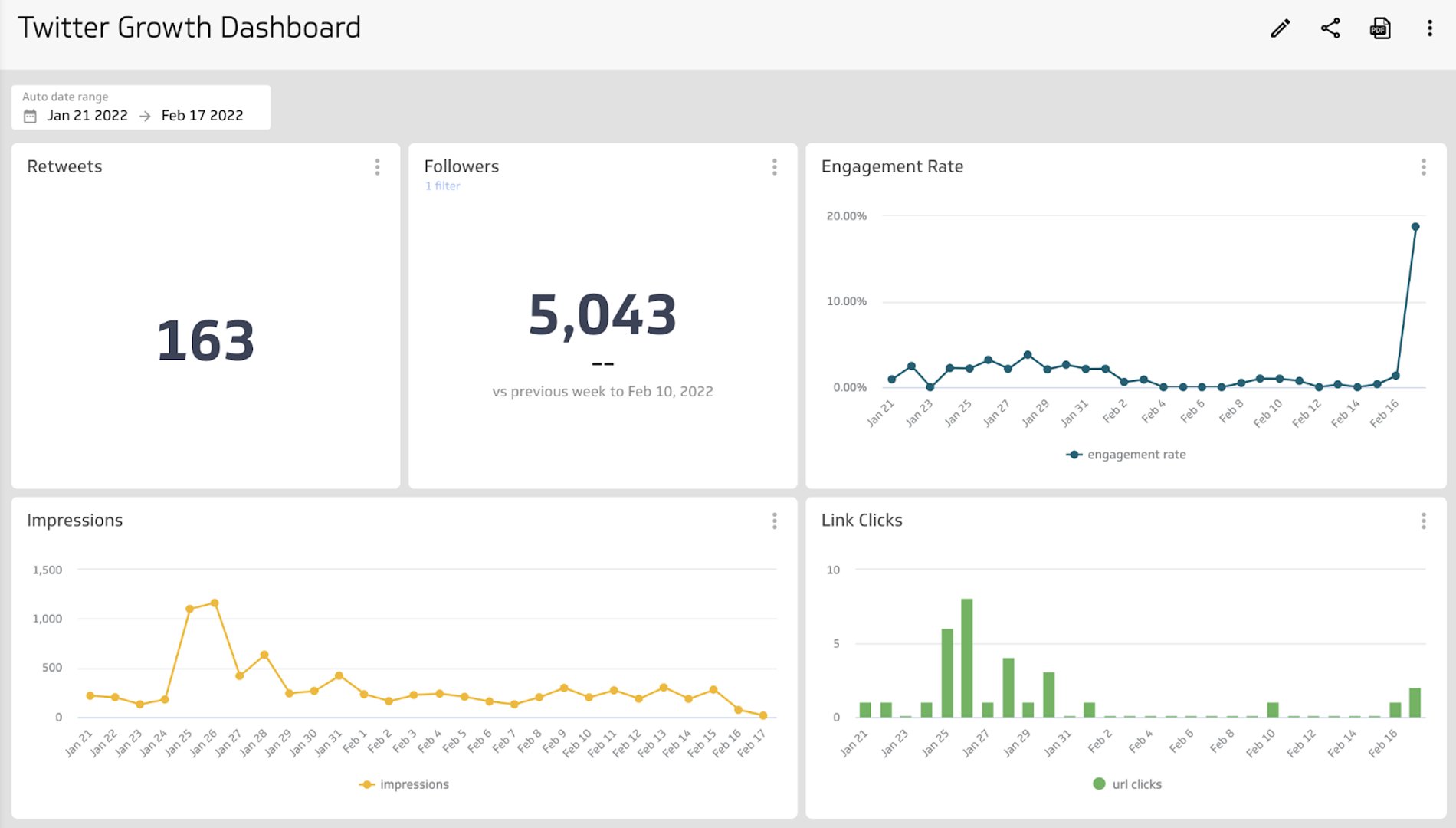
Track the growth of your Twitter account
Build a growth dashboard with the metrics that tell the story of your Twitter account growth. A Twitter growth dashboard will help you answer questions like:
- Is the number of followers my account has increasing?
- Are my followers and other Twitter users retweeting my content?
- Are impressions, engagement, and link clicks related to follower growth?
The metrics on your dashboard will help you answer these questions and develop your social media growth strategy.
What does success look like with a Twitter analytics dashboard?
A Twitter analytics dashboard is a reporting tool that you can share with your team and decision-makers so you can gain insight into your social media performance and engagement. A good reminder when building and designing a dashboard is that everyone, regardless of department or expertise, should be able to understand the data that is being presented. That’s a sign of a well-designed dashboard.
Twitter analytics are a reflection of your social media strategy. The data displayed on your dashboard should be used to optimize or adjust your approach to Twitter, and identify trends in engagement and behaviour with your followers.
Related Dashboards
View all dashboards
