

What makes a good lead generation dashboard?
A lead generation dashboard gives your whole team a shared, real-time view of your lead lifecycle without anyone having to pull a report or chase down numbers. This article covers what makes a good lead generation dashboard, which metrics to include, and how to connect it to the platforms where your lead data already lives.
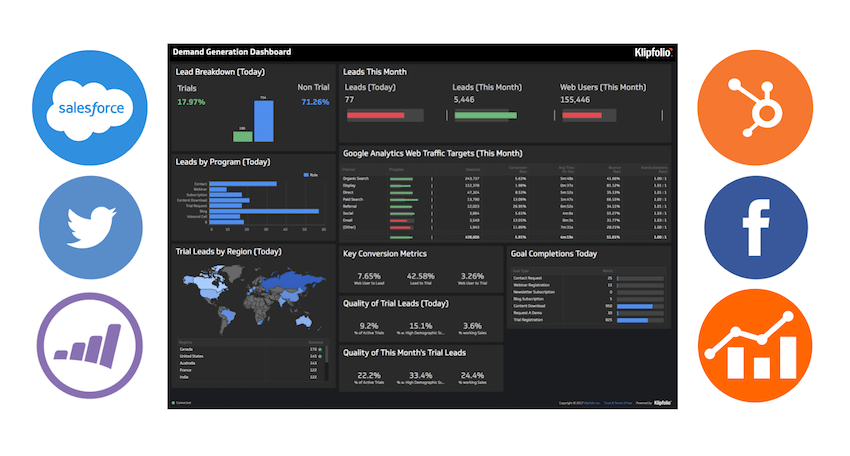
You probably already know your lead pipeline well. The harder part is making sure everyone else does too, and making sure the numbers you're all looking at are the same ones, updated without anyone having to chase them down.
A lead generation dashboard solves that. It puts your lead lifecycle in front of your whole team, in real time, without requiring anyone to pull a report or paste numbers into a spreadsheet.
To set the stage, here's how HubSpot frames lead generation within the broader inbound marketing funnel:
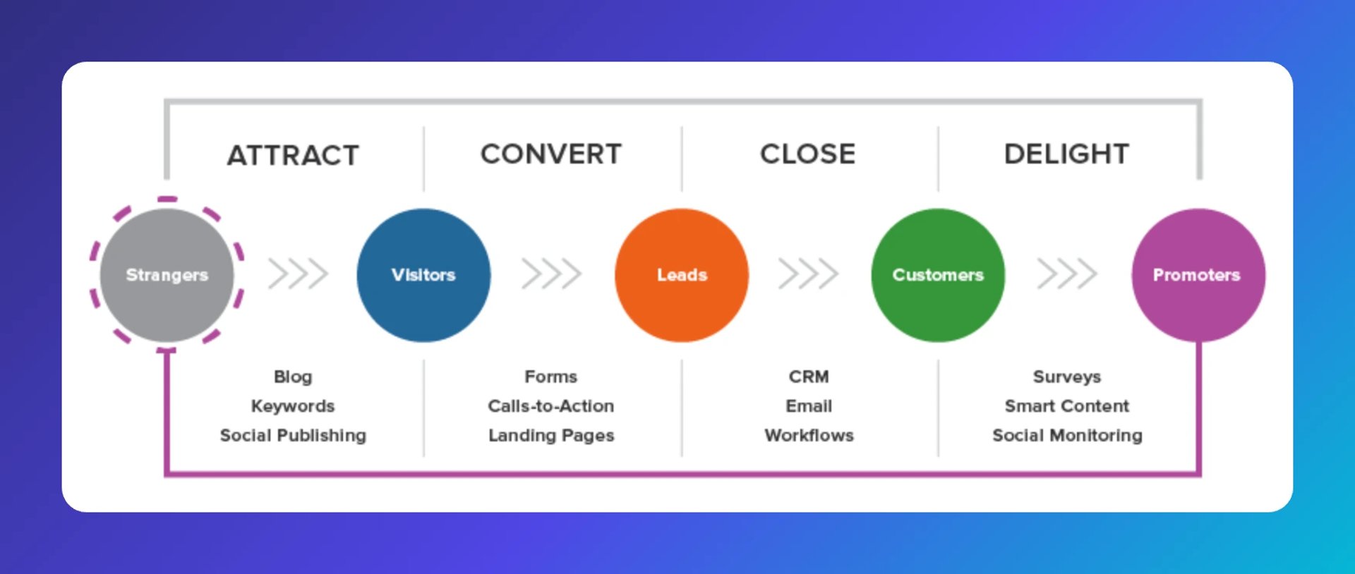
Note: For more context on the lead gen fundamentals, their lead generation guide is worth a read.
Lead generation sits in the "convert" stage. A dashboard built around that stage gives your team a shared view of what's working, where leads are dropping off, and what to do next.
How is lead generation measured?
Leads are people who have shown interest in your product or service. Lead generation is measured by the count of inbound or outbound leads, also called prospects, moving through your pipeline.
What is a good lead conversion rate?
According to MetricHQ, a good lead conversion rate is 2.4% globally for the average webpage. A dedicated lead generation landing page can reach 4%.
What makes a good lead generation dashboard?
A good lead generation dashboard gives you a clear, consistent view of your lead lifecycle without requiring you to dig for it. It surfaces the numbers that tell you whether your pipeline is healthy and where to act.
Your dashboard should answer questions like these:
Are you generating enough MQLs for your sales team?
Which campaigns are producing the most leads, and the most qualified ones?
Where are leads dropping off in your funnel?
Where are leads coming from, by source and region?
Are your key metrics trending in the right direction over time?
When these answers are visible to your whole team, you stop waiting for someone to pull a number. You make faster decisions, catch problems earlier, and improve conversion rates at each stage of the funnel. That compounding effect is where the real value comes from.
Here are four lead generation metrics worth including in any lead generation dashboard.
Lifecycle over time
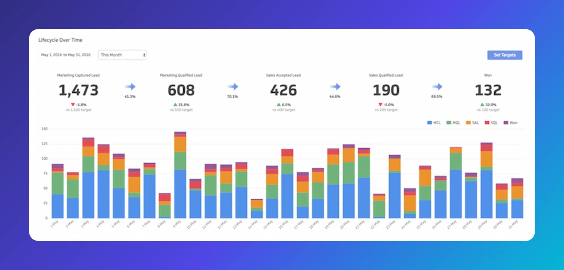
!Lifecycle Over Time chart showing lead progression from 1,473 marketing captured leads to 608 qualified leads to 426 sales accepted leads to 190 sales qualified leads to 132 wins, with stacked bar cha
This metric should anchor any lead generation dashboard.
The lifecycle view tracks a lead's progress through the purchase funnel and shows conversion rates from one stage to the next. It tells you whether your MQL targets are on track and where leads are getting stuck. More importantly, it shows you exactly where to focus if you want to move the needle on revenue.
New leads by source
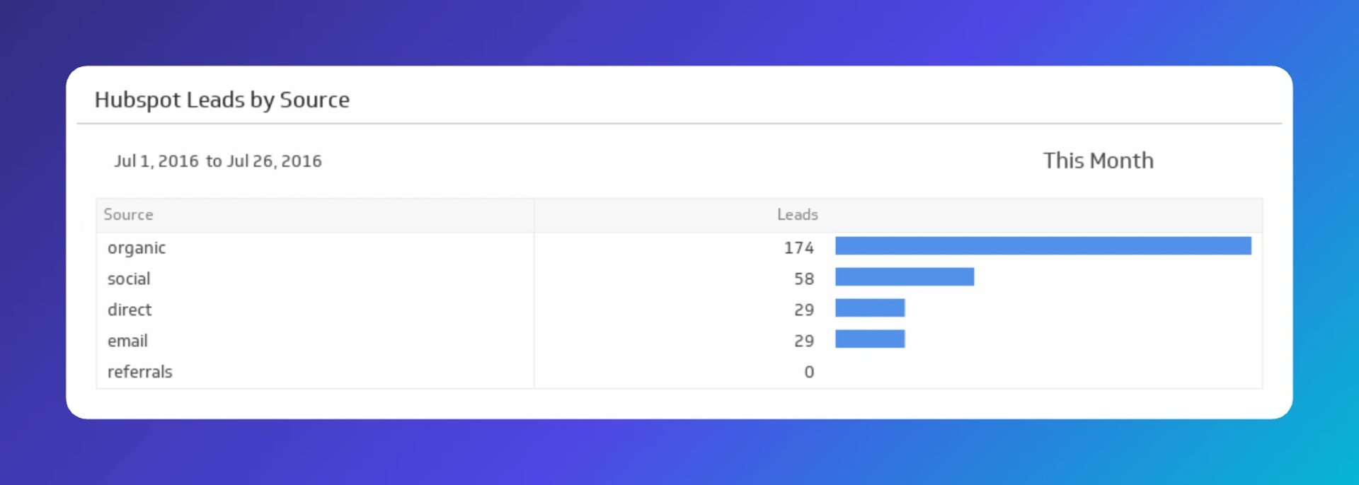
Knowing how many leads you're generating is only half the picture. Knowing where they come from tells you which programs are worth doubling down on.
This applies to inbound efforts like SEO, digital advertising, and social media, as well as outbound efforts like email outreach, tradeshows, and conferences. When source data is visible at a glance, you stop guessing about what's working.
Leads by region
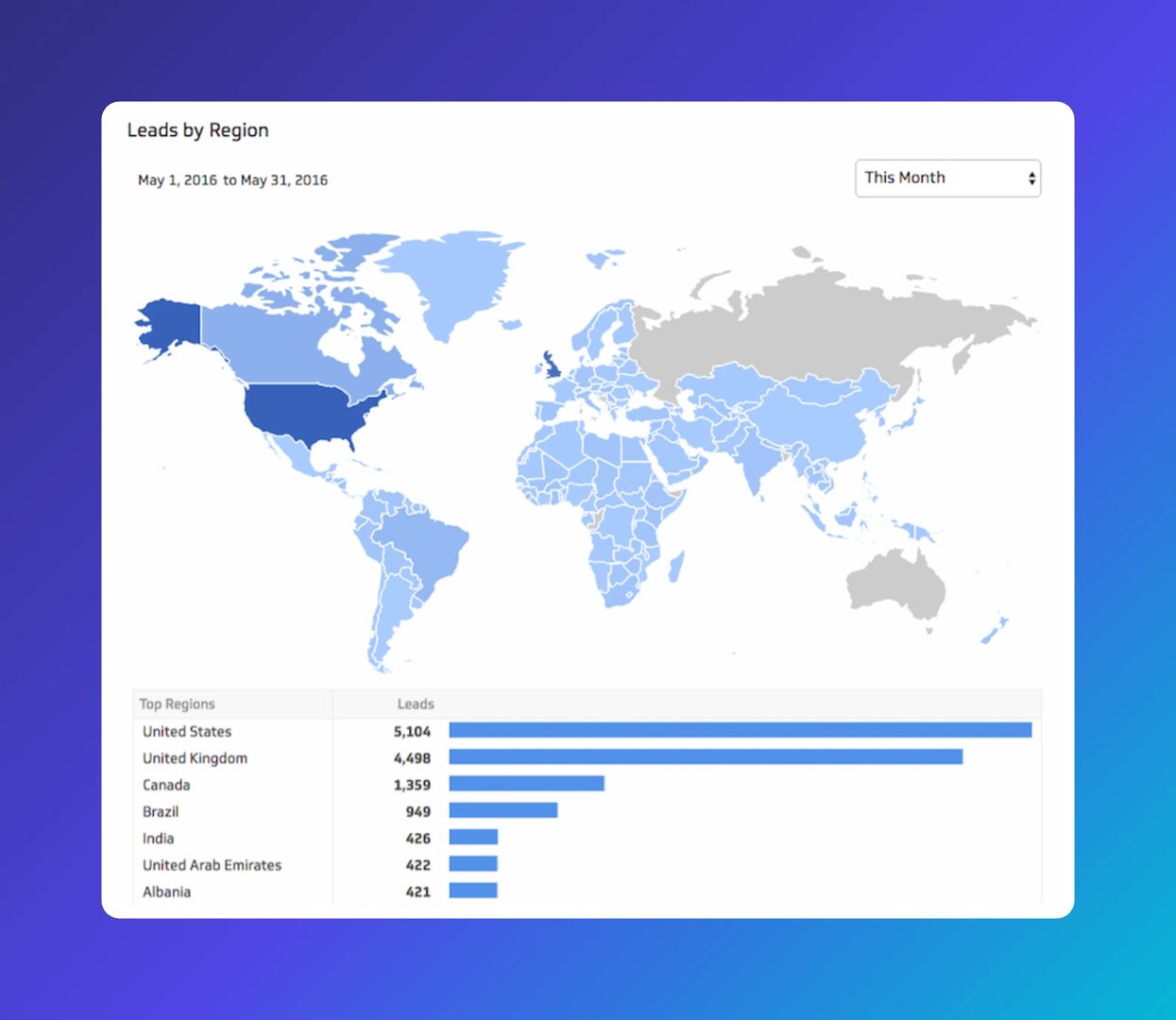
Lead volume is encouraging, but quality is what closes deals. Most organizations target specific geographies, which makes region a practical first filter for qualifying leads.
Beyond geography, qualification criteria often include role, industry, department, and company size. Starting with region gives you a fast, reliable signal before you layer in the rest.
Current leads by stage
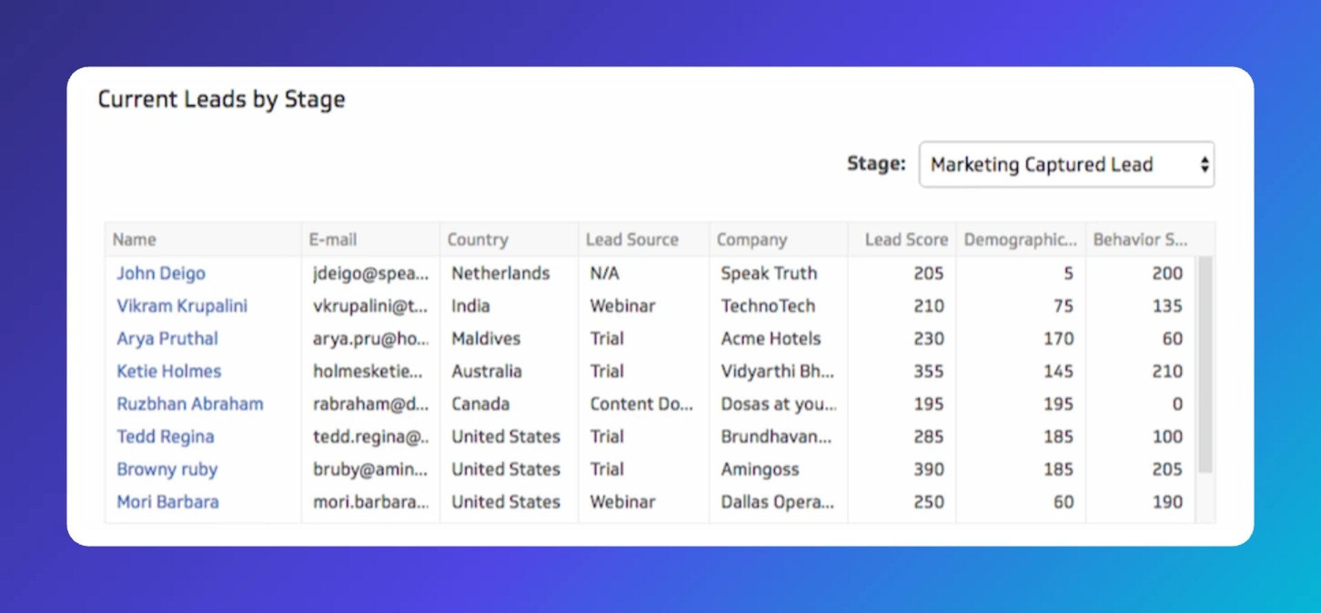
The lifecycle view shows the big picture. This metric zooms in. Current leads by stage lets you see the details behind your most recent leads: who they are, where they came from, and how they scored.
For teams generating leads at a steady pace, this view is especially useful. It lets you spot patterns quickly and adjust without waiting for a weekly report.
How to build a lead generation dashboard
Building a marketing dashboard for lead generation follows a straightforward four-step process:
- Decide which metrics matter for your lead generation goals.
- Identify where the data lives, whether that's a CRM, a marketing automation platform, or both.
- Connect that data to a dashboard tool.
- Build visualizations your team can read and act on.
The goal is a dashboard that stays current without anyone having to maintain it manually. Scheduled data refreshes and direct integrations handle that automatically, so the numbers your team sees are always reliable.
Create custom dashboards for you and your team.
Get started with KlipsGet started with your lead generation dashboard
Klips connects directly to the platforms where your lead data already lives. Start with the integration that fits your stack:
Updated 2026-09-02






Most recent
- SEP 25What SOC 2 taught a small team about trust
- SEP 15The AI race: progress, humanity, and trust
- SEP 9The good advisor
- AUG 11Beyond simple sign-ups: how True Trials and Activation predict growth
- JUL 7Why business leaders miss important trends in their dashboards
- JUN 19The best chart for the job: Visualizing data for non-technical users