Sales Performance Dashboard
A comprehensive guide to tracking the right metrics and driving revenue with powerful sales dashboards.
What is a sales performance dashboard?
A sales performance dashboard consolidates your most important sales data into one place, giving you a real-time view of team performance, revenue, and conversion health.
The difference between knowing your numbers and guessing at them is the difference between a confident decision and a costly one. This dashboard replaces scattered spreadsheets and app-hopping with a single source of truth your whole team can act on.
What is the difference between a sales performance dashboard and a sales dashboard?
A sales performance dashboard tracks activities and outcomes against specific goals, like quota attainment or conversion rates. It's your team's report card.
A more general sales dashboard visualizes any sales-related information, such as historical trends or regional distribution, without tying it directly to performance targets. Both are valuable, but the distinction shapes how you use each one.
Types of sales performance dashboards
There are several types of sales performance dashboards, each focused on a different part of the sales process. Here are four common examples: CRM, sales activity, revenue, and opportunity dashboards.
CRM dashboard
Your CRM holds a goldmine of data on customer interactions, sales cycles, and conversion rates. A CRM dashboard surfaces that data so you can see, at a glance, how your customers are engaging with your team.
You can monitor new contacts added, the status of current prospects, and lead-to-sale conversion rates. More importantly, you can spot a drop in interactions before it becomes a lost deal, and act on it without waiting for someone to pull a report.
Example KPIs to track on your CRM dashboard
Sales Cycle Length: Measures the average time it takes to close a sale from initial contact. A rising number signals a bottleneck in the pipeline worth investigating.
Length of pipeline: Tracks the total number of deals in your sales pipeline, so you always know how much potential business your team is carrying.
Sales Targets: Goals set to measure what the sales team aims to sell in a given period. Tracking these keeps performance visible and teams accountable.
Sales activity dashboard
A sales activity dashboard gives you a detailed view of daily sales activities: calls made, emails sent, meetings held, and proposals delivered.
When activity drops, you know before it shows up in revenue. That early signal is what lets a lean team move quickly, whether that means additional coaching, a territory shift, or a reallocation of resources.
Example KPIs to track on your sales activity dashboard
Sales Bookings: Tracks the total value of contracts signed within a specific period. A clear measure of how much business your team has actually secured.
Closing Ratio: Measures how effectively your team converts opportunities into customers. Low numbers at this stage point to a late-funnel problem worth addressing.
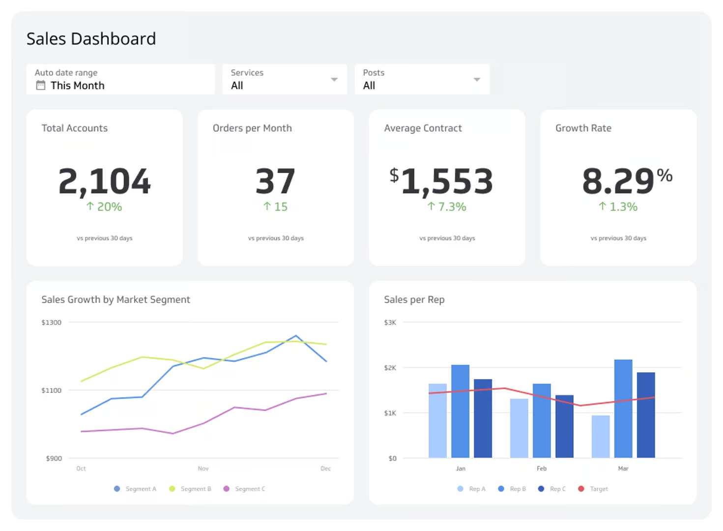
Sales Per Rep: Calculates average revenue generated per sales representative. Useful for spotting outliers, both high performers to learn from and gaps to close.
Revenue dashboard
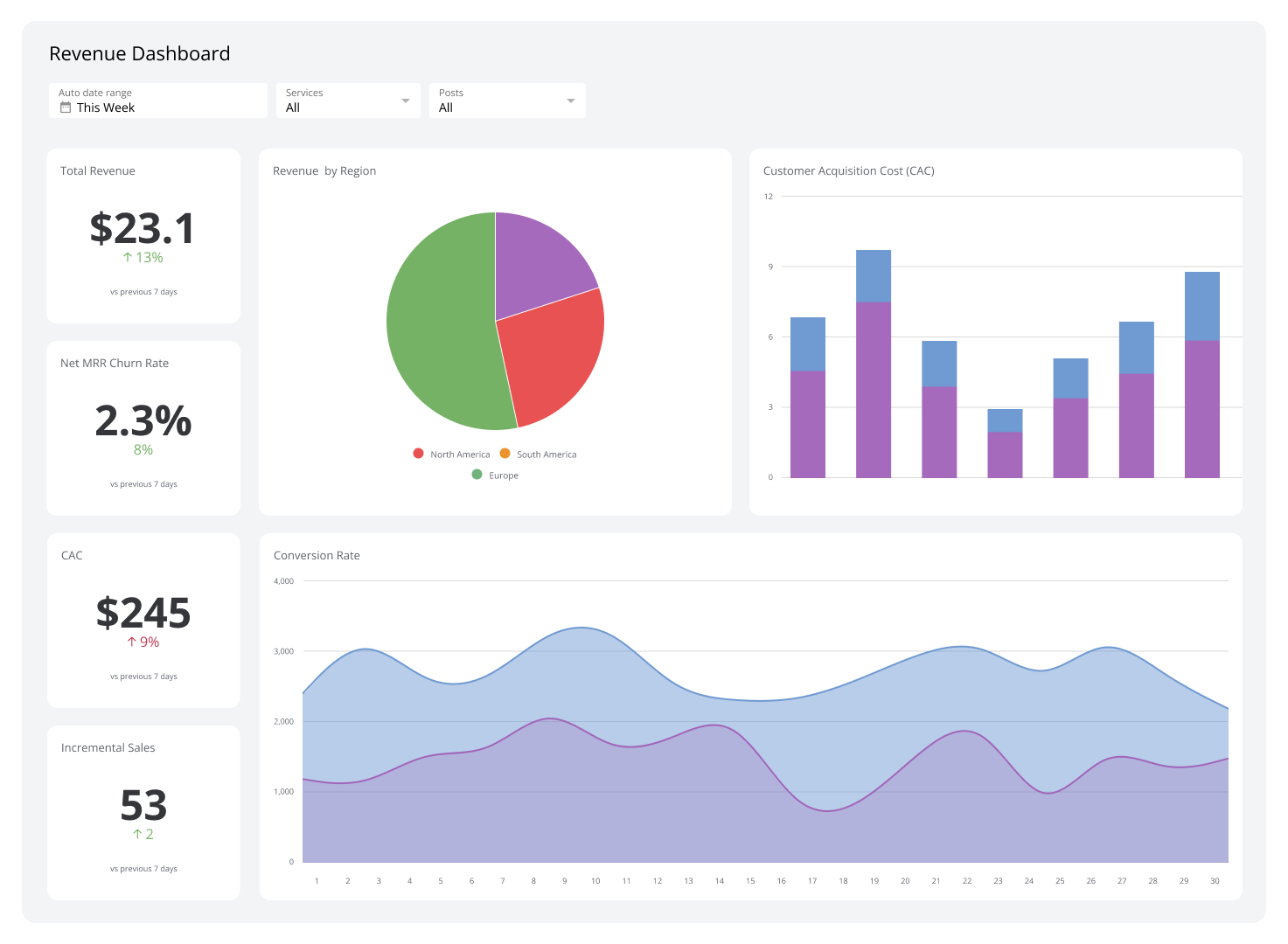
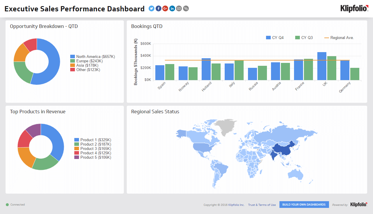
A revenue dashboard tracks and analyzes your income streams. It's especially valuable when you have multiple product lines or operate across regions.
Breaking revenue down by product or geography tells you which areas are pulling their weight and which need attention. If one region is consistently underperforming, you have the data to respond with targeted tactics rather than guesswork.
Example KPIs to track on your revenue dashboard
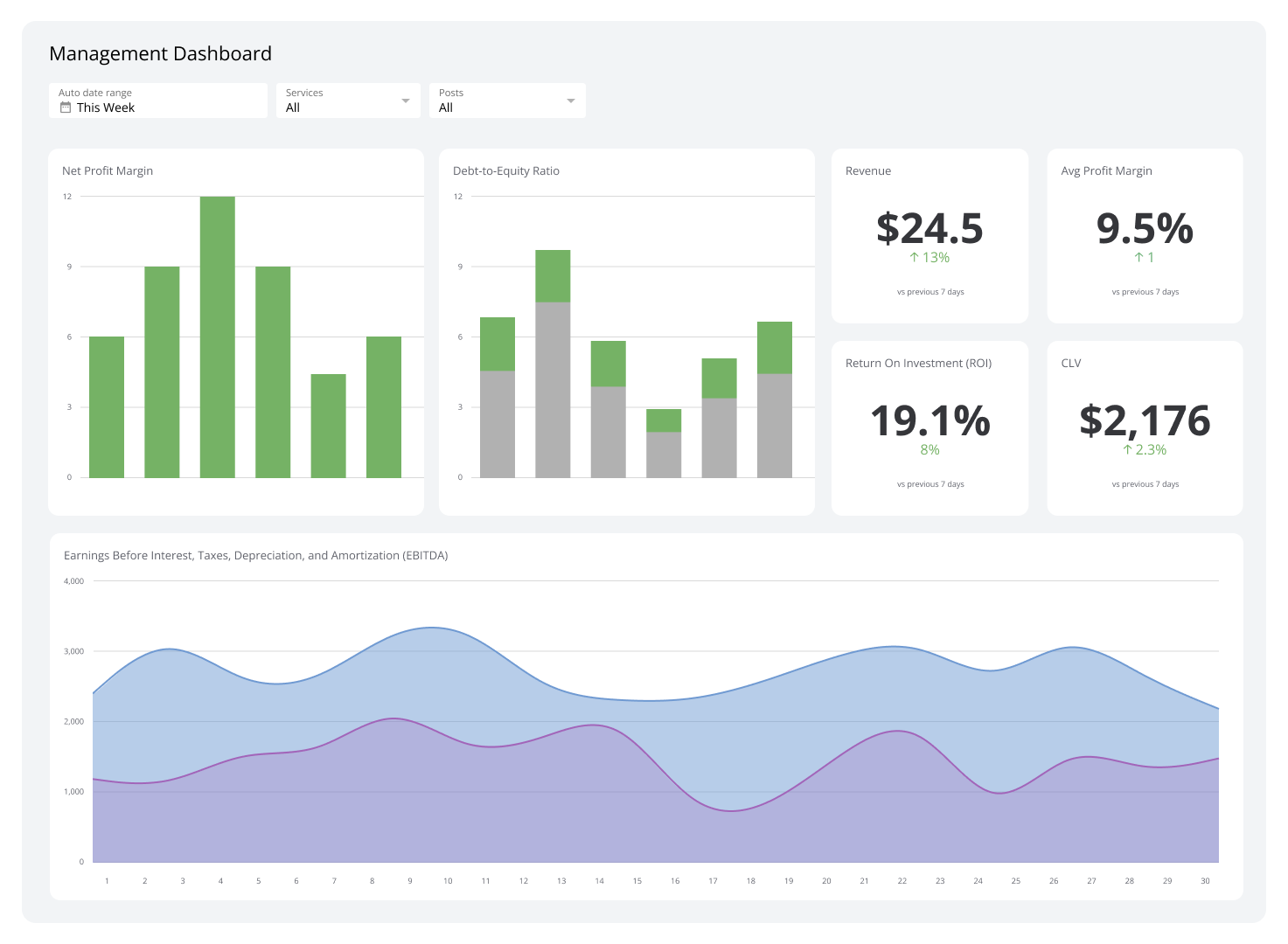
Average Profit Margin: Measures the percentage of revenue that remains as profit after all expenses. Informs pricing and cost decisions before they become problems.
Customer Lifetime Value: Predicts the total net profit you can expect from a customer over their entire relationship with your business. Guides how much to invest in acquisition and retention.
Customer Acquisition Cost: Measures the total cost of sales and marketing efforts required to acquire a new customer. Paired with Customer Lifetime Value, it tells you whether your growth model is sustainable.
Opportunity dashboard
An opportunity dashboard highlights where your next sales are likely to come from. It analyzes market trends and customer behaviour to show which products are in demand, where gaps exist, and how your offerings compare to the competition.
Spot an emerging trend early and you can launch a targeted campaign before competitors do. That kind of proactive visibility is what separates teams that react from teams that lead.
Example KPIs to track on your opportunity dashboard
Sales Opportunities: Organizes prospects by potential value and likelihood of closing, so your team focuses energy where it counts.
New Leads Generated: Measures the total number of new leads added in a given period. A key signal for evaluating whether your marketing is filling the top of the funnel.
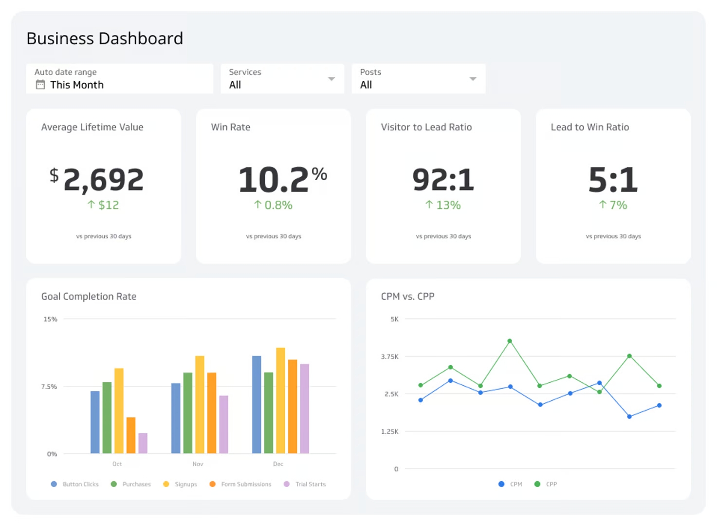
Win Rate: The percentage of deals closed compared to total opportunities pursued. One of the clearest indicators of overall sales effectiveness.
How to build an effective sales performance dashboard
A dashboard that just displays data is not enough. An effective Sales Performance Dashboard informs decisions and drives action.
Create custom dashboards for you and your team.
Get started with KlipsIdentify key metrics to track
Start with your business goals, then work backwards to the sales metrics that measure progress toward them. Focus on metrics that reflect sales volume, revenue, conversion rates, and Customer Acquisition Cost. If a metric does not change how you act, it probably does not belong on the dashboard.
Choose the right tool
The tool you choose determines what your dashboard can do. Look for software that connects to your existing systems and keeps data current without manual effort. Klipfolio Klips connects to 130+ data sources, including CRMs and cloud services, and lets you build dashboards your team can trust without needing a data team to maintain them.
Design for clarity
Put the most important information front and centre. Use clean charts, readable labels, and a layout that makes the key sales KPIs impossible to miss. A well-organized dashboard speeds up comprehension and reduces the time between seeing a number and knowing what to do about it.
Add interactive elements
Filters and drill-down capabilities let users customize their view without needing a separate report. Filter an overall revenue chart to a single product line. Drill from total sales into a breakdown by rep. This level of detail helps you pinpoint specific concerns or opportunities without pasting numbers into a spreadsheet or asking someone to pull a custom export.
Keep it current
Market conditions shift. Business priorities change. The metrics that mattered last quarter may not be the right ones today. Schedule regular reviews to confirm the dashboard still reflects what your team needs to know, and adjust when it does not.
Gather feedback
The people using the dashboard every day will tell you what is working and what is not. Make it a habit to ask. Open conversations about relevance and usability keep the dashboard aligned with how your team actually operates.
Common mistakes when building a sales performance dashboard
A few common mistakes can undermine a dashboard's value before it ever drives a decision.
Overloading with data
More metrics do not mean more clarity. A dashboard crowded with numbers makes it harder, not easier, to find what matters. Limit your dashboard to metrics that directly support your strategic goals.
Ignoring real-time data
Stale data leads to slow decisions. In a fast-moving sales environment, the value of a number often depends on how current it is. Use a tool that supports frequent or real-time data refreshes so your team is always working from the latest picture.
Neglecting data accuracy
If your team does not trust the numbers, they will not use the dashboard. Regularly audit your data sources and set up automated checks that flag anomalies before they mislead a decision. Reliable data is the foundation everything else rests on.
Choosing a poor design
A complicated layout slows people down and buries the insights they need. Keep it simple. Use intuitive charts, clear labels, and tooltips where context helps. Always design with the person reading it in mind, not the person who built it.
Lacking customization options
A sales rep needs a different view than a sales manager or a CRO. A single static layout rarely serves everyone well. Filters and selectable KPIs let each user see what is relevant to their role without needing a separate dashboard.
Build a Sales Performance Dashboard that drives results
A well-built Sales Performance Dashboard does more than display data. It gives your team a shared, reliable view of what is working, where to focus, and what to do next, without waiting for a weekly update or pasting numbers into a chatbot to figure out what they mean.
Klipfolio Klips connects your data sources, from CRMs and cloud services to spreadsheets, and turns that data into clear, consistent dashboards your whole team can act on.