

The top Salesforce reporting tools
Salesforce is a powerful CRM, but its built-in reporting tools are manual, siloed, and locked behind licences. This article reviews six external Salesforce reporting tools, including Tableau, Klipfolio, G-Connector, Smartsheet, Zoho Reports, and InsightSquared, covering the pros, cons, and best use cases for each so your team can find reliable, always-on visibility into sales performance.
Salesforce is one of the most widely used CRMs in the world, and for many sales leaders it serves as the single source of truth for pipeline activity, deal progress, and revenue forecasting.
But if you rely on Salesforce for reporting, you already know its limits. The built-in reporting tools are manual, siloed, and locked behind Salesforce licences. That creates a real problem when your leadership team needs clear, consistent numbers without waiting for someone to pull them.
The challenges of reporting within Salesforce include:
Manual, repetitive work: building and distributing reports takes time that compounds across your team every week
No external data blending: you can't join Salesforce data with data from other sources inside a single Salesforce report
Developer dependency: connecting Salesforce data silos without writing code is difficult
Licence restrictions: non-Salesforce users in your organization can't access reports, even when they need the numbers
Distribution caps: the Enterprise Edition limits you to 200 reports per month
Empty report noise: reports send even when there are no records to show
These gaps have created a strong market for external Salesforce reporting tools, both inside the Salesforce AppExchange and beyond. The right tool gives your team reliable, always-on visibility into sales performance, without waiting, without manual pulls, and without pasting numbers into a spreadsheet or a chatbot and hoping the output makes sense.
Below is an overview of six tools worth considering, including their advantages and limitations:
Tableau
Klipfolio
G-Connector
Smartsheet
Zoho Reports
InsightSquared
Data fluency is also one of the top sales skills the Salesforce team recommends developing. Worth a read if you haven't already.
Tableau as a Salesforce reporting tool
Tableau is a visual analytics platform built for exploring data through interactive dashboards. Its core appeal is the ability to connect disparate data sources and surface patterns without writing code. It has a native Salesforce connector and supports hundreds of other data sources.
Pros
Point-and-click visualizations: once Salesforce data is connected, building charts and dashboards requires no technical skill
Salesforce embed: visualizations can be embedded directly in Salesforce using Salesforce Canvas
Mobile-ready: touch-optimized controls make it practical to review dashboards on the go
Report templates: Tableau Report Templates for Salesforce help you get started quickly
Cons
Pulls more data than you need: Tableau's Salesforce connector treats Salesforce as a database rather than a web service. It only recognizes Salesforce objects, so you can't use a Salesforce report as a data source. You often pull an entire table when you only need a slice of it, which is slow and inefficient
Desktop-dependent creation: you can view dashboards in Tableau Online, but you must build them in Tableau Desktop. That creates data governance risks when different users pull different data subsets and choose different metrics
High cost: Tableau Desktop runs approximately $70/user/month, with Tableau Online adding roughly $42/user/month on top. That pricing puts it out of reach for many growing teams
Klipfolio as a Salesforce reporting tool
Klipfolio is a cloud dashboard platform built for teams that need real-time visibility into their numbers across every screen and every stakeholder. The focus is on getting reliable, consistent data in front of the people who need it, without requiring them to go looking for it.
Klipfolio connects to hundreds of data sources, including Salesforce via an open connector. You can pull in Salesforce reports directly or use SOQL to retrieve detailed or summary data with precision.
Pros
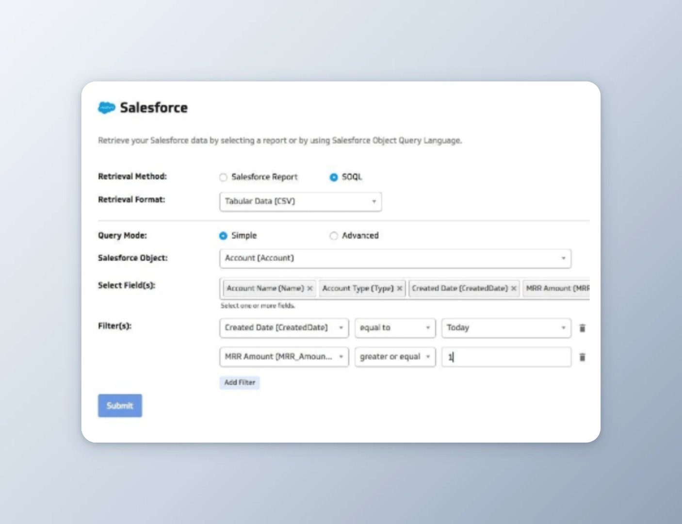
Flexible Salesforce connection: pull in Salesforce reports or pull in subsets of data in detailed or summary view using SOQL queries
Data blending: combine Salesforce data with data from other sources, including databases, files, and other web apps, in a single view
Broad distribution: Salesforce dashboards can be shared with Salesforce and non-Salesforce users alike, published via links, pushed by email, or displayed on TV screens in TV mode
Pre-built content: a library of plug-and-play Salesforce visualizations means you can get meaningful dashboards live quickly
Customization: the Klipfolio Editor gives you Excel-like control over metrics and visualizations when you need it
Accessible pricing: plans start with a free trial, making it practical for growing teams
Cons
SOQL required for large data sets: data sets with 2,000 or more rows require SOQL queries rather than simple report pulls
Learning curve: the flexibility that makes Klipfolio powerful takes some time to master
The real payoff for most teams is that once dashboards are live, the numbers stay current automatically. Your leadership team knows what's happening in the pipeline without waiting for someone to run a report or paste figures into a chat thread.
G-Connector as a Salesforce reporting tool
G-Connector for Salesforce connects your Google Sheet to your Salesforce account, syncing data manually or on a schedule. Its core appeal is automating data pulls and snapshots into a familiar spreadsheet environment.
Pros
Flexible connection options: connect to Salesforce reports or use custom queries to pull specific data subsets
Two-way data flow: edit data in Sheets and push it back to Salesforce using the Update command
Snapshot history: schedule recurring data snapshots saved to Google Drive for trend tracking
Automated refresh: data updates run on schedule, even when you're not logged in
Alerts: set up notifications and send them to multiple recipients
Free entry point: basic pull, refresh, and push features are available at no cost
Cons
Hourly refresh minimum: data refresh can only be scheduled as frequently as once per hour
Paywalled automation: scheduling automated data pulls and pushes requires a paid subscription
No built-in visualization: you'll need to build charts yourself in Sheets or another tool
Manual data blending: combining Salesforce data with other sources requires importing each data set separately into Sheets
No standalone interface: the entire experience lives inside Google Sheets
Create custom dashboards for you and your team.
Get started with KlipsSmartsheet as a Salesforce reporting tool
Smartsheet is a collaborative work management platform with a Salesforce plug-in that syncs data between the two systems. Its strength is in workflow automation rather than reporting or visualization.
Pros
Bi-directional sync: synchronize data between Salesforce objects and Smartsheet in both directions
Workflow automation: link standard and custom Salesforce objects to Smartsheet for collaborative management of pipeline reviews, territory assignments, and commission tracking
Cross-project reporting: create summary reports across multiple projects within Smartsheet
Cons
Significant learning investment: the platform takes time to configure and learn
Not primarily a reporting tool: Smartsheet is built for task and project management, not Salesforce analytics
Pricing is opaque: Salesforce integration is a premium add-on; contact Smartsheet for pricing
Zoho Reports as a Salesforce reporting tool
Zoho Reports is a self-service business intelligence tool with a drag-and-drop interface for building sales performance dashboards and reports. It has its own CRM but also integrates with Salesforce.
Pros
Ready-made reports: hundreds of pre-built report templates available out of the box
Accessible interface: drag-and-drop design requires no technical background
Cons
Slow refresh: data refreshes daily or hourly depending on your pricing plan, which limits how current your numbers are
Full-table imports: you must import entire Salesforce tables or modules, even when you only need a subset of the data
Limited customization: pre-built reports can be difficult to adapt to your specific needs
InsightSquared as a Salesforce reporting tool
InsightSquared is a sales intelligence platform with a Salesforce connector. It specializes in pulling historical CRM data to support pipeline analysis and revenue forecasting.
Pros
80+ pre-built sales reports: extensive library of ready-to-use reports covering pipeline, conversion, and activity metrics
Historical trend analysis: pull long histories of Salesforce data to identify patterns over time
Forecast modelling: project lead trajectory and pipeline outcomes
Multi-source data: combine Salesforce data with other sources like Zendesk
Cons
Opaque pricing: no published pricing; requires a sales conversation
Limited flexibility: customization options are constrained compared to more open platforms
Delayed sync: new Salesforce data can take time to appear in your dashboards, limiting real-time decision-making
Choosing the right Salesforce reporting tool
Salesforce is a powerful CRM, but it was never designed to be an analytics platform. Its reporting limitations are real, and they become more costly as your team grows and your leadership needs faster, cleaner answers.
The tools above cover a wide range of use cases, from workflow automation (Smartsheet) to full dashboard platforms (Tableau, Klipfolio). The right choice depends on what your team actually needs: richer visuals, broader access, blended data, or simply reliable numbers that update without anyone having to pull them.
If your priority is getting consistent, real-time Salesforce dashboards in front of the people who need them, including those without Salesforce licences, explore what Klipfolio makes possible. The goal is the same regardless of the tool: your team should know what's happening in the pipeline without having to ask.
Explore sales metrics and KPIs to sharpen what you measure alongside how you report it.
Updated 2026-09-08




Most recent
- SEP 25What SOC 2 taught a small team about trust
- SEP 15The AI race: progress, humanity, and trust
- SEP 9The good advisor
- AUG 11Beyond simple sign-ups: how True Trials and Activation predict growth
- JUL 7Why business leaders miss important trends in their dashboards
- JUN 19The best chart for the job: Visualizing data for non-technical users