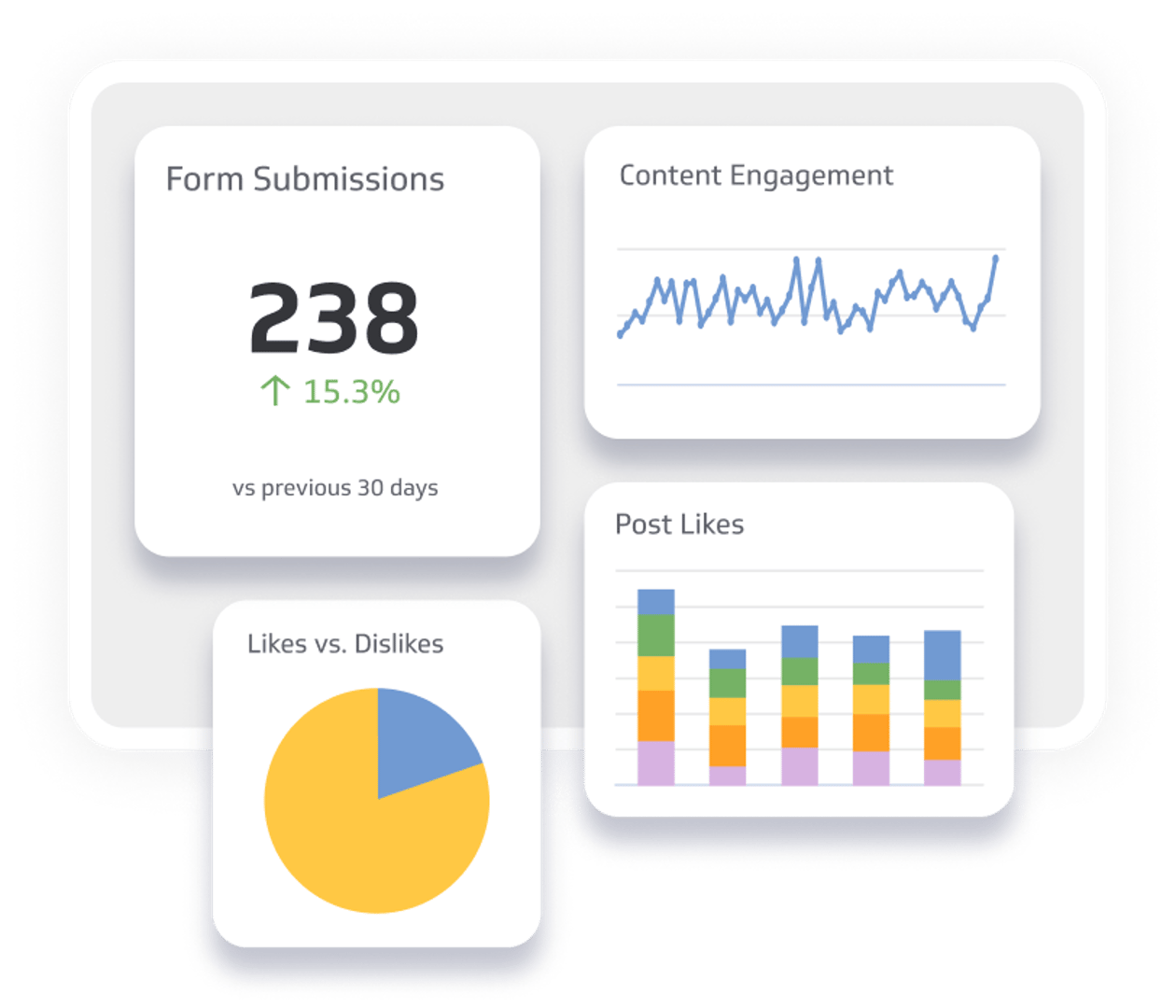

Summary - We use many tools and platforms to lay a foundation that supports our marketing strategy; without them, many of our campaigns and initiatives could not be effectively executed. This being said, it is extremely time-consuming for us to pull data manually from each of these tools. From Marketo, to Trello, to Pendo, to Google Analytics, our dashboards bring the key information
The marketing team at Klipfolio works fast. We are high performing. We are agile. We are data-obsessed in everything we do.
Since joining the marketing team in May, we have been learning a ton. What to measure, how to measure it, how to rework and remeasure, and most importantly, how to generate results. We learned very quickly that the best way to reach aggressive targets and lofty marketing goals was to be in the know about all of the real-time data that matters most to our team.
Demanding goals and objectives at every level
Organizational transparency is something that Klipfolio prides itself on. Our company’s OKRs are shared with every individual, team, and department, which allows goals at every level to be aligned seamlessly with overall objectives. From there, each contributor can develop an OKR strategy to support these high-level strategic goals.
For example, if one of Klipfolio’s OKRs is to have 35,000+ monthly active users, then our Customer Marketing Specialist could implement an OKR to reach 1000 active champions in Klipfolio’s advocacy program by the end of the year.
The marketing team is always juggling countless tasks and projects, and since each member has so many things going on at once, it can be a lot to keep track of. This is where marketing dashboards make our lives so much easier.
Marketing dashboards mean everything in one place
Not only do marketing dashboards provide a quick overview of our progress and performance, but they also allow the entire team and company as a whole to immediately understand our current position.
We use many tools and platforms to lay a foundation that supports our marketing strategy; without them, many of our campaigns and initiatives could not be effectively executed. This being said, it is extremely time-consuming for us to pull data manually from each of these tools to report on the success of a campaign, which is why dashboards make it easy. From Marketo to Trello, to Pendo, to Google Analytics, our dashboards bring the key information together - all in one place. We save valuable time while still checking in on our performance daily.
With multiple goals and data sources, we think it’s best to use different dashboards for each project. This allows us to see the performance of various initiatives separately, making it easier to share, decision-making, and determine the success of our efforts.
The 4 marketing dashboards that make help make us awesome
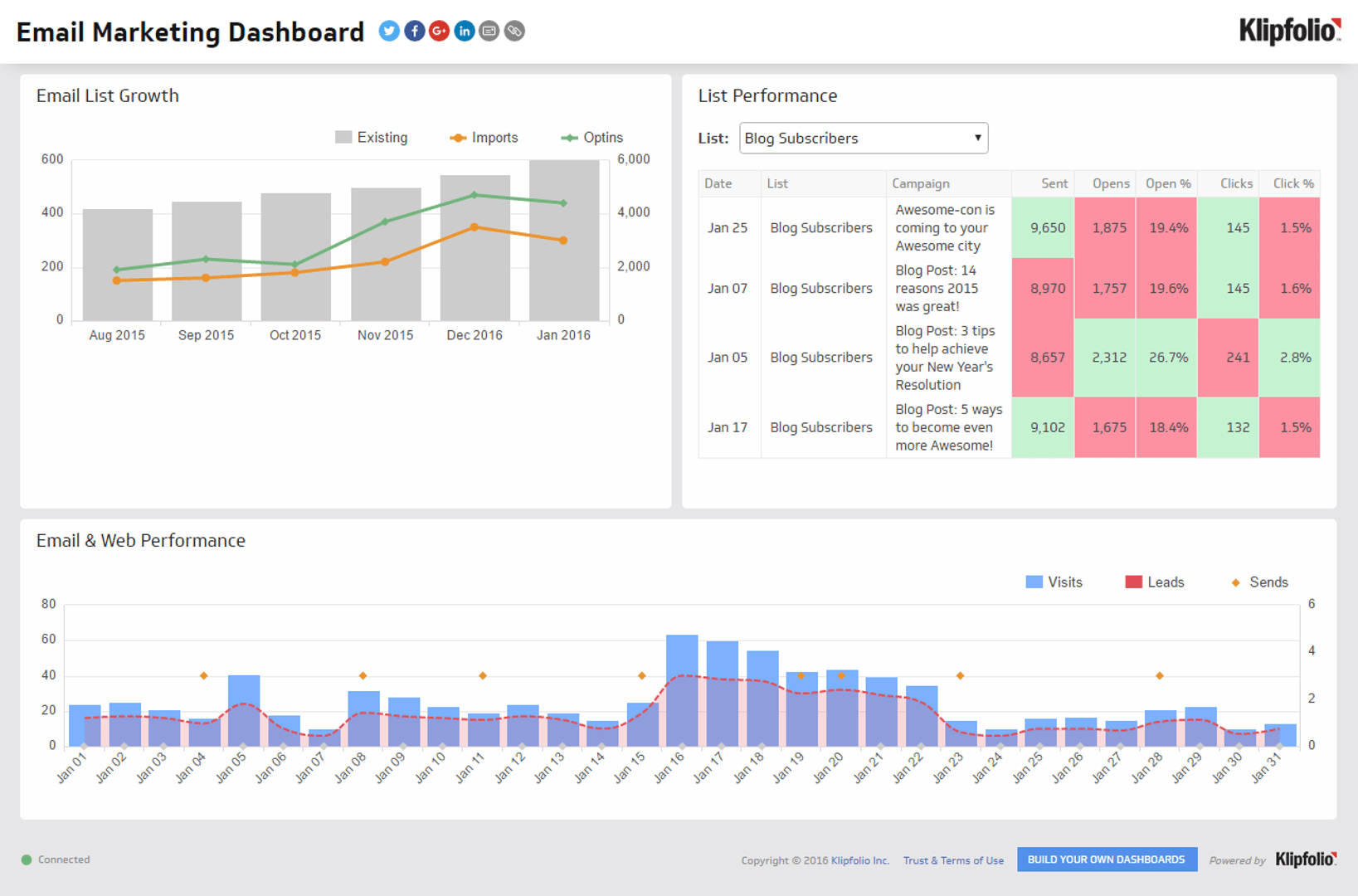
1. Email Performance Dashboard
We use Marketo to run our email marketing campaigns. Email is a huge lever for us and generates an abundance of leads and new customers. We take a lot of pride in our backend flow of the streams as well as the email copy.
At Klipfolio, there are 4 main types of email programs we run on a recurring basis.
Nurture Programs
The aim of a nurture program is to provide important information to trial users during the first 14 days of their Klipfolio experience. By gradually educating the user and ultimately making them more confident about their abilities in the app, they can more clearly see the potential value for their business and feel like data champions in the office.
Some of the metrics we use to track email nurture success include:
- Open rates
- CTR
- Wins
Reheats
Reheat campaigns are used to “reheat” expired users and are our last-ditch effort to get people who stopped using their trial to try the app again. Generally, we see lower success rates with this type of campaign, but we typically manage to encourage a handful of people to give us another try.
Some of the metrics we use to track reheat success include:
- Open rates
- Trial starts
- Wins
Product Updates
Although our product update initiatives are not used for lead generation, we pride ourselves on fostering current relationships and continuing to educate our users with updates on important product features. Once again, the goal here is to make our users as successful in Klipfolio as possible.
Some of the metrics we use to track newsletter success include:
Email Courses
Klipfolio email courses are another way we educate our users to be experts in data. From beginner to advanced courses, we offer easy-to-consume lessons delivered straight to our subscribers’ inboxes. Contrary to traditional PDFs and other gated content used by marketers to generate email opt-ins, our courses outperformed them because they didn’t feel like spam; they felt like paid programs, not free resources, and were broken down into bite-sized pieces.
“The problem with PDFs is that they don’t do a good job creating engagement. The traditional story is: someone downloads a PDF. They think it will be a really good guide. They open it once, read it really quickly, then close it. That PDF likely sits in their download folder never to be read again.”
- Phil Gamache, Marketing Automation Manager, Klipfolio
Some of the metrics we use to track email course success include:
- Number of subscribers
- Number of unsubscribes
- Active trials
- Trial starts
- Wins
Example of Email Marketing Dashboard
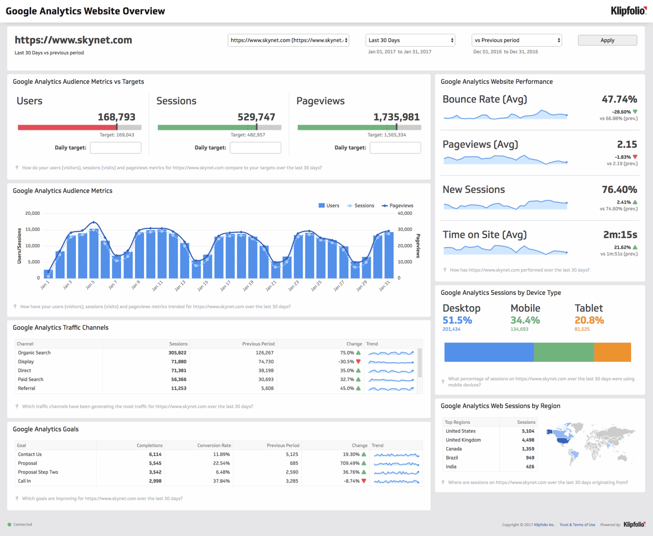
2. Google Analytics Dashboard
SEO is the foundation of our marketing strategy here at Klipfolio. Our website sees over half a million visitors monthly, which means that understanding where they are coming from and how they are interacting with our content is important for our continued growth.
Because we rely solely on inbound marketing to generate leads, it is imperative that we fine-tune our SEO tactics on a regular basis. This means revamping web pages, adjusting copy and code, playing around with meta tags and descriptions - the list goes on. All members of our team touch the website in some capacity every single day.
Every marketer knows that Google Analytics is a necessity when it comes to tracking SEO and overall website performance. Every marketer also knows that this tool can be a beast to navigate, so to simplify it, we extrapolate the metrics we need and put them up on a dashboard. Voila! Our most important metrics are in one place.
These metrics, the ones we love to stay on top of, include:
- Total visits
- Bounce rate
- Sessions by type
- Average time on page
- Sessions by channel
- Pageviews per session
- Goal completions
- Goal conversions
- Pageviews
Continuous monitoring of our Google Analytics dashboard helps us to identify our top-performing web pages and allows us to decide and prioritize which projects we should be tackling next. One of the most important metrics tracked by this dashboard is the conversion rates of leads in the funnel. By analyzing our data, we can also figure out exactly who is on our website, which means we can make more informed decisions about how to communicate with our visitors. It’s also awesome for figuring out which pages are best to test new marketing initiatives on, i.e., implementing pop-ups or testing new CTAs.
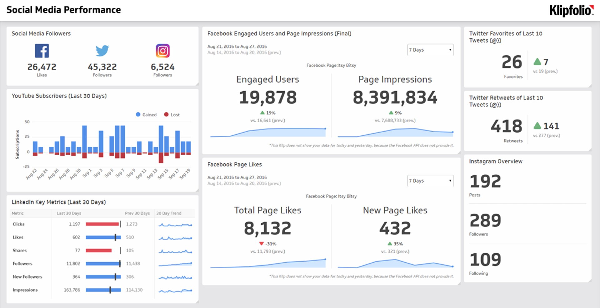
3. Social Media Performance Dashboard
Social media marketing is all about engagement, although measuring engagement can be a challenge. Each social media platform offers its own unique metrics (not to mention its own specific challenges). Here at Klipfolio, we use our social media dashboard to track engagement metrics across multiple platforms using a single interface that we can share with everyone on the team and the rest of the company.
- Social Interactions
- Social Traffic and Conversions
- Referrals, Conversions, and Events
- Followers Growth KPI
- Social Events
- Social Shares
- Social Followers
- Social Visits and Leads
- Social Sentiment
- New Followers
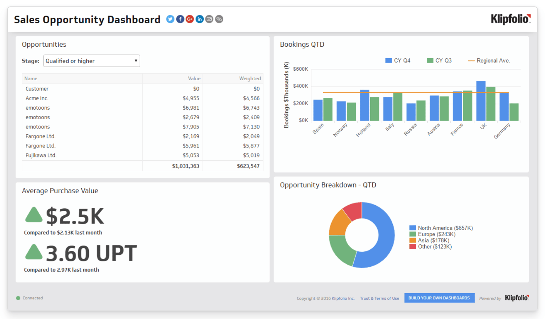
4. Sales Dashboard
Our marketing team makes it a priority to work hand-in-hand with our sales team, as it takes multiple touchpoints to push a lead through the entire funnel and lock them in as a customer.
Like most teams, our sales and marketing team members are motivated by the prospect of closing deals and converting leads into wins. We have designed our sales dashboard to show the latest opportunities and sort them according to their stage in the funnel, their location, and perceived value.
We use shared sales dashboards to display performance, making it easy to see what stage leads are at in the marketing funnel. Some of the specific metrics we display on our sales dashboard include:
If you want to add some friendly competition to fuel your sales team's motivation, you can learn how to track and compare both individual and team sales performance in real time with our step-by-step guide on sales leaderboards.
See more, learn more, do more
Getting serious about your data does wonders for your OKRs, your projects, and your overall workload. By going beyond standard monitoring and reporting, you’re able to see more, learn more, and do more. We love always being in the know, why don’t you try it for yourself?
Related Articles

5 tips to understand (and organize) your restaurant data
By Saleem Khatri — June 9th, 2026
6 Facebook ads reports every agency needs to attract and retain high-ticket clients
By Tanya Brody — April 10th, 2026
6 dashboards I use daily to run my SaaS company
By Allan Wille, Co-Founder — April 10th, 2026