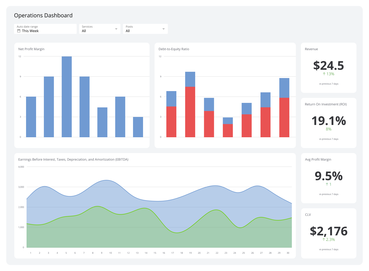
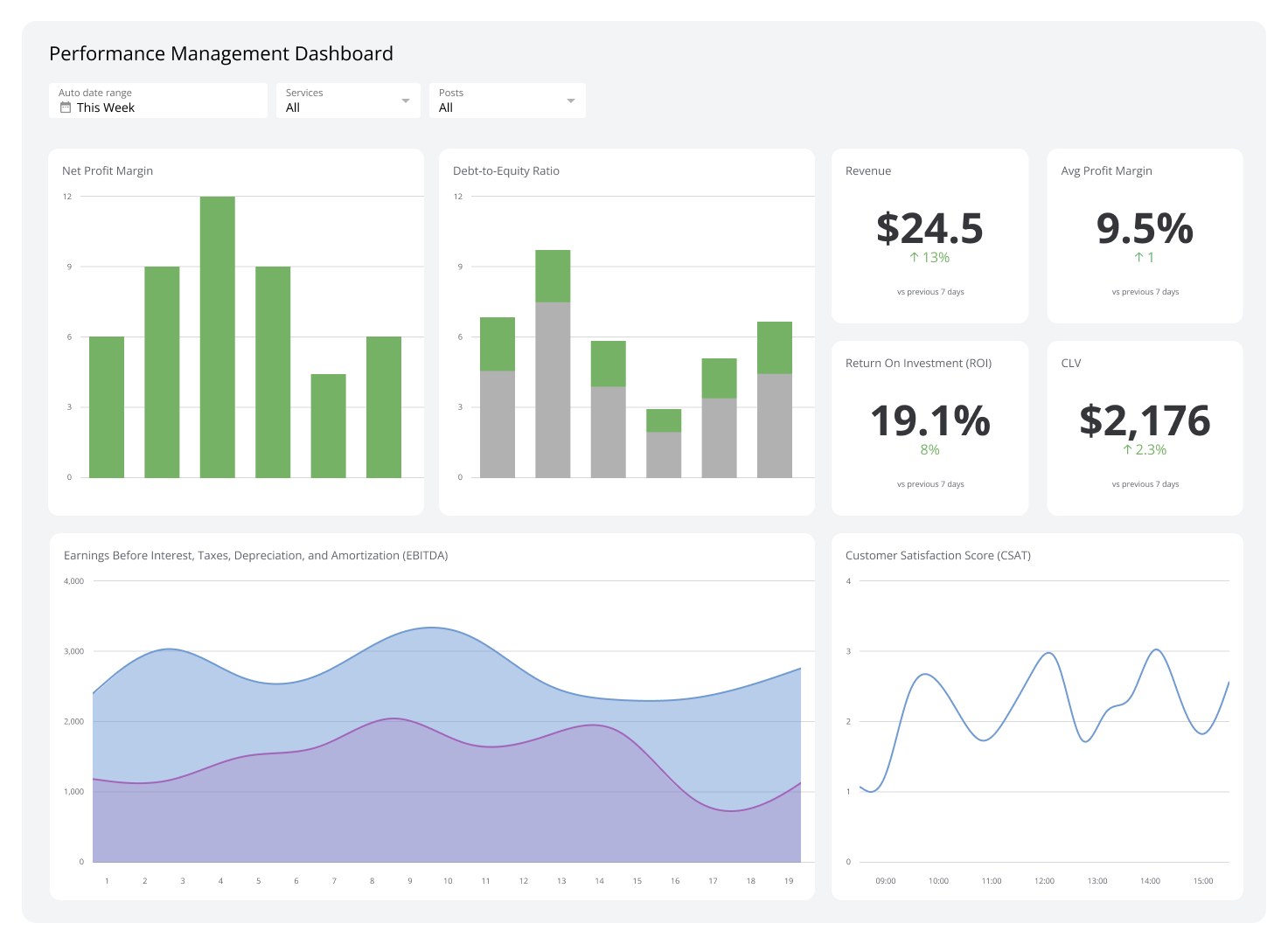
Business Intelligence Dashboard
A business intelligence dashboard connects your data sources and displays key metrics in one place, so you always know how your business is performing without having to ask or dig.
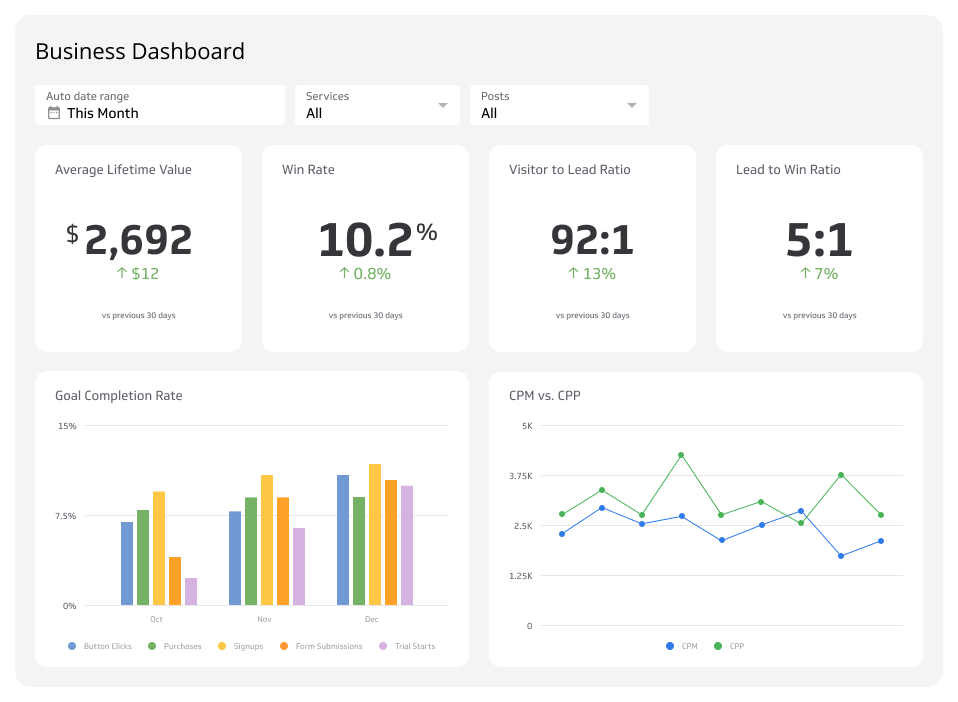
A business intelligence dashboard pulls live data from your sales, marketing, finance, and operations tools into one view, so you know what's happening across your business without having to ask or dig.
What is a business intelligence dashboard?
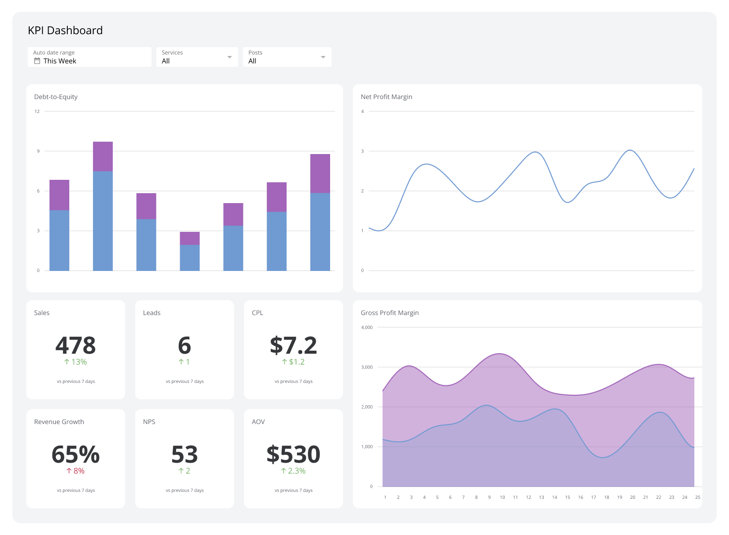
A business intelligence dashboard is a real-time reporting tool that connects your data sources and displays key metrics as charts, graphs, and tables, all in one place.
Most leaders piece together numbers from spreadsheets, app-specific reports, and email updates. A BI dashboard replaces that with a single, reliable picture of how your business is performing, updated automatically, without manual effort.
The difference between a BI dashboard and pasting numbers into a spreadsheet (or asking an AI tool to summarize a data dump) is consistency. Your metrics are defined once, calculated the same way every time, and available to everyone who needs them, without you having to explain your business from scratch on every check-in.
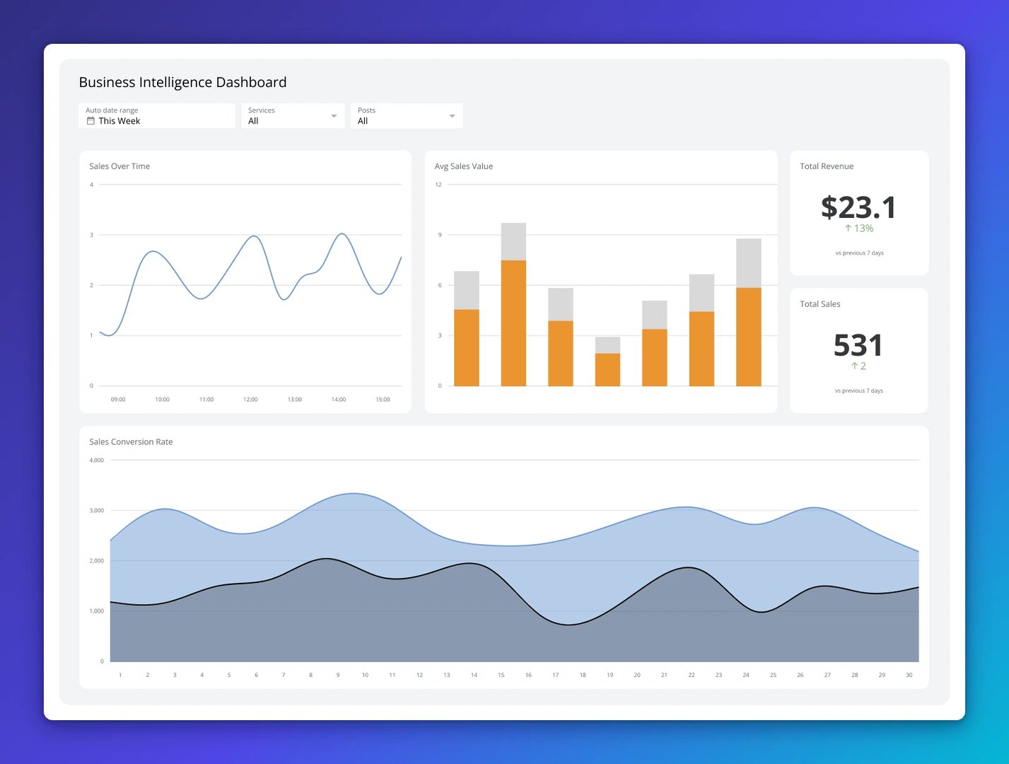
Examples of business intelligence dashboards
The right BI dashboard depends on your role and what you're accountable for. Below are the most common types, who uses them, how often they're needed, and which KPIs they cover.
Sales Performance Dashboard
Sales performance dashboards show how your sales team is performing right now. Revenue coming in, deals closing, pipeline health, and progress toward targets are all visible at once.
You can break performance down by region, product, or salesperson, so it's clear where things are on track and where they need attention. Patterns in customer behaviour, like which products sell most or which segments convert fastest, surface without anyone having to pull a custom report.
| Who's it for | Chief sales officers, sales directors, regional sales managers, account executives, business development managers, sales analysts, revenue operations teams, demand planners, customer success managers |
|---|---|
| How often it's needed | Real-time, hourly, daily, weekly |
| Covered KPIs | Total revenue by region, sales growth rate, average deal size, customer acquisition cost (CAC), conversion rate by sales stage, lead-to-customer ratio, quota attainment percentage, win/loss ratio, sales cycle length, revenue per sales representative, churn rate, customer lifetime value (CLV), product category sales distribution, upsell and cross-sell success rate, sales pipeline value, sales forecast accuracy, cost per lead, customer retention rate, response time to leads, number of new vs. returning customers |
Marketing Analytics Dashboard
A Marketing Analytics Dashboard shows whether your marketing spend is turning into revenue. You can see how many leads you're generating, where your website traffic comes from, and which channels, whether social media, email, or paid ads, are actually driving conversions.
With everything in one place, you stop guessing which campaigns to scale and which to cut. The numbers tell you directly.
| Who's it for | Chief marketing officers, marketing directors, digital marketing managers, content strategists, social media managers, paid advertising specialists, SEO analysts, brand managers, email marketing coordinators, demand generation teams |
|---|---|
| How often it's needed | Real-time, hourly, daily, weekly |
| Covered KPIs | Campaign ROI, CAC, marketing-sourced revenue, lead conversion rate, cost per lead, website traffic sources, organic vs. paid traffic ratio, click-through rate (CTR), bounce rate, social media engagement score, email open rate, email click-through rate, CLV, lead quality score, ad spend efficiency, search engine ranking position, content engagement rate, brand sentiment score, cost per thousand impressions (CPM), video completion rate, multi-channel attribution model performance |
Financial Performance Dashboard
A Financial Performance Dashboard gives you a live view of how your business is doing financially, without waiting for month-end reports. Gross revenue, net profit, cash flow, and cost breakdowns are always current and consistent.
You can track performance by customer segment, region, or sales channel, and spot trends like seasonal revenue shifts or rising costs before they become problems. That's the difference between reacting to your financials and managing them.
| Who's it for | Chief financial officers, finance directors, corporate controllers, financial analysts, budget managers, accounting teams, treasury managers, investors, board members, risk management teams |
|---|---|
| How often it's needed | Real-time, daily, weekly, monthly, quarterly |
| Covered KPIs | Revenue growth rate, net profit margin, gross margin percentage, operating expense ratio, EBITDA, cash flow from operations, accounts receivable turnover.), accounts payable turnover, working capital ratio, debt-to-equity ratio, return on assets (ROA), return on equity (ROE), budget vs. actual variance, cost of goods sold (COGS), break-even analysis, capital expenditure efficiency, financial forecast accuracy, liquidity ratio, tax liability trends, investment return rate, economic value added (EVA), shareholder equity growth |
Customer Service Dashboard
A customer service dashboard tracks response times, resolution rates, and satisfaction scores so you always know how well your team is serving customers.
Trends like longer wait times or recurring complaint categories surface automatically. You can see which support channels perform best and where customers are running into friction, so fixes happen before complaints escalate.
| Who's it for | Chief customer officers, customer service directors, support managers, call center supervisors, help desk teams, customer experience analysts, quality assurance specialists, customer success managers, service operations teams |
|---|---|
| How often it's needed | Real-time, hourly, daily, weekly |
| Covered KPIs | Average response time, first response time, average resolution time, first contact resolution rate, customer satisfaction (CSAT) score, net promoter score (NPS), customer effort score (CES), service level agreement (SLA) compliance rate, support ticket volume by category, agent utilization rate, ticket backlog, escalation rate, call abandonment rate, chatbot resolution rate, cost per support ticket, customer retention rate, self-service success rate, issue recurrence rate, peak support hours analysis, sentiment analysis from customer interactions |
Create custom dashboards for you and your team.
Get started with KlipsHR & Workforce Analytics Dashboard
An HR & Workforce Analytics Dashboard tracks how your people are performing, developing, and staying. Retention patterns, hiring speed, absenteeism, and engagement scores are all visible in one place.
If new hires are taking months to reach full productivity, or one department is burning through headcount, the dashboard surfaces it. That means fewer surprises and faster, fairer decisions about hiring, compensation, and team structure.
| Who's it for | Chief human resources officers, HR directors, talent acquisition managers, workforce planning analysts, compensation and benefits managers, employee engagement specialists, diversity and inclusion officers, training and development coordinators, payroll administrators, HR business partners |
|---|---|
| How often it's needed | Real-time, daily, weekly, monthly, quarterly |
| Covered KPIs | Employee turnover rate, time to hire, cost per hire, offer acceptance rate, employee engagement score, absenteeism rate, training completion rate, internal promotion rate, diversity and inclusion index, average employee tenure, retention rate by department, workforce productivity score, salary competitiveness ratio, benefits utilization rate, performance review completion rate, voluntary vs. involuntary turnover, skills gap analysis, HR-to-employee ratio, average time to full productivity, succession planning readiness, compliance violation incidents, workforce cost per full-time employee (FTE) |
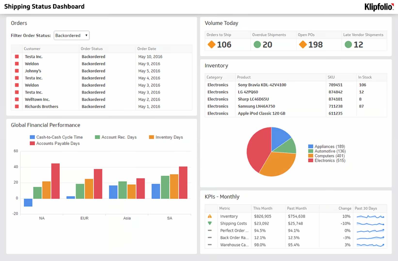
Supply Chain & Logistics Dashboard
A Supply Chain & Logistics Dashboard consolidates live updates on shipments, inventory counts, and delivery timelines. You can see warehouse stock levels, freight costs, and order processing speed without waiting for a weekly summary.
Emerging risks, like stalled shipments or excess inventory building up, appear early enough to act on. That visibility bridges gaps between suppliers, manufacturing sites, and distribution hubs and keeps product moving.
| Who's it for | Chief supply chain officers, logistics directors, operations managers, procurement specialists, inventory control managers, demand planners, warehouse supervisors, transportation coordinators, freight and distribution analysts, supplier relationship managers, risk management teams |
|---|---|
| How often it's needed | Real-time, hourly, daily, weekly |
| Covered KPIs | Order fulfillment rate, on-time delivery rate, inventory turnover ratio%20%3D%2020X%20per%20month), stockout rate, supplier lead time, demand forecast accuracy, warehouse utilization rate, freight cost per unit shipped, perfect order rate, carrier performance score, backorder rate, supply chain cycle time, transportation cost as a percentage of revenue, damaged goods percentage, procurement cost savings, inbound vs. outbound logistics efficiency, carbon footprint of logistics operations, labor productivity in warehousing, customs clearance time, return and reverse logistics rate, supply chain risk exposure index, inventory holding cost |
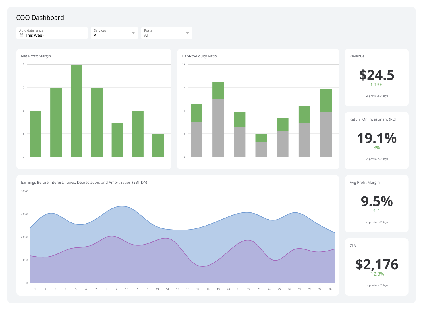
Executive KPI Dashboard
An Executive KPI Dashboard gives senior leaders a forward-looking view of the metrics that matter at the board level: shareholder value, market position, sustainability progress, and strategic initiative status.
Industry benchmarks and competitor data sit alongside your own numbers, so performance has context. Major projects, whether a merger, a digital upgrade, or a compliance effort, are tracked with visuals that make status clear at a glance.
| Who's it for | CEOs, COOs, CFOs, CMOs, CIOs, CHROs, board members, senior executives, business unit leaders, corporate strategists, financial planners, operations directors, risk management teams |
|---|---|
| How often it's needed | Real-time, daily, weekly, monthly, quarterly |
| Covered KPIs | Revenue growth rate, net profit margin, operating cash flow, return on investment (ROI), cost efficiency ratio, CAC, CLV, employee productivity index, market share percentage, sales conversion rate, brand equity score, operational cost per unit, CSAT score, NPS, employee retention rate, supply chain efficiency index, innovation pipeline success rate, digital transformation progress score, sustainability and ESG compliance metrics, corporate risk exposure index, strategic initiative completion rate, budget variance percentage, enterprise agility score |
E-commerce Dashboard
An E-commerce Dashboard tracks everything happening in your online store: total sales, Average Order Value, website traffic, and conversion performance, all in one place.
Cart abandonment rates and checkout drop-off points are visible without digging through platform reports. If a campaign is driving traffic but not purchases, the dashboard shows exactly where customers are leaving, so you can fix the issue rather than guess at it.
| Who's it for | E-commerce directors, online store owners, digital marketing managers, product category managers, inventory planners, customer experience analysts, sales performance teams, logistics coordinators, financial analysts |
|---|---|
| How often it's needed | Real-time, hourly, daily, weekly |
| Covered KPIs | Total sales revenue, average order value (AOV), conversion rate, cart abandonment rate, website traffic by source, CAC, return on ad spend (ROAS), CLV, repeat purchase rate, product return rate, inventory turnover ratio%20%3D%2020X%20per%20month), out-of-stock rate, fulfillment time, shipping cost per order, bounce rate, CTR, mobile vs. desktop performance, average session duration, marketplace vs. direct sales ratio, social media-driven sales percentage, discount and promotion effectiveness, referral traffic conversion rate |
Project Management Dashboard
A project management dashboard shows task completion, upcoming deadlines, and team workload in one view. You can see at a glance whether projects are on schedule and where delays are building.
When something is falling behind, the dashboard makes the cause visible, whether it's a resource constraint, scope creep, or a missed dependency, so you can act before the timeline slips further.
| Who's it for | Project managers, program managers, portfolio managers, resource managers, operations directors, client-facing teams, business analysts, executive sponsors, PMO leaders |
|---|---|
| How often it's needed | Real-time, daily, weekly, monthly |
| Covered KPIs | Project completion percentage, task completion rate, project timeline adherence, budget vs. actual variance, resource allocation efficiency, project cost variance, earned value management (EVM), milestone achievement rate, critical path progress, resource utilization rate, team productivity score, risk mitigation status, stakeholder engagement level, project backlog, scope creep percentage, change request volume, issue resolution time, client satisfaction score, project quality score, delivery on time, delivery on budget, project ROI, project portfolio health index |
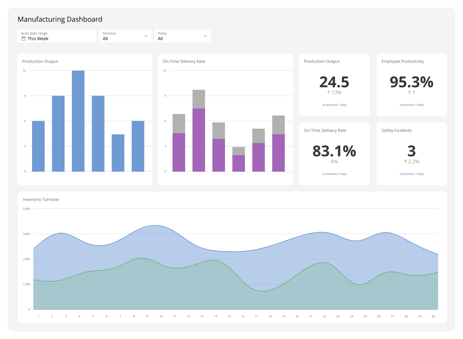
Manufacturing Dashboard
A manufacturing dashboard gives you live visibility into production efficiency, equipment performance, and potential bottlenecks. Cycle times, material availability, and machine utilization are tracked continuously, not summarized after the fact.
Automated alerts for delays, defects, or maintenance needs mean problems get flagged before they affect output. You get a clearer picture of where capacity is being lost and what to do about it.
| Who's it for | Manufacturing directors, plant managers, production supervisors, operations managers, quality control teams, supply chain coordinators, maintenance engineers, process improvement specialists, health and safety officers, inventory managers |
|---|---|
| How often it's needed | Real-time, hourly, daily, weekly |
| Covered KPIs | Overall equipment effectiveness (OEE), production yield, downtime percentage, cycle time, first-pass yield, production cost per unit, defect rate, on-time production rate, labor productivity, maintenance cost, machine utilization rate, scrap rate, work-in-progress (WIP) inventory, supply chain lead time, throughput time, order fulfillment rate, safety incident rate, energy consumption per unit produced, capacity utilization, inventory turnover, supplier performance, changeover time, production line efficiency, quality control pass rate, employee overtime rate |
IT & Security Dashboard
An IT & Security Dashboard gives your technology and security teams a single view of system health and risk. Uptime, network performance, security incidents, and compliance status are all visible without switching between tools.
Unusual activity and emerging threats surface in real time, so your team can respond before issues escalate. For leaders accountable for system reliability and data security, it's the difference between staying ahead of problems and discovering them too late.
| Who's it for | Chief information officers (CIOs), IT directors, security analysts, network engineers, system administrators, compliance officers, cybersecurity specialists, risk management teams, helpdesk teams, IT support managers |
|---|---|
| How often it's needed | Real-time, hourly, daily, weekly |
| Covered KPIs | System uptime percentage, network traffic analysis, mean time to detect (MTTD), mean time to respond (MTTR), number of security incidents, patch compliance rate, number of vulnerabilities detected, intrusion attempts, access control violations, threat severity levels, user activity logs, server load and performance, data breach attempts, firewall effectiveness, antivirus detection rate, network latency, data backup status, cybersecurity awareness training completion rate, compliance audit status, incident response time, cloud service performance, incident resolution rate, data encryption status, employee login failure rate |
Create custom dashboards for you and your team.
Get started with KlipsBuild a business intelligence dashboard with Klipfolio
The most effective BI dashboards do one thing well: they keep you informed without requiring you to go looking. The numbers are current, the definitions are consistent, and the right people see the right view, whether that's a shared screen, a scheduled PDF, or a client-facing embed.
Klipfolio connects to 130+ data sources, including your CRM, marketing platforms, accounting software, and databases. Pre-built templates get you running quickly. Excel-like formulas and flexible layouts handle more specific reporting needs. And with refresh rates from one minute to 24 hours, your team always works from numbers they can trust.