Operations Dashboard
Track performance across teams with live, role-specific operations KPIs.
What is an Operations Dashboard?
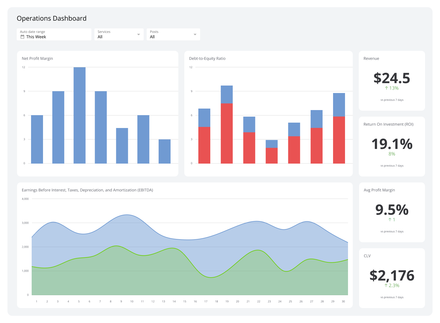
An operations dashboard gives you a real-time view of the metrics that run your business, so you can spot problems early, allocate resources confidently, and keep teams on target.
These dashboards pull data from systems like ERP and CRM platforms, databases, and web sources into one place. Instead of pasting numbers into a spreadsheet or waiting for someone to pull a report, you see what's happening as it happens.
They display KPIs in charts, graphs, and tables tailored to specific operational areas. In manufacturing, that might mean production schedules and defect rates. In customer service, it might mean average response times and call volumes. The result is the same: you know what's on track and what needs your attention, without having to go looking.
Examples of Operations Dashboards
Management Dashboard
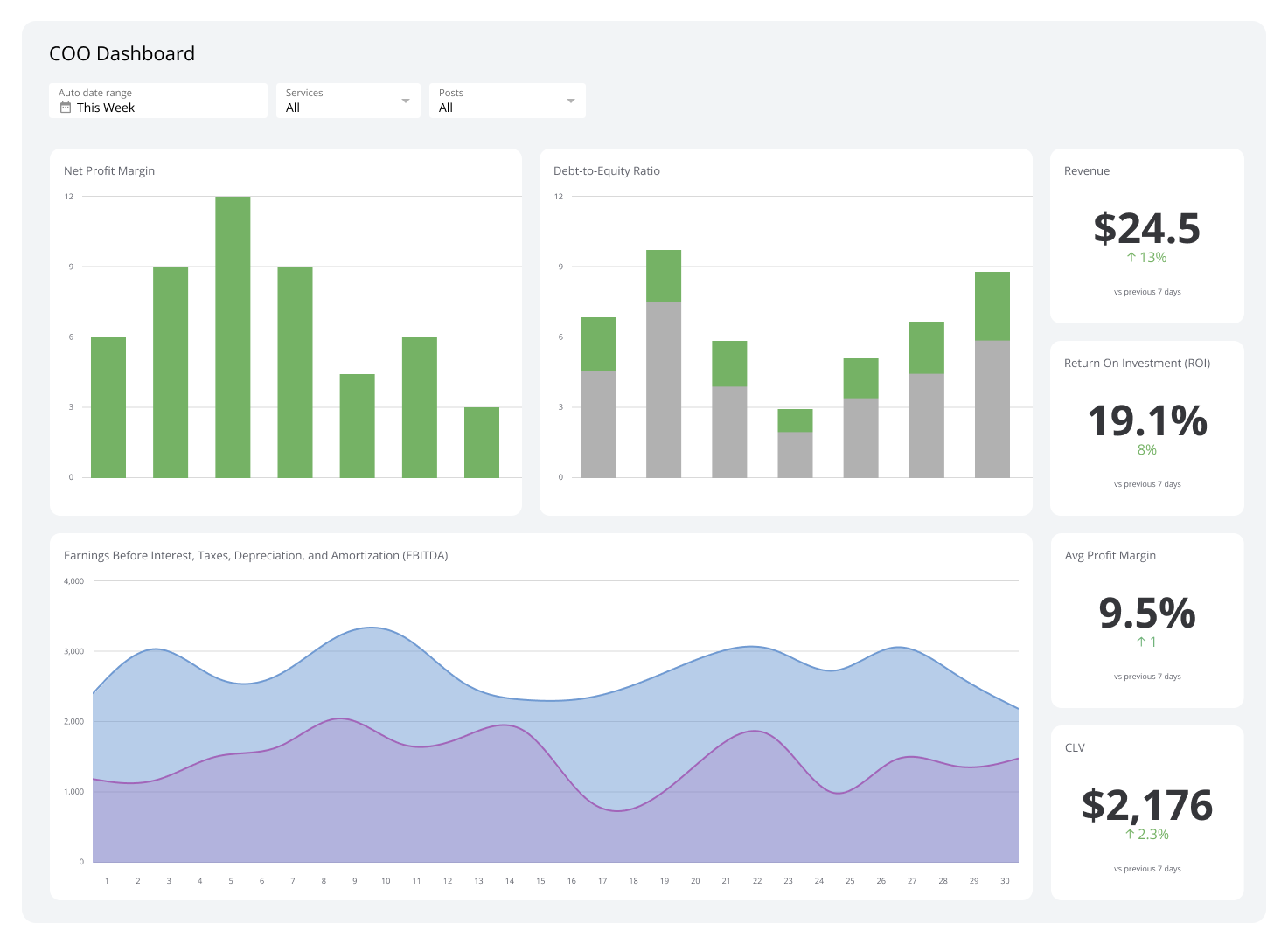
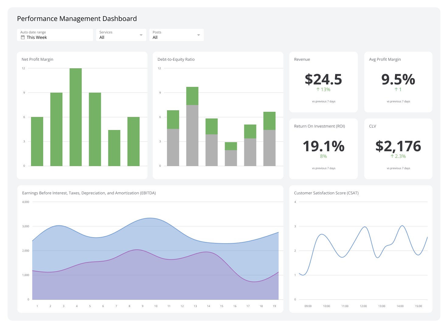
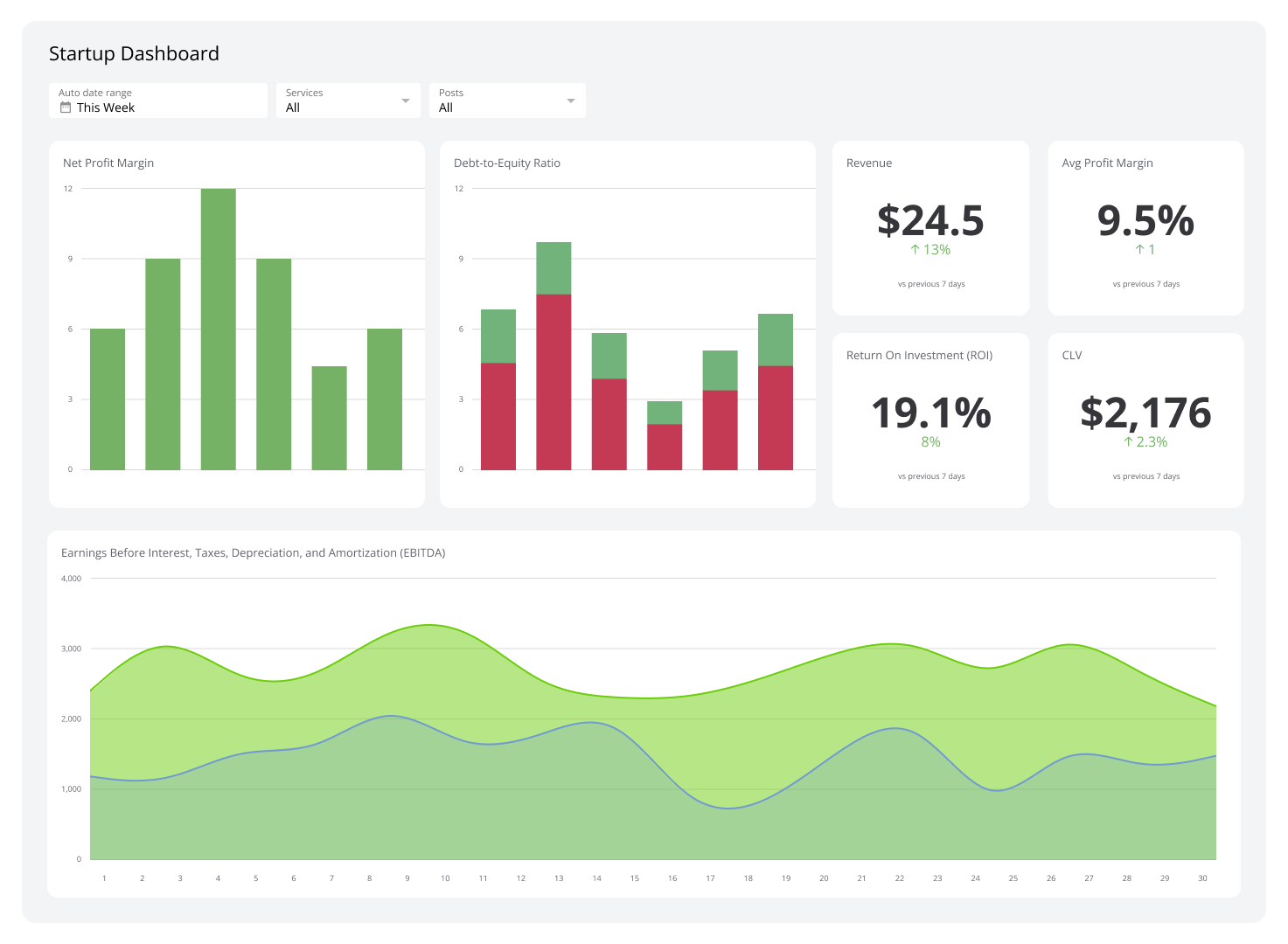
Management dashboards give managers and executives a live view of team performance, resource use, and goal progress. They bring together financial metrics like revenue and profit margins alongside operational KPIs like production rates and resource utilization.
When a metric starts moving in the wrong direction, such as a drop in customer satisfaction, you see it early enough to act.
| Who's it for | Managers, team leaders, company executives, project managers, department heads |
|---|---|
| How often it's needed | Daily, weekly, monthly, quarterly |
| Covered KPIs | Revenue, average profit margins, budget vs. actual expenses, cash flow, production rates, resource utilization, cycle times, defect rates, sales growth, conversion rates, customer acquisition cost (CAC), average deal size, customer satisfaction scores (CSAT), net promoter score (NPS), churn rate, customer lifetime value (CLV), productivity rates, absenteeism, employee satisfaction, turnover rates, milestone completion rates, budget adherence, scope changes, risk indicators, progress towards strategic goals, balanced scorecards, competitive benchmarking, campaign effectiveness, lead generation rates, customer engagement, market penetration |
Finance Operations Dashboard
A Finance Operations Dashboard shows your organization's overall financial health: cash flow, expenses, profitability, and liquidity in one view. It gives you the clarity to act on cost reduction or investment decisions without digging through reports.
Accounts receivable and payable trends surface automatically, so you can monitor liquidity and manage working capital before a gap becomes a problem.
| Who's it for | Chief financial officers (CFOs), financial analysts, finance managers, company executives, accounting teams |
|---|---|
| How often it's needed | Daily, weekly, monthly, quarterly |
| Covered KPIs | Net profit margin, EBITDA, operating cash flow, accounts receivable turnover, accounts payable turnover, working capital, debt-to-equity ratio, current ratio, quick ratio, return on assets (ROA), return on equity (ROE), budget variance, cost of goods sold (COGS), gross profit margin, expense ratios, forecast accuracy, liquidity ratios |
IT Dashboard
An IT Dashboard shows your infrastructure's performance and security status in real time. It tracks system uptime, network performance, and incident response times so your team can act before an issue escalates.
Trends in resource use and security threats surface without anyone having to run a query, making it easier to target vulnerabilities and maintain reliable performance.
| Who's it for | Chief information officers (CIOs), IT managers, network administrators, cybersecurity teams, system analysts |
|---|---|
| How often it's needed | Daily, weekly, monthly, quarterly |
| Covered KPIs | System uptime, network latency, server response time, incident response time, number of security breaches, mean time to repair (MTTR), mean time between failures (MTBF), system and network availability, IT resource utilization, user satisfaction with IT services, number of helpdesk tickets, resolution rate, cost per incident, patch status, compliance with IT policies, backup success rate, software and hardware inventory status |
HR Operations Dashboard
An HR Operations Dashboard tracks the metrics behind your people strategy: turnover, time to hire, training effectiveness, cost per hire, and workforce demographics. It tells you what's driving your HR outcomes, not just what they are.
You can see individual and team performance, identify high achievers, support underperformers, and monitor employee sentiment, all from one view.
| Who's it for | HR directors, HR managers, recruiters, talent development teams, company executives |
|---|---|
| How often it's needed | Daily, weekly, monthly, quarterly |
| Covered KPIs | Employee turnover rate, time to hire, cost per hire, engagement scores, training effectiveness, diversity metrics, headcount, absenteeism, satisfaction, appraisal scores, promotion rate, internal mobility, tenure, exit feedback insights, recruitment funnel metrics, offer acceptance rate, workforce productivity, benefit use, policy compliance, retention rate |
Create custom dashboards for you and your team.
Get started with KlipsOKR Dashboard
An OKR (objectives and key results) dashboard shows how each team and department is tracking against broader goals. It displays objective completion rates, key result progress, and cross-functional alignment in one place.
When a goal is at risk or a team is consistently exceeding targets, you see it clearly enough to reallocate resources or adjust priorities without waiting for a status meeting.
| Who's it for | Executives, department heads, team leaders, project managers, performance management teams |
|---|---|
| How often it's needed | Daily, weekly, monthly, quarterly |
| Covered KPIs | Goal completion rate, key result progress, OKR alignment with strategy, performance vs. timelines, team contribution, cross-functional progress, resource allocation efficiency, performance vs. stretch goals, milestone rate, retrospective outcomes, impact on initiatives, individual performance vs. OKRs, alignment score, update cadence, accountability metrics, departmental congruence, variance vs. plan, success highlights, challenges encountered |
Warehouse Dashboard
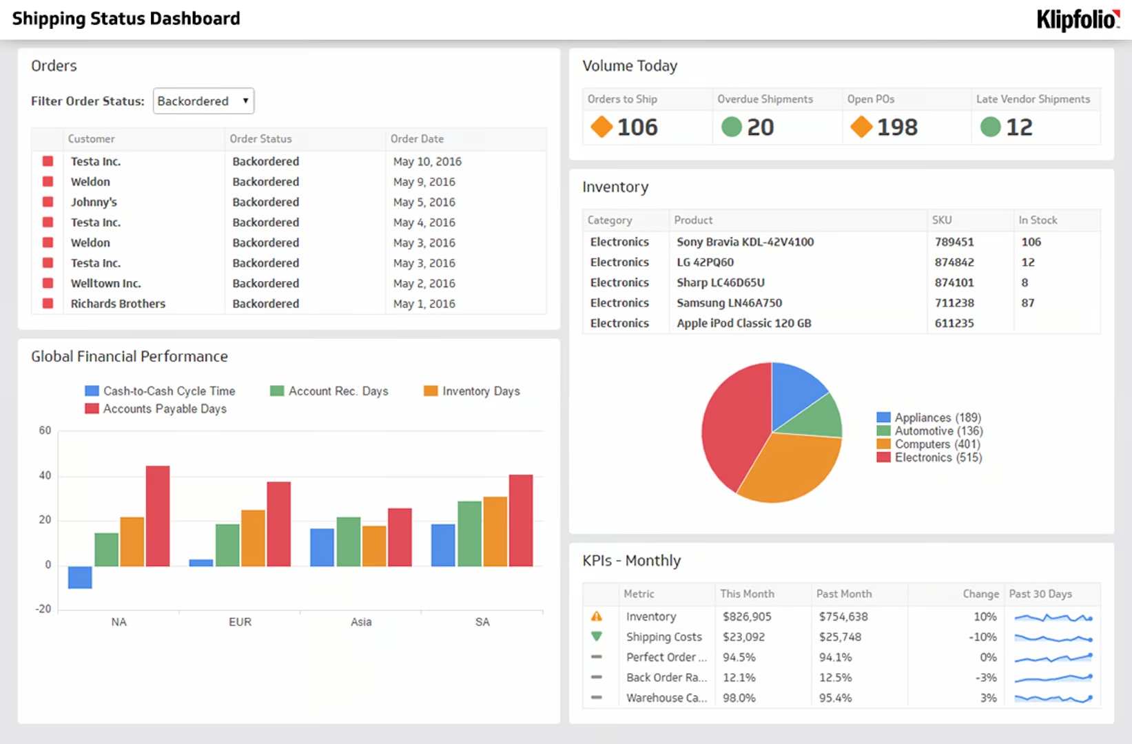
A Warehouse Dashboard gives you a complete view of warehousing operations: inventory levels, overstock risk, stockouts, fast-moving items, and cycle changes across periods. You see what's moving, what's sitting, and where the process is breaking down.
That visibility makes it easier to act on inefficiencies before they affect fulfilment or cost.
| Who's it for | Warehouse managers, inventory controllers, supply chain managers, logistics teams, company executives |
|---|---|
| How often it's needed | Daily, weekly, monthly, quarterly |
| Covered KPIs | Inventory turnover rate, perfect order rate, stockout rate, percentage of out of stock items, picking accuracy, order cycle time, average inventory, storage use, receiving time, dispatch time, rate of return, labour efficiency, shipment accuracy, back order rate, capacity, space use, carrying cost, SKU performance, forecast accuracy, cost per order, on-time delivery rate, safety incidents, transport time, packing time |
Health and Safety Dashboard
A Health and Safety Dashboard tracks the impact of your safety initiatives: incident rates, equipment inspection compliance, safety actions, and accident trends. High-risk areas and sites that need attention are visible without anyone having to compile a report.
That clarity supports better training decisions, more targeted audits, and faster corrective action.
| Who's it for | Safety officers, HR managers, operations managers, company executives, health and safety compliance teams |
|---|---|
| How often it's needed | Daily, weekly, monthly, quarterly |
| Covered KPIs | Incident rate, total recordable incident rate (TRIR), lost time injury frequency rate (LTIFR), near-miss frequency, severity rate, compliance rate, training completion rate, number of audits conducted, corrective action rate, participation, days since last incident, inspection compliance, drill performance, observation and reporting rate, personal protective equipment (PPE) compliance, ergonomics assessment rate, mental health and well-being metrics, environmental safety metrics, safety-related absenteeism, root cause analysis completion rate, incident cost, chemical safety compliance |
Production Dashboard
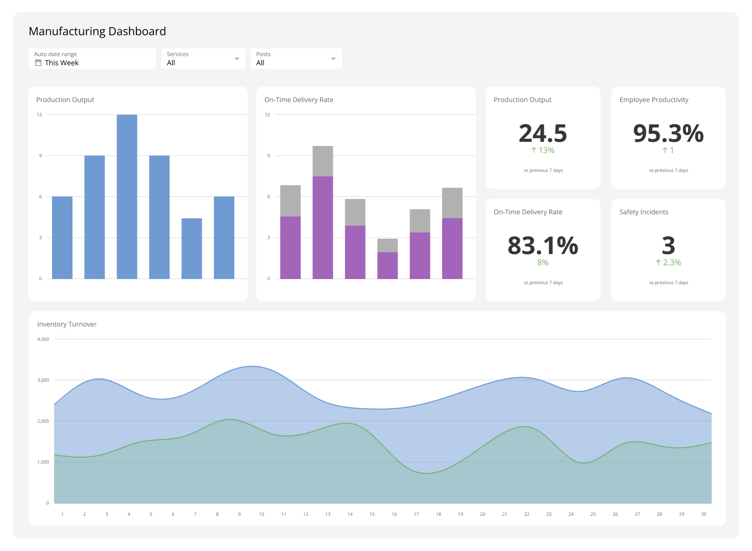
A Production Dashboard shows real-time data on volume, efficiency, yield, and defects. Line delays, defect spikes, low inventory, and equipment failures surface as they happen, not after the shift ends.
With output, quality, equipment status, and inventory in one view, you can decide when to reallocate resources or schedule maintenance with confidence.
| Who's it for | Production managers, floor supervisors, quality teams, operations managers, company executives |
|---|---|
| How often it's needed | Daily, weekly, monthly, quarterly |
| Covered KPIs | Production volume, efficiency rate, yield rate, defect rate, downtime, overall equipment effectiveness (OEE), cycle time, lead time, throughput, capacity use, scrap rate, rework rate, on-time delivery, inventory levels, machine use, maintenance adherence, labour productivity, first pass yield, quality metrics, setup time, energy use, safety incident rate, cost per unit, order fulfillment rate, compliance, environmental impact metrics |
Wholesale and Retail Dashboard
A Wholesale and Retail Dashboard gives you real-time sales data, inventory levels, and customer metrics in one place. You can see what's selling, what's stalling, and where risks like stockouts or sudden drops in foot traffic are building.
That view supports faster decisions on pricing, replenishment, marketing focus, and resource allocation across your wholesale and retail operations.
| Who's it for | Retail managers, wholesale managers, inventory managers, purchasing teams, company executives |
|---|---|
| How often it's needed | Daily, weekly, monthly, quarterly |
| Covered KPIs | Total amount sold, sales by region, sales by product category, inventory turnover, days sales of inventory (DSI), shrinkage, GMROI, foot traffic, basket size, retention rate, sell-through rate, order fulfillment rate, stockout rate, inventory accuracy, seasonal trends, sales per square foot, revenue per employee, promo effectiveness, supply chain costs, vendor performance, return rate, cross-channel effectiveness, e-commerce vs. in-store ratio, loyalty program metrics |
SLA Dashboard
An SLA Dashboard displays metrics tied to your service level agreements. Colour-coded indicators show at a glance which areas are meeting targets, which are approaching thresholds, and which have already breached.
That central view lets you manage service quality proactively, spot recurring issues, and assign resources before a breach affects a customer relationship.
| Who's it for | Service managers, customer support teams, IT managers, company executives, operations managers |
|---|---|
| How often it's needed | Daily, weekly, monthly, quarterly |
| Covered KPIs | Incident resolution time, first response time, SLA compliance, CSAT, mean time to resolve (MTTR), mean time to acknowledge (MTTA), tickets reopened, on-hold time percentage, response accuracy, service availability, uptime, downtime incidents, average handle time (AHT), complaints, escalation rate, backlog, response time by priority, resolution time by priority, contract breaches, request volume, team performance, ticket closure rate, root cause trends, service cost per ticket, customer effort score (CES) |
Customer Support Dashboard
A customer support dashboard gives a complete view of support performance: first response time, average handling time, ticket backlog, and satisfaction scores in one place. You can see where the team is performing well and where bottlenecks are forming, without waiting for an end-of-week report.
Agent productivity, ticket priority mix, and channel preferences surface automatically, so staffing and coaching decisions are grounded in current data.
| Who's it for | Customer support managers, team leads, agents, company executives, operations managers |
|---|---|
| How often it's needed | Hourly, daily, weekly, monthly |
| Covered KPIs | First response time, average handling time (AHT), CSAT, NPS, ticket volume, backlog, resolution rate, first contact resolution, average time to resolution, CES, agent productivity, priority mix, channel preference, self-service success, escalation rate, wait time, shopping carts abandoned, SLA compliance, retention rate, knowledge base usage, agent utilization, feedback trends, recurring issues, cost per ticket, channel efficiency, CLV, ticket reopening rate |
Create custom dashboards for you and your team.
Get started with KlipsBuild an Operations Dashboard with Klips
The best operations dashboards don't wait for you to go looking. They surface what matters, keep your numbers current, and give your team one reliable place to check, whether that's on a shared screen, a scheduled email, or a client-facing embed.
Klips connects to 130+ data sources and brings your operational metrics into one place. Your whole team sees the same numbers, and you spend less time chasing data and more time acting on it. Try Klips free. No credit card required.